

Browse Topics
Discover stories that matter to you
 Color Theory
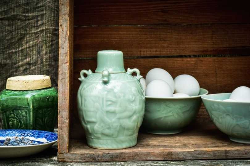
Celadon Color – All You Need to Know About Celadon Green
The celadon color is most probably one of those colors you have never heard of before. So, if you are interested in learning more about this particular green hue, where it came from, who coined the term “celadon”, and how to use it in the home, then read on.Table of ContentsToggleWhat Color Is Celadon?Celadon Color: A Brief HistoryMeaning of the Celadon ColorWorking With the Celadon Green ColorWhat Colors Go With Celadon?How to Create Celadon Green Acrylic PaintIdeas and Inspiration for Celadon-Color Interior DesignsCeladon on WallsCeladon as an Accent ColorFrequently Asked QuestionsWhat Color Is Celadon?What Colors Are Similar to Celadon?Is Celadon Green Warm or Cool?What Color Is Celadon? The celadon color can be described as being an extremely soft lime green hue. Others also describe it as a pale green-blue, with a gray undertone, a pale spring green with grayish undertones, or a bright shade of pastel green. Since it can have a grayish undertone, it is also sometimes known as dusty green.The celadon color is a modest and muted color that blends the freshness and sense of renewal of green, with the calmness and tranquility of blue. You should also be able to find a Pantone color labeled celadon green, which is identified by its code 13-6108 TCX. Celadon ShadeCeladon Hex CodeCMYK Celadon Color Code (%)RGB Celadon Color CodeCeladon ColorCeladon#ace1af24, 0, 22, 12172, 225, 175 Celadon Color: A Brief History The name is linked to the natural color that originated from Chinese ceramics, which were covered in a green-gray glaze. The pale-green glaze that originated in China, was developed, and improved upon centuries the 10th as well as 11th centuries. The glazed ceramics came in a variety of tones from green-gray to yellow-green. But who coined the term “celadon”?Ceramics and porcelains were exported to Europe, and they became quite a sought-after commodity by connoisseurs. It is said that the name “celadon” was created by these European connoisseurs, who took it from a fictional character in a French pastoral novel,L’Astrée(1607 and 1627) by Honoré d’Urfé. The shepherd in the novel, who is one of the main characters wears ribbons that represent the celadon color. However, before this, the Chinese only knew the color asmi se,which means a “mysterious color”.The celadon green color may not be as popular as many other colors, however, it has its own appeal that many love. One of the more famous brands that incorporate the hue into their packaging and image, is the Clinique skincare brand. Not only has the color made a place for itself in the business world, but it is also a popular color in fashion and can be found in many homes. Meaning of the Celadon Color Celadon falls under the green family, and as such, has many of the same properties and qualities. Celadon green is a calming color and can help to promote rest as well as relaxation. The calming nature and freshness of the hue can also help to improve focus, which is why it is used in home design. The hue also represents health, balance, growth, prosperity, and harmony.Working With the Celadon Green Color There are many colors and shades of colors, so it can become a bit confusing, and you might think one color is the same as the next. However, since you can view the breakdown of colors using their various color codes, you can easily differentiate each hue. The RGB and CMYK color codes are for web designs and printing respectively, and the hex code identifies each color. Below you will see the celadon color, as well as jade and mint. Jade is a stronger and darker green, while mint is very similar but more moderate in color.Celadon ShadeCeladon Hex CodeCMYK Celadon Color Code (%)RGB Celadon Color CodeCeladon ColorCeladon#ace1af24, 0, 22, 12172, 225, 175 Jade#00a86b100, 0, 36, 340, 168, 107 Mint#3eb48966, 0, 24, 2962, 180, 137 What Colors Go With Celadon? Celadon works well with neutral colors like white, brown, beige, and gray. The best way to work out what colors go with celadon is to look atcolor theory. Color combinations can be determined using thecolor wheel. Celadon looks good with othershades of blueand green, which are your analogous colors that are found near one another on the color wheel as seen below.Celadon ShadeCeladon Hex CodeCMYK Celadon Color Code (%)RGB Celadon Color CodeCeladon ColorCeladon#ace1af24, 0, 22, 12172, 225, 175 Soft Cyan#ace1ca24, 0, 10, 12172, 225, 202 Soft Green#c4e1ac13, 0, 24, 12196, 225, 172 If you are looking for more contrast, where colors stand out, then you want to go for a complementary color combination. These colors usually fall on opposite sides of the color wheel. When it comes to the celadon color, you will see a soft pink. However, brighter, and more vibrant pinks can also work. Other color combinations that also offer contrast include triadic and tetradic combinations, which can also be found on the color wheel and involve three to four colors.Celadon ShadeCeladon Hex CodeCMYK Celadon Color Code (%)RGB Celadon Color CodeCeladon ColorCeladon#ace1af24, 0, 22, 12172, 225, 175 Soft Pink#e1acde0, 24, 1, 12225, 172, 222 How to Create Celadon Green Acrylic Paint The easiest way to use celadon green is to purchase a tube of celadon green paint. However, you can also try blending some gray paint with a bright green, or a light green with a light gray. Another method is to experiment with black, white, and yellow paint.Take some white as your base color and add some to your mixing palette. Then add small amounts of black until you create a nice gray. To this, you can then add a small amount of yellow. You might have to play around with the proportions until you achieve the color you are looking for. Ideas and Inspiration for Celadon-Color Interior Designs Celadon can be a versatile color when it comes to using it for interior design. However, since it is a calming color, it would work quite well in the bedroom. Celadon is great to use in a neutral room, to add some natural color. You can also use the celadon color in the kitchen and add it to the kitchen cabinets along with beige and white for a relaxing and pleasant cooking space.Celadon on Walls Celadon is not as bold as some othergreen colorsand can add a beautiful fresh look to any room. Add layers of green to create more depth and interest, for example, celadon walls withemerald greenchairs. However, if you still think that it is too much to add celadon green paint on all the walls, an accent wall would work just as well. The other walls can be done in neutral tones, such as white or maybe beige, to create a harmonious look. Another option is to go for a patterned wallpaper that brings in the celadon color more subtly.Celadon as an Accent Color All shades of green are quite popular, and it is safe to say that they will not go out of fashion. Instead of using celadon green paint, which takes time and effort, you can bring the color into the room in other ways. Consider sofas and chairs in the celadon color, or cushions, vases, sculptures, plant containers, comforters, throws, curtains, and rugs. A rug would look especially nice on dark hardwood floors. You can also consider creating a focal point by painting built-in shelving or bringing in a coffee table that is celadon green. You can also combine it with pops of pink, yellow, or red to create even more interest.If you are looking for a versatile and less intense green, you might want to take a look at the celadon green. Not only is it a fairly easy color to work with, but it can also help to bring a sense of calm, healing, and balance into a space.Frequently Asked QuestionsWhat Color Is Celadon? Celadon green is a pale green-blue, with a gray undertone. The color comes from the pale-green glaze that originated in China. In the RGB color code, it contains 88 percent green, 69 percent blue, and 67 percent red. What Colors Are Similar to Celadon? There are a few colors that are close to the celadon color. The green tones that are often mistaken for each other include mint and jade. However, these are all separate colors with their own hex codes. Is Celadon Green Warm or Cool? The celadon color is calming and fresh and is considered a cool color. However, it can be considered a warmer shade of green when compared to jade.
 Color Theory
Hunter-Green Color – Colors in the Hunter-Green Palette
Blue is considered the number one popular color in the world; however, it is followed quite close by green. This is not surprising, as this color surrounds us in nature and plays a significant role in our lives. Colors are amazing and have many different shades, tints, and tones between which we can distinguish. So, when looking at green and all its various shades, what color is hunter green?Table of ContentsToggleWhat Color Is Hunter Green?Hunter-Green Color: A Brief HistoryMeaning of the Hunter-Green ColorHunter-Green Color ComparisonsHunter Green vs. Forest GreenHunter-Green Color vs. Emerald GreenHunter Green vs. Olive GreenHunter Green vs. Sage GreenHunter-Green Color CombinationsAnalogous ColorsComplementary ColorsMonochromatic ColorsHow to Mix Hunter-Green Acrylic PaintHunter-Green Color in Interior DesignFrequently Asked QuestionsWhat Color Is Hunter Green?What Colors Make Hunter Green?Do You Get Hunter-Green Interior Paint Colors?What Color Is Hunter Green? The hunter-green color can be described as a dark yellowish green, the yellow undertone providing a certain warmth to the dark color. However, you also get other shades that offer more of a blue undertone and have a cooler feel to them. Below is a web version of hunter green, with its hex code that helps identify the color and color codes specifically for HTML or website design and printing. You will notice that for printing, which is the CMYK color code, it contains 44 percent cyan, zero magenta, and 37 percent yellow, which will produce green, and then a whole lot of black ink that gives you the darker hunter-green color.Hunter-Green ShadeHunter-Green Hex CodeCMYK Hunter-Green Color Code (%)RGB Hunter-Green Color CodeHunter-Green ColorHunter Green#355e3b44, 0, 37, 6353, 94, 59 Hunter-Green Color: A Brief History The color green itself has a long history from the Ancient Egyptians and Romans, through to the Middle Ages and Renaissance. Although there were a few natural pigments, there were also synthetic pigments, for example,emerald green, which was considered highly toxic. The hunter-green color got its name when English hunters chose to wear the color while hunting in the 19th century. Later, the color changed to olive drab, which is now a popular hue for camouflage. Hunter green did, however, become the official color for the Green Bay Packers, an American football team, in 1957.Also, since 1998, hunter green became one of the official colors for the New York Jets as well as Ohio University. Hunter green saw a trend during the 1990s, where you often found the colors in libraries, studies, and offices, and today it is a color that is often considered for home interiors and exteriors.Meaning of the Hunter-Green Color Like all greens, hunter green is closely linked to nature. Therefore, it is associated with growth, rebirth, renewal, and health. The rich, deep color is also associated with wealth, as well as relaxation, as it has a calming effect. Many doctor’s consulting rooms, or hospital corridors, may have a light hunter green for this very reason. Hunter-Green Color Comparisons There are many shades of green, some are bright and bold, while others are more subdued. In many cases, you might not even be able to tell the difference between one green color to the next. So, let us look at a few of these similar hunter-green colors.Hunter Green vs. Forest Green Both of these colors are rich and dark greens. However, hunter green can be a little darker and warmer than forest green. Also, when it comes to hunter green vs. forest green, forest green has more of a blue undertone. When looking at these colors, they do have similarities and are quite close in comparison. Although, there are also variousshades of forest greenas well, as seen below in the table. When it comes to hunter-green paint for the home, there is a paint manufacturer, Benjamin Moore, who has created their own versions of these shades of green. The Benjamin Moore Hunter Green 2041-10 is a dark, saturated green that is more of a true green color, while the Forest Green 2047-10, is a lighter color, closer to cyan.Artists often have both these colors in their collections, however, if you had to choose, it would be forest green. The reason is you can create darker tones easier than you can lighten the hunter-green color for better coverage.Hunter-Green ShadeHunter-Green Hex CodeCMYK Hunter-Green Color Code (%)RGB Hunter-Green Color CodeHunter-Green ColorHunter Green#355e3b44, 0, 37, 6353, 94, 59 Dark Forest Green#01442199, 0, 51, 731, 68, 33 Forest Green#228b2276, 0, 76, 4534, 139, 34 Hunter-Green Color vs. Emerald Green Emerald green is a brighter blue-green color and is similar to the gemstone it is named after. Emerald green is a more popular paint color, as you can easily purchase it almost anywhere and it costs less than hunter green. Both colors are quite versatile and distinctive in their shade of green and work well together. However, when painting and layering colors, they also complement one another.Hunter-Green ShadeHunter-Green Hex CodeCMYK Hunter-Green Color Code (%)RGB Hunter-Green Color CodeHunter-Green ColorHunter Green#355e3b44, 0, 37, 6353, 94, 59 Emerald Green#50c87860, 0, 40, 2280, 200, 120 Hunter Green vs. Olive Green The olive color is more yellowish green and is similar to the skin of the green olive many people enjoy consuming. The lighter olive tones tend to have a stronger yellow undertone. Darker olive tones work better with hunter green. The olive drab color is what took the place of hunter green for camouflage purposes in the military, but today it is also a popular fashion color for everyday wear. Hunter-Green ShadeHunter-Green Hex CodeCMYK Hunter-Green Color Code (%)RGB Hunter-Green Color CodeHunter-Green ColorHunter Green#355e3b44, 0, 37, 6353, 94, 59 Olive Green#bab86c0, 1, 42, 27186, 184, 108 Olive Drab#6b8e2325, 0, 75, 44107, 142, 35 Hunter Green vs. Sage Green Sage is a pale gray-green that is similar to the popular herb everyone uses for cooking. The color has become quite popular in home designs for its versatility and calming nature. You can use hunter green and sage together, but to balance the look and add contrast, make sure to bring in other colors like white to create a more harmonious look.Hunter-Green ShadeHunter-Green Hex CodeCMYK Hunter-Green Color Code (%)RGB Hunter-Green Color CodeHunter-Green ColorHunter Green#355e3b44, 0, 37, 6353, 94, 59 Sage Green#b2ac880, 3, 24, 30178, 172, 136 Hunter-Green Color Combinations Green is generally an easy color to work with and tends to go well with many different colors. Of course, when creating a hunter-green palette, remember you can also use other shades from dark to light hunter green. The darker shades of hunter green tend to work better with earth tones like shades of brown and yellow, but it also goes with neutral tones like white, gray, cream, brown, and beige.The best color combinations can be determined by simply referring to a color wheel. Incolor theory, there are specific color combinations that offer contrasting and harmonious color schemes, depending on where all the colors are positioned. Below are three simple color combinations you can use. You can easily find these combinations online, where the specific programs will find them for you. Analogous Colors Colors all in a row and next to each other areanalogous colors, which are usually found on the same side of the color wheel. These colors are more harmonious and go well together. In this case, it is other shades of green and green blue.ShadeHex CodeCMYK Color Code (%)RGB Color CodeColorHunter Green#355e3b44, 0, 37, 6353, 94, 59 Dark Green#445e3528, 0, 44, 6368, 94, 53 Dark Cyan#355e5044, 0, 15, 6353, 94, 80 Complementary Colors Colors facing or opposite one another are known as complementary colors. When placed next to each other, they will pop out at you and compete for your attention. In most cases, you have to be careful with these colors so as not to overwhelm the viewer in a design. A dark, desaturated magenta is the complementary color for hunter green.ShadeHex CodeCMYK Color Code (%)RGB Color CodeColorHunter Green#355e3b44, 0, 37, 6353, 94, 59 Magenta#5e35580, 44, 6, 6394, 53, 88 Monochromatic Colors The variations of color for hunter green are called monochromatic colors. These colors offer a wide range of darker and lighter color selections. This color combination is similar to the analogous option, as the colors go well together.ShadeHex CodeCMYK Color Code (%)RGB Color CodeColorHunter Green#355e3b44, 0, 37, 6353, 94, 59 Grayish Lime#94c39b24, 0, 21, 24148, 195, 155 Dark Lime Green#192d1c44, 0, 38, 8225, 45, 28 How to Mix Hunter-Green Acrylic Paint What colors make hunter green? To make hunter-green paint, you can start by mixing a basic green from yellow and blue. You can then include some more yellow to produce a brighter color, or more blue to create a darker look. Try using navy blue and add small amounts to lemon yellow until you reach the desired color. You might need to experiment with the proportions to get it right.A quicker way to produce a dark green is to blend black and yellow paint. Experiment with using one part black and about five parts yellow. You can also consider a light cyan mixed with yellow, to which you can add small amounts of black until you reach a nice dark green. There are also tube paints of hunter green available. Hunter-Green Color in Interior Design Hunter green is a popular color in fashion, as it works wonderfully in a variety of styles. The same can be said for interior designs using a hunter-green palette. The dark green color can be used as the main color, or if this is too much, it can easily be incorporated as an accent color. You can pair hunter green successfully with neutral and pastel tones, however, it can also look luxurious alongside bright jewel tones.Just be careful, as the color can make a space feel smaller than it appears.You can, however, make sure you have plenty of natural light in a room as well as lighting. Try to include mirrors to help improve the reflection of light. If the dark color is too much on all the walls, a hunter-green accent wall is an ideal alternative. However, you can also bring in the color by simply adding a few plants or using accessories like throws, cushions, and rugs. You also do not have to stick to a single shade, create more depth and layers of colors with lighter and darker shades.You can also bring in hunter-green furniture, paint the kitchen cabinets, or bring in some hunter-green tiling ideas. A dark green couch will Consider pairing the color with luxurious woods like oak and walnut as well as metallic accents like brass and gold. We know hunter green works well with neutrals as well as other shades of green, but try pairing it with the following colors as well:OchreRustNavy bluePinkTurquoisePeachShadeHex CodeCMYK Color Code (%)RGB Color CodeColorHunter Green#355e3b44, 0, 37, 6353, 94, 59 Ochre#cc77220, 42, 83, 20204, 119, 34 Rust#b7410e0, 64, 92, 28183, 65, 14 Navy Blue#000080100, 100, 0, 500, 0, 128 Pink#ffc0cb0, 25, 20, 0255, 192, 203 Turquoise#40e0d071, 0, 7, 1264, 224, 208 Peach#ffe5b40, 10, 29, 0255, 229, 180 With so many shades of green and other colors out there, it can be difficult to choose the right color for our project. We hope you have gained a little more insight into the hunter-green color so that you can make a better choice.Frequently Asked QuestionsWhat Color Is Hunter Green? Hunter green is described as being a dark yellowish green, which makes it a warmer green hue. However, there are also different shades and tints of the color that you can use. What Colors Make Hunter Green? When mixing the hunter-green color, you can start by adding yellow to blue until you get green. You can then add more blue to darken the color. Try using navy blue to produce a darker green that is close to hunter green. Do You Get Hunter-Green Interior Paint Colors? Yes, some manufacturers produce wonderful paint colors for the home. There is a Benjamin Moore hunter green, which is labeled Hunter Green 2041-10, and a Sherwin Williams offers a color close to hunter green, Dard Hunter Green SW 0041. A great idea is to create a hunter-green accent wall that you can use as your focal point.
 Color Theory
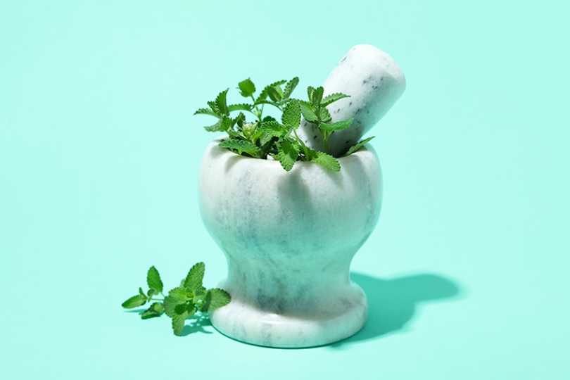
Mint Green Color – How to Create a Mint Color Palette
Green is a popular color chosen by many as their favorite color. However, there are many different shades of green, and if you are looking for something a little more subdued, the mint pastel colors are a perfect fit.Table of ContentsToggleWhat Color Is Mint Green?Mint Color: A Brief HistoryMeaning of the Mint ColorMint Green Color CombinationsShades of Mint Green: Monochromatic ColorsAnalogous Mint ColorsComplementary Mint ColorsTriadic Mint ColorsFour or More Colors in a Color SchemeMixing Mint Green Paint ColorsMint Color Palettes in DesignConclusionFrequently Asked QuestionsWhat Color Is Mint Green?How Can You Mix Mint Color Paint?Why Decorate With Mint Green?What Color Is Mint Green? The name might come from the mint plant, but the mint color is a little less intense than the leaves of the mint plant. What color is mint green? The mint color can be described as being part of a group of mint pastel colors and is a combination of blue, green, and white. The strength of the color is influenced by the proportions of each color.The mint color is a lighter version, but it still has vibrancy and a fresh, cool quality to its appearance. Mint green is sometimes mistaken forseafoam green, however, seafoam is more neutral and lighter. Both these colors are separate and have their own identifying hex codes for web designers.Mint Green ShadeMint Green Hex CodeCMYK Mint Green Color Code (%)RGB Mint Color CodeMint Green ColorMint Color#3eb48966, 0, 24, 2962, 180, 137 Seafoam#94e9be36, 0, 18, 9148, 233, 190 Mint Color: A Brief History Green is a natural color and can be seen abundantly in nature.Ancient Egyptianssaw the color as symbolizing rebirth, growth, and health. Theancient Romanseventually created a green pigment through the process of weathering metal. A bluish-green substance, known as verdigris, formed on the outside of brass or copper.During the Renaissance, the green color was considered special and only worn by the gentry. Color represented a person’s status or social rank in society. Other green pigments also came into light during the 18th century. For example, arsenite, a chemical compound, was used to create a vivid green color.Unfortunately, this chemical was and is toxic and may have caused quite a few fatalities, including Napoleon Bonaparte, the French emperor. Thankfully, today we have more synthetic pigments that can produce a variety of green shades. The color green over the years has also become a political symbol, but today it is seen as a color that represents sustainability and is closely linked to everything eco-friendly. The mint color was originally used as a name in the early 20th century. A few years later, there was a time referred to as theArt Deco era, which saw mint green become quite popular. The color was often used in kitchens and bathrooms. However, it also became a popular color for automobiles. The mint color was often used alongside black to form a beautiful contrast. Today, mint pastel colors are becoming more prevalent in both the fashion industry as well as in interior designs. Meaning of the Mint Color Studies show that the human eye can discern more green hues when compared to other colors. All green shades are closely associated with nature and bring harmony and peace. The mint color is more subdued than other varieties, but still provides a nice crisp and fresh look.The color is calming and can help people to relax. Light shades like mint green are also associated with creativity, wellness, growth, fertility, and health. The color is also linked to positive emotions, and people who favor green are usually calm and patient. They are easygoing and are considered natural peacemakers.Even though green is mostly seen as a positive color, it can also have some negative connotations. Green is often seen as greed or jealousy and can also be associated with possessiveness and indicate envy. Green can also be linked to sickness, and people who choose green may also exhibit over-cautiousness and selfishness. Mint Green Color Combinations Mint green is a versatile color and can work wonderfully with many colors. Combine it withshades of blueand lilac for a soft and soothing effect. To find the perfect color combination, you should look tocolor theory. Here you will find thecolor wheeland the various color schemes available. Each of these color schemes is laid out differently on the color wheel.Shades of Mint Green: Monochromatic Colors Take mint green and then create different shades and tints of the same color, and you have a monochromatic color scheme. In the table below, you can see some examples of light to dark shades of mint green. Neo mint is a popular current pastel shade that is being used for interior designs.Mint Green ShadeMint Green Hex CodeCMYK Mint Green Color Code (%)RGB Mint Color CodeMint Green ColorLight Mint#4fffb069, 0, 31, 079, 255, 176 Neo Mint#a5ffd635, 0, 16, 0165, 255, 214 Dark Mint#3d664740, 0, 30, 6061, 102, 71 Analogous Mint Colors This color combination is relaxing to look at and involves colors that are in the same range or close together on the color wheel. In this case, the mint color we have chosen will work well with other shades of green and blue.ShadeHex CodeCMYK Color Code (%)RGB Color CodeColorLime Green#3eb44e66, 0, 57, 2962, 180, 78 Mint Color#3eb48966, 0, 24, 2962, 180, 137 Shade of Cyan#3ea4b466, 9, 0, 2962, 164, 180 Complementary Mint Colors This is a popular color scheme as it involves contrasting colors. Find the mint color on the color wheel and opposite this, you will find its color complement. As you can see below a moderate pink will make the mint color pop and stand out when they are placed alongside each other.ShadeHex CodeCMYK Color Code (%)RGB Color CodeColorMint Color#3eb48966, 0, 24, 2962, 180, 137 Moderate pink#b43e690, 66, 42, 29180, 62, 105 Triadic Mint Colors Sticking with colors that stand out, another color scheme that works is thetriadic color palette. This can be identified by forming a triangle with equal sides. Whenever using this color combination, make sure to use it carefully as too much of all of these colors can become overwhelming. Rather choose a base color, which can be your mint, and then use the other colors as accents. This way there is more balance with all the colors.ShadeHex CodeCMYK Color Code (%)RGB Color CodeColorShade of Orange#b4893e0, 24, 66, 29180, 137, 62 Mint Color#3eb48966, 0, 24, 2962, 180, 137 Shade of Violet#893eb424, 66, 0, 29137, 62, 180 Four or More Colors in a Color Scheme Four or more colors in a color scheme can become a little tricky. However, if you are more comfortable with colors and you want to experiment, then there is no reason why you should not give it a try. When it comes to four colors, you can get a square or tetradic color scheme. This is four colors in an equal-sided square or rectangular form on the color wheel. Below is an example of a tetradic color scheme for the mint color.ShadeHex CodeCMYK Color Code (%)RGB Color CodeColorModerate Green#69b43e42, 0, 66, 29105, 180, 62 Mint Color#3eb48966, 0, 24, 2962, 180, 137 Moderate Violet#893eb424, 66, 0, 29137, 62, 180 Moderate pink#b43e690, 66, 42, 29180, 62, 105 Mixing Mint Green Paint Colors Since many artists enjoy painting natural scenes, green is going to be a popular color. When it comes to theprimary colorsfor pigments, artists may consider the RYB, which represents red, yellow as well as blue. So, if these are your primary colors, you should combine blue and yellow. You can try using lemon yellow and cerulean blue. You will then get asecondary colorof green. To get closer to a mint color, you will then need to add titanium white to the mixture. You can try different proportions of paint colors to find the best mint color you are looking for. You can also take green paint in a tube and mix this with white, as a simpler way to get to mint. You should be aiming to make a bright, lighter green color. However, if you want a darker, more saturated color, you can also add in a little blue.Mint Color Palettes in Design Mint green has become a popular color in fashion design and can be seen in clothing items, accessories, make-up, and nail polish colors. In the home, the mint color can offer a cool, calm, and fresh space that can be used in any room. If you want the perfect fresh look, mint green and white are always a great pair. Shades of gray is another popular mint color palette combination. In the bathroom, mint can be used in the wall tiles to add a modern art deco look that is refreshing and calming. Along with more neutral colors including white, beige, and brown, mint green can be an eye-catching accent color. You can create a very natural and appealing look for any room.In the kitchen, consider a lighter shade of mint for the kitchen cupboards, making it a subtle, yet attractive focal point. Bring in a beige rug or neutral color floor and ceiling to balance out the look. Appliances and kitchen furniture can also bring in color. For example, a mint green refrigerator or toaster.Choose a shade of mint that can be used as your base color on the walls or go for a darker version and make an accent wall instead. This can create an elegant and interesting space. The color is ideal for a bedroom or as a neutral color for a baby’s room.You can also bring the mint green in using accessories like rugs or cushions. You can also consider furniture in a mint color or use curtains in a mint green shade. In the bedroom, you can also bring in mint green with mint pillows, linen, throws, bedspreads, lamps, or pictures. Mint colors also work well with bolder colors like dusty pink and combine nicely with natural wooden elements. Gold accents can also bring a bit of warmth and luxury into a space. Conclusion The mint color is becoming a more popular color, most probably because is it a beautiful soft color that is versatile and still brings in that fresh and calming feeling. The color is not overbearing and can be used in anything from fashion to interior designs.Frequently Asked QuestionsWhat Color Is Mint Green? The mint color is a little more subtle than its plant namesake and can be described as being a bright and lighter shade of green. You can also get lighter or more mint pastel colors to darker versions. However, all shades remain crisp and fresh.How Can You Mix Mint Color Paint? This is fairly easy, as you only need your primary colors of blue and yellow to make the secondary color green. To this, you can add white to achieve a mint green color. You can also simply mix green paint with white and add a little blue to darken if necessary. Why Decorate With Mint Green? All shades of green including the mint color are seen as positive and are associated with nature. Mint green is fresh and calming and can lend a clean, bright, and tranquil yet refreshing feeling to any room in the home. It is also best to use mint green with other colors for a more harmonious look.
 Color Theory
Analogous Colors – What Are Analogous Colors in Color Theory
There is always more to creating great designs than meets the eye. Many do not realize the importance color plays in everyday designs online and at home. Colors have a profound effect on our lives, even if we do not notice them at first, but how do designers know what colors to use? The whole process has to begin with understanding color theory and how colors are connected. So, what are analogous colors and how do they work?Table of ContentsToggleA Brief Look at Color TheoryTraditional and Modern Color WheelsHow to Determine the Different Color CombinationsWhat Are Analogous Colors?Examples of Analogous ColorsAnalogous Color Combinations in Art and NatureThe Meaning Behind Analogous ColorsHow to Use Analogous ColorsTips for Using Analogous ColorsFrequently Asked QuestionsWhat Are Analogous Colors?Are Analogous Colors Warm or Cool?What Are the Analogous Colors of Brown?A Brief Look at Color Theory At school, we all learned about the basics when it came to colors, so most of us know what primary, secondary and tertiary colors are.Color theorytakes these colors further and places them in a visual representation known as the color wheel. Today, you can get more than one color model that is based on traditional or modern ideas.Traditional and Modern Color Wheels The traditional color wheel is based on what we learned at school and is known as the RYB color model. In this color system, theprimary colorsare red, yellow, and blue, which you can then combine to make your secondary colors orange, green as well as purple. Then you also have your intermediate ortertiary colorsincluding blue-green, yellow-green, red-purple, blue-purple, yellow-orange, and red-orange. These colors are created when paint pigments are mixed.The modern color wheel is based on how light combines to create various colors and is used by graphic artists or web designers and is how your television and computer screens work.This color model uses the RGB color codes, which represent red, green, and blue. When searching for specific colors online, each color has a hex code that identifies it and a breakdown of how much of each color is present. You might also notice another color code with the letters CMYK. This is used for printing purposes and will you how much of each ink color is used to produce a specific color. The primary colors involved here include cyan, magenta, yellow, and lastly, black. How to Determine the Different Color Combinations Color theory and the color wheel is what can help determine the bestcolor combinations. Graphic artists and other designers use this to create appealing designs that work. The basic idea is that all the colors have their place on the color wheel, and how they are positioned and relate to one another is how to determine different color combinations. There are more color combinations besides analogous and these include the following.Complementary colors: Contrasting colors or colors that work well and stand out are complementary. These are found on opposing ends of the color wheel.Monochromatic colors: These colors are obtained from a single color, and use various tones, tints, and shades.Triadic Colors: These three colors also form a contrast and go nicely together, and on the color wheel, they form a triangle with equal sides.Tetradic colors: These, as well as the square color combinations, use four colors. The tetradic colors form a rectangle and have multiple sets of complementary colors.Besides the main colors in a color wheel, it also contains various shades, tints, tones, and hues, which increases your choice of colors exponentially. You can also see the color temperature, which means all the cooler colors like blue, and green are found on one half of the color wheel, while warmer colors like red, orange, and yellow are found on the other half. Hue: This is another term you can use for color.Shade: A shade is a color to which black has been added to darken it.Tint: A tint is a hue that white has been added to, so it becomes lighter.Tone: Colors with a similar hue and lightness but have a different saturation.Saturation: The saturation is an indication of the purity or intensity of a color.What Are Analogous Colors? So, what are analogous colors? We have mentioned the other color combinations you can get, but our focus today is on analogous colors. In this color combination, there are usually three colors, which can all be found adjacent to one another. You will choose your main color and from there, you have your supporting and then your accent color. These colors all share similar characteristics or traits and go well when used collectively. Analogous colors are harmonious and pleasant to look out for, without standing out as the complementary colors do. The word “analogous” actually refers to two things that have functions or features that are alike. Analogous and monochromatic colors are similar in this fashion.For example, green and yellow are neighbors on the color wheel. These two colors combined form yellow-green, which has traits of both colors. All three colors are analogous, as they are all connected.Examples of Analogous Colors There are 12 basic analogous color combinations you can choose from. Each of these combinations has three colors and is located somewhere on the color wheel. Below is a list of these analogous colors.Red, red-orange, orangeYellow-orange, yellow, yellow-greenGreen, blue-green, blueBlue-violet, violet, red-violetShadeHex CodeCMYK Color Code (%)RGB Color CodeColorRed#ff00000, 100, 100, 0255, 0, 0 Red-Orange#ff53490, 67, 71, 0255, 83, 73 Orange#ff8000255, 128, 0255, 128, 0 Yellow-Orange#ffae420, 32, 74, 0255, 174, 66 Yellow#ffff000, 0, 100, 0255, 255, 0 Yellow-Green#9acd3225, 0, 76, 20154, 205, 50 Green#00ff00100, 0, 100, 00, 255, 0 Blue-Green#0d98ba93, 18, 0, 2713, 152, 186 Blue#0000ff100, 100, 0, 00, 0, 255 Blue-Violet#8a2be239, 81, 0, 11138, 43, 226 Violet#ee82ee0, 45, 0, 7238, 130, 238 Red-Violet#c715850, 89, 33, 22199, 21, 133 Analogous Color Combinations in Art and Nature Analogous colors have been used in art to help express emotions, meaning, and tone. If used properly, the use of analogous colors can help to create something that is recognizable and connects with the viewer. For example, the well-known artist Claude Monet used analogous colors to create a piece that has energy in hisWater Lily Pond(1899) painting. You can see he uses a green analogous color combination. Another example of yellow, orange, and yellow-orange would be the flowers inVincent van Gogh’s Sunflowers(1888).You can try to create analogous colors as well. Consider primary and secondary colors like green and blue.With these colors, you can then mix green-blue, blue-green, and all colors in between. All of the colors will have something in common, and that is the color blue. Analogous colors abound in nature, which is where many artists get inspiration from. Many types of leaves display analogous color combinations, and you can see green, yellow, and yellow-green shades of color. The Meaning Behind Analogous Colors All colors have meaning and can affect how we feel, sometimes, even directly affecting our physical bodies. Analogous color schemes occur naturally and are pleasant to look at, which makes them a popular option in various designs. Colors are used in advertisements, marketing, and even movies to bring about certain feelings and associations. Colors can be stimulating or calming, or they can be associated with nature or romance. Analogous colors, depending on the hue, can be used in all these cases. For example, green, yellow, and yellow-green can be connected to nature.Many different emotions and experiences can be created by using analogous colors. Warmer analogous color schemes that contain red, red-orange, and orange can be more stimulating, while calmer combinations will include blue, blue-green, and green color schemes. Ultimately, the color scheme you choose will depend on what you want the outcome to be. How to Use Analogous Colors Analogous colors are used in all types of design ideas from graphic designs for websites, to advertising, marketing, interior design, movies, and more. Analogous colors can be used to create a harmonious and balanced color scheme that is clear, where colors work effortlessly together. Make sure to choose an analogous color scheme that has tonal contrast, to easily identify each color. You can also incorporate gray, black, and white into an analogous color theme. You can go about choosing color combinations yourself, using the color wheel, or you can use the many tools and websites available. Simply choose your main color, which should have its own hex code that identifies it, and with this, you can determine all the best color combinations.A design is dependent on the message you want to send or the feeling you wish to create, which makes it a subjective decision.However, for example, if you wish to use a red, red-orange, and orange combination, consider selecting the red-orange color as your main attraction, and use the other two as accents. Choosing the middle color can help to produce a more balanced look. When you want to go for a more energetic look, you may want to consider contrasting colors or complementary colors instead. Analogous colors tend to be more harmonizing and calming in nature. A business that can take advantage of an analogous color scheme is a wellness spa or other natural products. The sense of calm and balance should work perfectly with analogous colors. Analogous colors are also ideal for bedroom designs in the home.When it comes to working with three or more colors within a design, designers usually make use of the 60:30:10 rule. This division of color use helps to create a balance and prevents all the colors from becoming too overwhelming. So, you will choose the main color, and this will become 60 percent of your design. The 30 percent will then be your first accent color, and the 10 percent will just be a pop of color here and there. For example, when implementing an interior design, you can use the main color on the walls, and in other areas like larger furniture pieces, and area rugs. The next color can also be accent rugs, chairs, bedding, or even window treatments. The last color can be added through cushions, throws, art pieces, or other accessories. You can use analogous colors for the following.Interior designFashion designAdvertisingLogosPackagingProduct designStationaryArtMoviesTips for Using Analogous Colors There are a few tips you can follow to help create the best analogous color schemes. Sometimes, you can understand the basic principles, but it is always good to get some practical advice you can use for your designs.Be aware of your color choices. Choosing the correct analogous colors can affect the outcome you wish to achieve.Do not overuse the colors. Analogous colors are great, but they still need to be used properly. Do not use too much of one color, but make sure the colors are balanced.Experiment with different hues. Play around with various tints, shades, and tones of analogous colors until you find the perfect match. Lighter colors can have a minimalistic and soft look, while darker colors are more daring.Incorporating contrast. You can bring in some contrast through different textures and shapes, which can help to spice up the design.Understanding how to work with colors and how to apply analogous colors goes a long way to helping produce some amazing designs. So, the next time you are looking for a more cohesive and pleasing design, consider an analogous color scheme.Frequently Asked QuestionsWhat Are Analogous Colors? These are a group of three colors that have similar traits and can usually be found close to one another on the color wheel. For example, green, yellow-green, and yellow. These colors work well together and are pleasing to look at, creating a harmonious effect. Are Analogous Colors Warm or Cool? This will depend on the main color you choose. If you decide on blue, green, or purple as your main color, then it will be cool. However, if you choose red, orange, or yellow, the combination will be warm. What Are the Analogous Colors of Brown? Technically, brown is not one of the colors found on the color wheel. However, brown is usually a mixture of red and yellow, so all other shades of red and yellow will help create a brown analogous color scheme.
Why traditional fashion thrives in Germany
Monocle Christmas Market 2019
Workwear is back in the fashion fold – does the trend mark a shift in consumer behaviour?
Sharp dressing at The Decorum
 Fashion
Le19M: Chanel’s commitment to craftsmanship
 Fashion
Tailoring’s youthful refit
 Fashion
A different view with Adrien Sauvage
 Fashion
Step into atelier Luca Avitabile, Naples’ bespoke shirtmaker
 Fashion
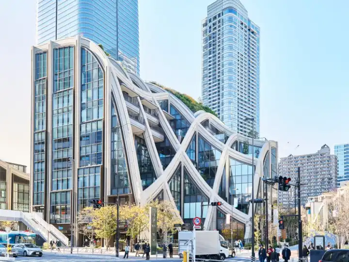
A look inside Azabudai Hills – Tokyo’s ‘city within a city’
 Fashion
Brussels + Antwerp: The Monocle Travel Guide


More Articles
Vermilion Color – The Bright and Exciting Vermilion Red Color
Red is one of the top preferred colors among all people and is the topmost color used in country flags around the world. However, there are numerous shades of red, all of which have their own fascination. One of these colors that has quite a history is the vermilion color.Table of ContentsToggleWhat Color Is Vermilion?Vermilion Color: A Brief HistoryVermilion Color MeaningVermilion Color TonesScarletCrimsonDifferent Shades of VermilionVermilion Color CombinationsVermilion Analogous Color CombinationsVermilion Monochromatic Color CombinationsVermilion Triadic Color CombinationsHow to Mix Vermilion-Color PaintThe Vermilion Color and Interior DesignVermilion on WallsIncorporating Vermilion AccentsFrequently Asked QuestionsWhat Color Is Vermilion?Is Vermilion Expensive?What Color Paint Is Closest to Vermilion?Is Cinnabar a Color?What Color Is Vermilion? Each shade of red that is produced has its own unique composition, whether it is from pigments or a combination of light wavelengths. This particular color has been around for many years and originates from the powdered mineral known as cinnabar, which is toxic as it contains mercury sulfide. The color is often referred to as a vermilion red color, as it is a bright red-orange that is saturated and warm.Vermilion ShadeVermilion Hex CodeCMYK Vermilion Color Code (%)RGB Vermilion Color CodeVermilion ColorVermilion#e342340, 71, 77, 11227, 66, 52 Vermilion Color: A Brief History The word itself is an Old French wordvermilion, which is fromvermeil, and this is derived from the Latin wordvermiculus, which is the diminutive expression of the wordvermis, meaning worm. This is associated with the red dye that was made from the insect calledkermes vermilio. The production of kermes dye was quite expensive but has been used since ancient times and was quite popular during themedieval period. A less expensive darker red dye known as carmine was later produced from the Mexican cochineal, which is a scale insect. The color name vermilion was first documented as an English color name in the late 13th century.Another source of the vermilion color was a mineral source known as cinnabar, which contains mercury sulfide and is highly toxic. Both cinnabar and vermilion were common names used to describe the color. However, after the 17th century, vermilion became more of a popular choice, while cinnabar was used to describe the mineral. Mining the cinnabar in those days was expensive, difficult as well as dangerous, because of its toxicity. Many of the miners perished while digging up this sought-after mineral. The very first time the powdered cinnabar was used can be dated thousands of years before Christ in what is today known as Turkey. The pigment was also discovered in Spain and the Ancient civilization of China, where they used the cinnabar pigment to paint floors, walls, and pottery. The pigment became known as China red, which was also used in printing pastes and was used in the calligraphic ink used by the emperors.Mystic Nativity (1500) by Sandro Botticelli; Sandro Botticelli, Public domain, via Wikimedia Commons In the Chinese Taoist culture, the vermilion color is considered a living color and is the color of life as well as eternity. Many Chinese New Year decorations also have this color, which is a symbol of prosperity and good luck. Besides obtaining pure and natural vermilion, the Chinese are also recognized for synthesizing vermilion by a heating process using mercury and sulfur. The Romans particularly enjoyed incorporating color into frescoes, sculptures, and even cosmetics. Romans also painted the faces of victorious generals with vermilion. During theByzantine Empire, vermilion ink was used for decrees as well as official letters. Pure vermilion became so expensive, the Roman leaders had to eventually fix the price.The synthetic version of vermilion became quite popular in Europe during the 12th century.It was commonly used to illuminate manuscripts, in particular, medieval manuscripts that included various documents, elaborate borders, and miniature illustrations. The synthesized version of vermilion became even more popular during the 14th century, as the process was easy to control and replicate and was even considered better than the natural vermilion pigment. Since the pigment, whether pure or synthesized, was so expensive, the European version was often adulterated with other cheaper materials like brick dust, red lead, and iron oxide among other additives. This made the final pigment produced more unstable in paintings. Below are some examples of paintings using the vermilion color:Mystic Nativity(1500) by Sandro BotticelliThe Origin of the Milky Way(1575) by Italian artist TintorettoDescent from the Cross (1612-1614) byPeter Paul RubensBelshazzar’s Feast(1635) by RembrandtDue to the toxicity of vermilion, interest declined over the years, and in the 20th century, synthetic pigments came into play, such as cadmium red. You can easily purchase a tube of cadmium red or cadmium red deep from an art store today. However, you can still get the original versions of vermilion, which should be used with extreme caution.Belshazzar’s Feast (1635) by Rembrandt; Rembrandt, Public domain, via Wikimedia CommonsVermilion is still a part of many cultures, for example, Hindu women make use of a vermilion calledsindoor, which is placed along the parting of the hairline and is a sign that the woman is married. Hindu men also wear some on their foreheads for certain religious ceremonies. The vermilion color has also made it to modern culture, especially as a color for motorcars. For example, the Maclaren 570s Spider Vermilion Red 2022. Vermilion Color Meaning All shades of red share similar attributes, for example, they are all associated with love, passion, romance, energy as well as anger. As mentioned, vermilion is also seen as something that stands for life and vitality. Vermilion, as with all red colors, also draws attention, is stimulating, exciting, and exudes confidence. However, the vermilion color meaning can also be negative. Besides anger, vermilion can also be associated with aggressiveness, dominance, and impulsiveness.Vermilion Color Tones The vermilion red color is most probably a color that is less recognized and can most often be confused with other shades of red like scarlet and crimson. These are all vibrant and saturated colors. You can see the difference if you have a look at each color code, which provides the percentages or differences in the amount of color that makes up each hue. This is represented by the RGB color code for web graphics that uses light and the CMYK color code for ink and printing.Scarlet As you can see below, scarlet and vermilion are slightly different. You will notice that scarlet has a more pronounced red tone as it has more red in the red, green, and blue (RGB) color code system. Scarlet is more of a pure, bright, and intense red.Vermilion ShadeVermilion Hex CodeCMYK Vermilion Color Code (%)RGB Vermilion Color CodeVermilion ColorVermilion#e342340, 71, 77, 11227, 66, 52 Scarlet#ff24000, 86, 100, 0255, 36, 0 CrimsonCrimsonis more of a vivid and deeper red color, with slightly more blue added in, making it a cooler red. The vermilion, on the other hand, has more of an orange undertone, making it a warmer shade of red.Vermilion ShadeVermilion Hex CodeCMYK Vermilion Color Code (%)RGB Vermilion Color CodeVermilion ColorVermilion#e342340, 71, 77, 11227, 66, 52 Crimson#dc143c0, 91, 73, 14220, 20, 60 Different Shades of Vermilion There is a wide range of variations when it comes to vermilion. The red-orange color is part of the Crayola Crayon colors, while the orange-red was part of the first web colors that were available. Medium vermilion is a popular interior design color. Chinese red has been around for many years and is the shade used for Chinese lacquerware.Vermilion ShadeVermilion Hex CodeCMYK Vermilion Color Code (%)RGB Vermilion Color CodeVermilion ColorVermilion#e342340, 71, 77, 11227, 66, 52 Red Orange#ff53490, 67, 71, 0255, 83, 73 Orange Red#ff45000, 73, 100, 0255, 69, 0 Medium Vermilion#d9603b0, 56, 73, 15217, 96, 59 Chinese Red#aa381e0, 67, 82, 33170, 56, 30 Vermilion Color Combinations When dealing with colors and how to use them, you need to have a basic knowledge ofcolor theory. This means learning all about things like acolor wheel, and of course, color combinations. Today, you can easily go online and find the various color combinations for a particular color. However, you can also figure it out yourself by checking out the colors on a color wheel.The most common color combination offers contrast and grabs a viewer’s attention. These are usually your complementary colors, which are on opposing sides when looking at the color wheel. When it comes to vermilion, the color that works best and makes vermilion stand out is a bright cyan or turquoise color.ShadeHex CodeCMYK Color Code (%)RGB Color CodeColorVermilion#e342340, 71, 77, 11227, 66, 52 Bright Cyan#34d5e377, 6, 0, 1152, 213, 227 Turquoise#40e0d071, 0, 7, 1264, 224, 208 Another great color combination is known as split complementary colors. These are also contrasting colors and provide a nice visual color combination. This kind of color palette is quite popular in graphic and web designs. These colors are found on either side of the complementary hue.ShadeHex CodeCMYK Color Code (%)RGB Color CodeColorVermilion#e342340, 71, 77, 11227, 66, 52 Bleu De France#347ee377, 44, 0, 1152, 126, 227 Eucalyptus#34e39a77, 0, 32, 1152, 227, 154 Vermilion Analogous Color Combinations To create a more pleasant color combination that is easy on the eyes, you can useanalogous colors. These colors are all in the same area on the color wheel and usually share similar attributes. Below, we can see the colors are shades of pink and orange.ShadeHex CodeCMYK Color Code (%)RGB Color CodeColorVermilion#e342340, 71, 77, 11227, 66, 52 Pink#e3347e0, 77, 44, 11227, 52, 126 Orange#e39a340, 32, 77, 11227, 154, 52 Vermilion Monochromatic Color Combinations Looking for a slight variation in your color combination? Then the monochromatic option is the way to go. These colors stem from a single hue and offer various tints and shades of the same color. As you can see in the table, you have a darker and lighter version of the vermilion color.ShadeHex CodeCMYK Color Code (%)RGB Color CodeColorVermilion#e342340, 71, 77, 11227, 66, 52 Dark Vermilion#b225190, 79, 86, 30178, 37, 25 Light Vermilion#ec81770, 45, 50, 7236, 129, 119 Vermilion Triadic Color Combinations This is another triple color combination, that again forms a contrast. The colors can be found on the color wheel and all three colors are evenly spaced, forming a triangle. The same principle applies to the square color combination of four colors. You can also get a rectangle or tetradic color scheme. ShadeHex CodeCMYK Color Code (%)RGB Color CodeColorVermilion#e342340, 71, 77, 11227, 66, 52 Blue#4234e371, 77, 0, 1166, 52, 227 Lime Green#34e34277, 0, 71, 1152, 227, 66 How to Mix Vermilion-Color PaintWhenmixing colors, it can be an opportunity to experiment and create your own color palette. There are various types of paint colors, so you might want to simply purchase a vermilion paint tube. However, if you want to start from scratch and mix your paint colors, then we suggest the following.Cadmium red deepCadmium redTitanium whiteCadmium red can be described as being a color that resembles vermilion the best. To this, you can add very tiny amounts of cadmium red deep and titanium white. Try various proportions to see what will get you closest to the vermilion hue. The white will help with opacity, while the cadmium red provides the brightness.ShadeHex CodeCMYK Color Code (%)RGB Color CodeColorCadmium Red Deep#b72e350, 75, 71, 28183, 46, 53 Cadmium Red#e300220, 100, 85, 11227, 0, 34 Titanium White#ffffff0, 0, 0, 0255, 255, 255 In general, you could try using a cool red, small amounts of warm blue, and warm yellow in various proportions to achieve a vermilion color. To create a more comprehensive color palette, if possible, it is a good idea to always have a cool as well as warm red and a warm and cool blue, as well as a cool and warm yellow for blending purposes. When painting with shades of red like vermilion, you do not have to use a large amount, as even small additions can make a difference and will draw attention.The Vermilion Color and Interior DesignThe vermilion red color is a bright and bold color that can successfully be used to bring some liveliness into any room. However, the color does have some limitations, if you use too much of it, you will land in a space that is uncomfortable and overwhelming. You can also use variations of vermilion with other colors.Vermilion on WallsThe best way to paint walls with vermilion is to do an accent wall and make this your focal point in a room. However, if you want a different style and a larger space, you can apply it to all the walls. Be sure to break the color with white trim and ceilings, and maybe a light wooden floor. Instead of paint, why not try patterned wallpaper for a dramatic, yet stylish effect? The vermilion color is not only for inside the house, consider painting the exterior of the home. Besides the outside walls, you can add color to the roof tiles. A vibrant vermilion shade for the front door and garage doors can also make a statement and will draw attention to those areas. Vermilion color can also be applied to wooden shutters, and do not forget the mailbox.Incorporating Vermilion AccentsBesides an accent wall, there are many ways to bring in the vermilion color, without it becoming your main theme. Consider furniture pieces in vermilion, or if this is still too much, rather include vermilion colors with cushions or throws, which can easily be removed if you tire of it.Vermilion would look great paired with white, cream, gray, andshades of blueincluded in the color scheme. Dark wooden textures would go well. You can also bring in the vermilion color through the woodwork, like cabinets or shelves, which can act as a type of showpiece. Other ideas to bring in vermilion include the following:Vermilion countertopsPatterned area rugVasesLampsCurtainsVermilion-themed artworkKitchen AppliancesFloor and wall tilesThe vermilion color is another shade of red you might want to consider adding to your color scheme arsenal when designing your next project. This shade of red will bring in some excitement and energy and makes a colorful statement. Frequently Asked QuestionsWhat Color Is Vermilion?The vermilion red color is a bright, saturated, and warm shade of red that can often be confused with other reds, for example, crimson and scarlet. However, all these are separate colors that come with individual hex color codes.Is Vermilion Expensive?The pure sources of the mineral cinnabar are rare and expensive, as it has always been in the past. However, the sought-after pigment color was also toxic. Today, you can still get pure vermilion, but you can get much cheaper and safer versions of the vermilion color.What Color Paint Is Closest to Vermilion?The paint color that you can find today that most closely represents the vermilion color is cadmium red. To the cadmium red, you can add a little cadmium red deep and white for opacity. Play around with the proportions until you get the color you are after.Is Cinnabar a Color?Cinnabar and vermilion are often names used for the same color. Originally, the color comes from the mineral known as cinnabar. Today, vermilion is more of a description of the color, and cinnabar is used more in reference to the mineral.
Neon Green Color – All You Need to Know About Neon Green
Neon green might not be your first choice when painting your bedroom, however, the vibrant color does have its uses. Whatever you do, the neon color will bring some excitement and energy to any design project! Further below, we will be delving into the history of the neon color, along with all its fascinating shades and uses.Table of ContentsToggleWhat Color Is Neon Green?Neon Green: A Brief HistoryMeaning of the Neon Green ColorShades of Neon GreenSeafoam GreenForest GreenYellow GreenColors That Go With Neon GreenComplementary Neon Green ColorsAnalogous Neon Green ColorsMonochromatic Neon Green ColorsTriadic Neon Green ColorsWorking With Neon Green ColorsHow to Make Neon Green PaintNeon Green Colors in Fashion and Interior DesignNeon Green and FashionNeon Green Interior DesignsFrequently Asked QuestionsWhat Color Is Neon Green?What Works With Neon Green?Can You Mix the Neon Color?What Color Is Neon Green? Neon green is a vibrant and dazzling shade of lime green. When referring to pigments, lime green contains slightly more red than neon. Neon green also only has a small amount of blue, which creates a brighter shade of green. In the table below, you can see the composition of neon green when viewing graphics, and therefore, light. This would be your RGB color code that shows you the amounts of red, green, and blue. There is also the CMYK color code that represents the amount of ink in color when printing. The colors for this include cyan, magenta, yellow, and black.ShadeNeon Green Hex CodeCMYK Color Code (%)RGB Color CodeNeon Green ColorNeon Green#39ff1478, 0, 92, 057, 255, 20 Lime Green#32cd3276, 0, 76, 2050, 205, 50 Neon Green: A Brief History The color green has a history that stretches far back into history, while neon green only comes into the picture during the early 20th century. This is when fluorescent pigments like neon green were created using chemical processes. It all started when some British chemists Morris W. Travers and William Ramsay discovered neon gas, and then not long after that neon lights were invented by a French engineer by the name of Georges Claude. These lights were eventually mass-produced and were a sensation in Paris and then in America. Neon lights were used and still are used for advertising purposes, but the neon color was also incorporated into industrial clothing. The neon color made items highly visible, making them valuable in dangerous locations.Neon works of art also became popular during the 30s and 40s. During this time, fluorescent dyes were also invented by Robert Switzer and his brother Joseph, which became known as Day-Glo paint. However, neon eventually lost its appeal and became associated with motels and less respectable associations. Today, neon colors have again gained a better reputation in advertising, art, and even interior design. Meaning of the Neon Green Color Neon green is a strong and vibrant color, so naturally, it will be stimulating and energizing. This color is perfect if you want to add a bit of energy to a design and can evoke feelings and memories of the earlier years when far-out and groovy were popular terms. Neon green can also be associated with vivacity and enthusiasm. However, when using this color in designs, it is mostly recommended that you apply it as an accent color. Neon green can also be linked to things like willpower and bravery, being a motivating color that encourages and inspires. The vibrant neon green color grabs your attention and is perfect as a focal point in designs or to get a viewer’s attention. More vibrant colors like neon green are also said to help you feel happier and more optimistic, and alert. Again, only use it in moderation as too much neon green will be overwhelming and cause irritation. This color can also be associated with danger as well as acting as a warning sign. Shades of Neon Green Neon green is a part of the green family, meaning you can get a range of different shades of neon green. Some can be dark neon green, while others are a lighter or softer version of neon green. Here we have three examples of colors that are comparable to neon green.Seafoam Green This is a softer shade of green that also has a blue undertone. Seafoam is often mistaken formint greenand vice versa, as these two colors are extremely close. However, they each have their own identifying hex code, which makes them separate colors.ShadeHex CodeCMYK Color Code (%)RGB Color CodeColorNeon Green#39ff1478, 0, 92, 057, 255, 20 Seafoam Green#93e9be37, 0, 18, 9147, 233, 190 Mint Green#98ff9840, 0, 40, 0152, 255, 152 Forest Green This can be categorized as dark neon green and is named after natural forests and scenery. This color is, therefore, closely linked to nature. The color that makesforest greenstand out is red, which often creates a Christmas-type feeling. So, if you wish to avoid this, rather pair forest green with other shades of green and blue.ShadeHex CodeCMYK Color Code (%)RGB Color CodeColorNeon Green#39ff1478, 0, 92, 057, 255, 20 Forest Green#228b2276, 0, 76, 4534, 139, 34 Yellow Green Yellow-green, a color also referred to as chartreuse, is positioned on the color wheel in between yellow and green. Like neon green, this color is vibrant and exciting and can help provide feelings of happiness and joy.ShadeHex CodeCMYK Color Code (%)RGB Color CodeColorNeon Green#39ff1478, 0, 92, 057, 255, 20 Yellow Green#9acd3225, 0, 76, 20154, 205, 50 Colors That Go With Neon Green When searching for a color that goes with neon green, you should look tocolor theory. Here you will find variouscolor combinationson the color wheel. However, neon green does have undertones of blue and red, so it should go well with various shades of these colors, for example, pink and other shades of red-violet.White is an ideal color that goes with neon green, as well as other neutral colors like gray will always go well with neon green. Pairing neon green can be challenging, and as mentioned, it is best used as an accent color. However, if you are looking for a high-energy combination, then bold primary colors like blue or vibrant magenta can do the trick.Complementary Neon Green Colors This color combination offers a high energy and contrasting look, as both colors side-by-side pop out at you. Directly opposite neon green on the color wheel is the vibrant magenta, which is a perfect complementary color that goes with neon green.ShadeHex CodeCMYK Color Code (%)RGB Color CodeColorNeon Green#39ff1478, 0, 92, 057, 255, 20 Vivid Magenta#da14ff15, 92, 0, 0218, 20, 255 Analogous Neon Green ColorsAnalogous colorsall fall on the same side of the color wheel and sit close to one another, in this case, it is green and blue-green colors. This color combination usually is pleasant to look at, however, all these bright colors together might not be as easy to look at. Consider using different shades of these colors unless you are looking for a high-energy combination. Another color that goes with neon green You might also consider various shades of yellow and orange.ShadeHex CodeCMYK Color Code (%)RGB Color CodeColorNeon Green#39ff1478, 0, 92, 057, 255, 20 Vivid Green#afff1431, 0, 92, 0175, 255, 20 Vivid Cyan#14ff6592, 0, 60, 020, 255, 101 Monochromatic Neon Green Colors Different shades of neon like the dark and pale version of neon green will create a monochromatic color scheme. You can apply this combination to generate more interest and intensity, or a layered look to a design.ShadeHex CodeCMYK Color Code (%)RGB Color CodeColorNeon Green#39ff1478, 0, 92, 057, 255, 20 Dark Lime Green#13760084, 0, 100, 5419, 118, 0 Pale Lime Green#bdffb126, 0, 31, 0189, 255, 177 Triadic Neon Green Colors Since neon green can be challenging to work with, adding more colors to a neon green color palette should be done carefully. You can choose it as the main color, using other colors as accents, or you can have a neutral base color scheme, and bring in these colors as accents. Variousshades of blueand red are another option as well.Triadicsimply means these three colors form an equal-sided triangle if you had to connect them on the color wheel.ShadeHex CodeCMYK Color Code (%)RGB Color CodeColorNeon Green#39ff1478, 0, 92, 057, 255, 20 Vivid Red#ff14390, 92, 78, 0255, 20, 57 Vivid Blue#1439ff92, 78, 0, 020, 57, 255 Working With Neon Green Colors Working with neon green and other neon colors might be challenging, but they can add vibrancy and energy to designs. To create a design, for whatever purpose, that is balanced and works, you need to gain a little understanding of how colors work before moving forward. We will, however, show you how to make neon green paint and we learn a bit more about neon green in fashion and interior design. How to Make Neon Green Paint You can easily purchase ready-made paint tube colors in art stores; however, many artists prefer to mix colors from scratch. All you need to make neon green paint is some blue paint, bright yellow paint, a brush, and a mixing palette. Remember to always create a color chart when mixing colors, so you can refer back to it at a later stage. To mix neon green paint, first place some blue paint onto the mixing palette. Some blue paint colors tend to have different undertones. So, you will need a blue that is purer and does not have any purple or green undertones. If you have learned anycolor theory, you will understand why. The main reason is that if you mix all the primary colors, you will only create a muddy color and not the color you intended.You might need to experiment with proportions until you get the perfect color. Next, mix in some of the bright yellow paint, slowly adding n more until you achieve a neon green. If you cannot get the mix right the first time, rather try again with fresh paint instead of trying to fix what you have already blended.Neon Green Colors in Fashion and Interior Design Neon green can make the perfect accent color. Too much, and you create something that is completely overstimulating. This can be applied to fashion ideas as well as interior design neon green color palettes. Neon Green and Fashion Brightly colored clothes have become quite popular and neon green is a trending color for 2022, especially since many celebrities also follow the trend. Neon green is a fun, cheerful, and bright addition to any outfit. You can go all out and wear an entire outfit of neon green if you are that daring, or simply bring in a pop of color to an outfit!Try a monochromatic look, and layer instead of just going for a single color.If you want to try neon green out,pair it with more neutral colors to tone it down. For example,incorporte white or beige with the outfit.If you do not want to wear neon green, thenconsider accessorizing with the neon green color. For example, handbags, shoes, or even nail polish would work wonders.Neon Green Interior Designs You can effortlessly add a pop of color including vibrant neon green. However, many designers recommend using less and not more, as it can overpower a space. So, think about adding neon green through accessories like light fixtures, art, cushions, or lamps. Theneon coloris also ideal if you feel like creating a focal point. You can make an object the focal by making it neon green or make something stand out by placing a neon green element close by. Instead of smaller accessories as accents, you can think bigger. Why not a neon green couch or table? If you want, you can even make a statement by painting an accent wall, which is balanced by including a neutral color like white. You can use a neon green color palette in most rooms, even the kitchen, and the bathroom. No rule says you cannot use neon green in the bedroom, but many other better choices are more conducive to relaxation. However, you can bring in a few small accessories if you want to add a bit of color or use a lighter shade.Even though neon green is a vibrant and intense color, it is a color that will be around for many years to come. The fun and energizing color is a wonderful option for those who are looking for something different and exciting!Frequently Asked QuestionsWhat Color Is Neon Green? Neon green is a bright and energetic color that can be described as vivid lime green. This color can be used in designs to bring in some energy and playfulness. What Works With Neon Green? There are a few colors that go well with neon green including white, which can add freshness to the combination. Other shades of green and yellow also go with neon green. However, for contrast, shades of pink or magenta will work nicely. Can You Mix the Neon Color? Yes, it is quite easy to mix neon green paint. All that is required is some blue paint and bright yellow paint. Mix a little of each until you achieve a color that resembles neon green.
Lime Green Color – What Colors Go With Lime Green?
Do you need a fresh and energizing color for your next creative venture? Then lime green might be an excellent choice. Bright, appealing, and refreshing, it can help create something more distinctive and unique. The lime green color can also add an attractive, fresh look to any interior design. Before making a decision, let us delve a little deeper into shades of lime green.Table of ContentsToggleWhat Is a Lime Green Color?Lime Green Color: A Brief HistoryThe Lime Green Color MeaningShades of Lime GreenKelly GreenNeon GreenChartreuseLime Green Color CombinationsComplementary Color Combination for Lime GreenAnalogous Color Combination for Lime GreenMonochromatic Color Combination for Lime GreenThree or More Contrasting Color CombinationsMixing Lime Green Acrylic PaintsLime Green Color InteriorsConclusionFrequently Asked QuestionsWhat Colors Make Lime Green?What Colors Go With Lime Green?Is Lime Green Warm or Cool?What Is a Lime Green Color? Lime green is a strong and bright shade of green that comes from the citrus lime fruit, which has a similar color to its skin or peel. The color can also be described as lime green-yellow. What colors make lime green? The lime green color can be found on the color wheel, sitting between yellow and green. So, it consists of both these hues. However, many of the different shades of lime green can either lean more towards green or yellow. Other names for lime green include bitter lime, lemon-lime or yellow-green.The RGB color code is used mostly in graphic designs and involves the blending of colors and light. In this case, you will notice that it contains decimal values of 50 for red, 205 for green, and 50 for blue. The CMYK color model is applied when printing and involves the use of ink.When creating lime green, it will use 76 percent cyan, zero magenta, 76 percent yellow, and 20 percent black. In web design, you can also find two varieties of the lime green color. You will notice that one is a little darker, and the other is brighter and can be described as being more of a pure lime green.Lime Green ShadeHex CodeCMYK Color Code (%)RGB Color CodeLime Green ColorLime Green#32cd3276, 0, 76, 2050, 205, 50 Pure Lime Green#00ff00100, 0, 100, 00, 255, 0 Lime Green Color: A Brief History The color green has a vast history, dating far back to ancient civilizations. Green was a symbol of status in years to come, usually worn by nobility, bankers, and merchants, who could afford the dyed materials. Green pigments were often used in paintings, however, some green pigments likeScheele’s Greenwere highly toxic and were more than likely responsible for quite a few deaths, including that of Napoleon Bonaparte. Another green pigment known as Paris Green was also quite toxic and may be responsible for some health issues artists likePaul Cézannesuffered from. The green pigment was used to create beautiful green landscapes, for example, theMont Sainte-Victoire and the Viaduct of the Arc River Valley(1885) by Paul Cézanne. Getting back to lime green, the color name was first used as such in the English language in 1890. The bright lime green color became popular in the 1970s. Today, lime green has seen a comeback in popularity, particularly in web design and interior design. Lime green has also become trendy in the fashion industry, helping to brighten up a look and helping to project a sense of confidence and positivity.The Lime Green Color Meaning As with all shades of green, the lime green color meaning is also associated with nature, growth, happiness, health, hope, and peace, and it provides more energy, freshness, creativity, excitement, and liveliness. Lime green is a lighter shade of green, which helps to promote all these energizing effects. This is something darker greens do not produce as effectively. However, too much of the vibrant color can become annoying and produce feelings of restlessness. The color can also be overwhelming and associated with sickly feelings.Shades of Lime Green You might be confused about some colors that might look similar. The shades of lime green, all vary slightly in the amounts of a color present. For example, a softer lime green, or seafoam green, will have different values in the color codes when compared to lime green. Seafoam is a soft green-blue shade that is often mistaken for mint. Below this, are a few more different hues of lime green.Lime Green ShadeHex CodeCMYK Color Code (%)RGB Color CodeLime Green ColorLime Green#32cd3276, 0, 76, 2050, 205, 50 Seafoam Green#93e9be37, 0, 18, 9147, 233, 190 Kelly Green This is an intense, almost pure green that is located between green and blue on thecolor wheel. You can say it is more of a lime green yellow than a yellow-green. The name is derived from an old Irish family and is the perfect color that represents the green Irish landscape.Kelly greenis also a color that is connected to St. Patrick’s Day.Lime Green ShadeHex CodeCMYK Color Code (%)RGB Color CodeLime Green ColorLime Green#32cd3276, 0, 76, 2050, 205, 50 Kelly Green#4cbb1759, 0, 88, 2776, 187, 23 Neon Green This is an extremely vibrant shade of lime green and can be found next to one another on the color wheel. You will notice that neon green is much brighter than lime green, containing 100 percent green in the RGB color model, while lime green contains a little less green and slightly more blue to balance the hue.Lime Green ShadeHex CodeCMYK Color Code (%)RGB Color CodeLime Green ColorLime Green#32cd3276, 0, 76, 2050, 205, 50 Neon Green#39ff1478, 0, 92, 057, 255, 20 Chartreuse Lime green and chartreuse are very similar, with only slight variations in the make-up of each color. Chartreuse is also a vibrant color and was named after a French liqueur that also had a yellow-green hue to it. Thechartreuse coloris located, along with lime green, between green and yellow on the color wheel.Lime Green ShadeHex CodeCMYK Color Code (%)RGB Color CodeLime Green ColorLime Green#32cd3276, 0, 76, 2050, 205, 50 Chartreuse#7fff0050, 0, 100, 0127, 255, 0 Lime Green Color Combinations What colors go with lime green? To discover the answer, you need to do a little research oncolor theory. There you will find that all colors can be seen on a color wheel, and depending on how they are all positioned, you can work out the bestcolor combinations. Lime green does go well withneutral colorslike white, black as well as gray. But let us look at some of the color combinations you can get.Complementary Color Combination for Lime Green If you are looking for a color combination that offers great contrast, then complementary colors are what you need. Go to a color wheel, find a lime green, and the color opposite this is your complementary color. You will notice how, when placed next to each other, the colors stand out. When it comes to lime green, you have various shades of magenta, fuchsia, or pink and purple colors.ShadeHex CodeCMYK Color Code (%)RGB Color CodeColorLime Green#32cd3276, 0, 76, 2050, 205, 50 Magenta#cd32cd0, 76, 0, 20205, 50, 205 Fuchsia#ff00ff0, 100, 0, 0255, 0, 255 Analogous Color Combination for Lime Green These are groups of adjacent colors on the color wheel. These colors offer less contrast and are more pleasing and easier to look at. Analogous colors for lime green will have either a more pronounced undertone of yellow or green.ShadeHex CodeCMYK Color Code (%)RGB Color CodeColorLime Green#32cd3276, 0, 76, 2050, 205, 50 Strong Green#80cd3238, 0, 76, 20128, 205, 50 Strong Cyan#32cd8076, 0, 38, 2050, 205, 128 Monochromatic Color Combination for Lime Green This color combination is similar to the analogous option, as the colors are not contrasting and work harmoniously together. Using these colors usually adds more depth to a design. This color combination is a variety of darker shades as well as lighter shades of lime green.ShadeHex CodeCMYK Color Code (%)RGB Color CodeColorLime Green#32cd3276, 0, 76, 2050, 205, 50 Dark Lime Green#23902376, 0, 76, 4435, 144, 35 Soft Lime Green#70dc7049, 0, 49, 14112, 220, 112 Three or More Contrasting Color Combinations Besides the complementary colors, you also have split complementary colors,triadic colors, square, and tetradic color combinations. The split complementary colors are simply the two colors next to your main complementary color. The other color combinations all form equal shapes on the color wheel. Triadic forms a triangle, of which the lime green color combination is seen in the below table. The square color combination is self-explanatory, while tetradic is in the form of a rectangle. Of course, the more colors involved in a design, the trickier it is to create a balanced look. So, it is always a good idea to choose one main color, while the others play more minor or accent roles.ShadeHex CodeCMYK Color Code (%)RGB Color CodeColorLime Green#32cd3276, 0, 76, 2050, 205, 50 Strong Red#cd32320, 76, 76, 20205, 50, 50 Strong Blue#3232cd76, 76, 0, 2050, 50, 205 Mixing Lime Green Acrylic PaintsPrimary colorsinclude blue, yellow, as well as red. Green falls into thesecondary colorcategory. This means two of the primary colors are blended to make green. So, you will need some blue and yellow paint to start with.When you are busy blending colors, create a color chart as you go so that you will know what colors and proportions you used for future projects. To make a basic green, mic equal amounts of blue and yellow paint. Blend the paint thoroughly to get the green color.All you need to do to create a lime green color is to add in a little more yellow. Make sure to add only small amounts until you reach the lime green color. If you wish to lighten the color, you can then include a bit of white paint. If you wish to darken the color, include more blue, or you can also try adding a small amount of black. Of course, there is always the option of purchasing a lime green color paint tube from an art store. Lime Green Color Interiors Lime green can work well with both warmer yellow colors as well as cooler blues. Even though it is a bright color, lime green has become quite a trendy color in both fashion as well as interior design. Lime green can bring a vibrant and refreshing look to any room. However, painting an entire room lime green might be too intense. Lime green is energetic, so this is especially true for rooms where you wish to relax, like the bedroom.However, you can add the lime green color as an accent color to great effect. For fun and splashes of color, you can bring in the color through accessories like cushions, patterned rugs, lamps, tiles, paintings, and wallpaper. Sofas and chairs can also work in lime green. Consider a green sofa, and pairing this off with a blue rug, and off-white painted walls. An accent-painted wall can also bring in a bright color, without overwhelming the space. There are some very popular shades of lime green paint from well-known paint manufacture’s Sherwin Williams and Benjamin Moore.Lime Green ShadeHex CodeCMYK Color Code (%)RGB Color CodeLime Green ColorCat’s Eye(Benjamin Moore)#2f6f4658, 0, 37, 5647, 111, 70 Center Stage(Sherwin Williams)#b4c51f9, 0, 84, 23180, 197, 31 Lime Green(Benjamin Moore)#a8b6008, 0, 100, 29168, 182, 0 Conclusion Lime green is a vibrant and invigorating color that is a great choice for many design ideas. If you want to attract attention and provide a bit of a fun element, lime green is the ideal color. Lime green is perfect for an eye-catching, green-toned interior, which is sure to make a visual impact.Frequently Asked QuestionsWhat Colors Make Lime Green? When creating lime green paint, you will need to use two primary colors. The primary colors that make green are yellow and blue. To produce more of a vibrant green like lime green, add a little more yellow. What Colors Go With Lime Green? Lime green goes with white, gray, as well as black, which are neutral colors. However, for lime green to stand out, it pairs nicely with pinks and purples. Lime green also goes withshades of blue.Shades of yellowand other shades of green are also good combinations. Is Lime Green Warm or Cool? Lime green, along with olive, pistachio, chartreuse, and khaki, are all warmer greens. If you wish to make a green color cooler, simply choose a green that contains more blue than yellow.
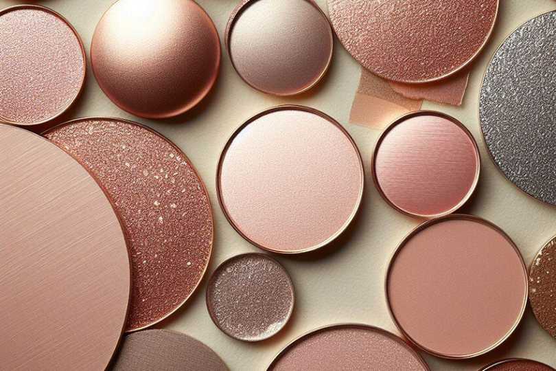
Rose Gold Color – Exploring a Rose Gold Color Palette
The popularity of some colors can fluctuate from one year to the next. The rose gold color has seen popularity in the past and is now on trend again and can be seen in jewelry, interiors, shoes, and other accessories. To understand why this color is so popular, we will be delving into what color makes rose gold and looking at colors that go with rose gold amongst other interesting information.Table of ContentsToggleWhat Color Is Rose Gold?Rose Gold: A Brief HistoryMeaning of the Rose Gold ColorShades of Rose GoldRose DustPuceParrot PinkWhat Colors Go With Rose Gold?Rose Gold Complementary ColorsAnalogous Colors for Rose GoldMonochromatic Colors for Rose GoldOther Color Combinations for Rose GoldTriadic Color CombinationsTetradic Color CombinationsCreating a Rose Gold Color With PaintsRose Gold Color Palette for the HomeFrequently Asked QuestionsWhat Color Makes Rose Gold?What Colors Go With Rose Gold?Is the Rose Gold Color Similar to Copper?What Color Is Rose Gold? Is rose gold a color? The rose gold color can be described as a darker and softer form of pink, that can have a golden metallic undertone. Rose gold was first a form of metal, which was created by the combination of gold and copper alloy. The copper is what adds that pinkish tinge to the gold, and the more copper that is added, the stronger or deeper the rose gold color becomes. True rose gold metal contains 75 percent gold, just over 22 percent copper, and a small amount of silver. The rose gold metal is now used to describe anything with a similar hue.Rose Gold ShadeRose Gold Hex CodeCMYK Rose Gold Color Code (%)RGB Rose Gold Color CodeRose Gold ColorRose Gold#b76e790, 40, 34, 28183, 110, 121 Rose Gold: A Brief History The rose gold metal has been popular for many years, and is used to make a variety of items, especially jewelry. As far back as the 1800s, the metal was admired in Russia, which is why it came to be known as “Russian gold”. One of the more famous pieces made with rose gold was a Faberge egg, which was commissioned by the Tzar, Nicholas II. He had the egg created for his wife, Empress Alexandra, as a gift for Easter in the early 20th century.Another well-known example of a piece of rose gold jewelry is Cartier’s Trinity ring, which symbolizes love, friendship, and fidelity. The ring was worn by the famous French writer, Jean Cocteau. This is believed to be what made rose gold more popular, and it has grown ever since.Rose gold is a popular jewelry choice, but it has also become popular with other more modern accessories. Apple developed a new iPhone in 2015 and chose the rose gold color as its theme. The rose gold color has also become more popular in both fashion as well as interior design. Today, rose gold has a broad application from clothes to cars and kitchen appliances. Meaning of the Rose Gold Color Since rose gold metal is associated with jewelry, it does impart a sense of luxury and wealth. The soft pinkish color is also seen as being refined, elegant, feminine, and romantic. Although, rose gold has been mentioned as being a gender-neutral color as well. The color is said to be able to create a sense of calm and can help to ease any feelings of anger.Shades of Rose Gold When keeping with the metal, you can have different shades of rose gold, some have more pink, while others are more gold in color. However, when it comes to the color you see on your computer screen, you might not have that metallic shine to it, but there are still a few shades of rose gold you can use. These shades of gold can be recognized by what is known as a hex code.Rose Dust This particular color can be described as a desaturated dark pink. The rose dust color should not be mistaken for thedusty rose color, which is more of a grayish-red color. Rose dust is a much darker andmuted color.Rose Gold ShadeRose Gold Hex CodeCMYK Rose Gold Color Code (%)RGB Rose Gold Color CodeRose Gold ColorRose Dust#a167780, 36, 25, 37161, 103, 120 Puce Puce is more of a desaturated red color, or it can also be described as being a pale, earthypink color. The name is derived from the French word for flea, and you can try combining purple with brown, and a little white. The first time that the word puce was used in reference to the color, was in 1778. Colors that go well with puce include shades of yellow, green, and orange.Rose Gold ShadeRose Gold Hex CodeCMYK Rose Gold Color Code (%)RGB Rose Gold Color CodeRose Gold ColorPuce#c7898e0, 31, 29, 22199, 137, 142 Parrot Pink The parrot pink can also be described as being a desaturated red, which makes it a part of the red family. You can create the color by simply blending some red and white to make pink, and then adjusting the color by adding a little redder until you reach the desired color. The color can also be described as being a lighter shade of pinkish-red.Rose Gold ShadeRose Gold Hex CodeCMYK Rose Gold Color Code (%)RGB Rose Gold Color CodeRose Gold ColorParrot Pink#d49fa30, 25, 23, 17212, 159, 163 What Colors Go With Rose Gold? A rose gold color palette can add sophistication and a bit of liveliness to any design. The color can be a background color, which creates a soft and romantic look, or an accent color that stands out and adds just a touch of elegance. So, what colors go with rose gold? This is where thecolor wheelcan help out.Neutral colorslike gray, white, and cream work great with rose gold. You also have various color combinations that can help you create the perfect rose gold color palette.Rose Gold Complementary Colors Thiscolor combinationis quite popular and uses colors that are facing one another on the color wheel. As you can see below in the table, a green-blue or shade of cyan complements the rose gold color. Ababy blue coloras well as teal would also work quite nicely with rose gold. Complementary colors tend to help each other stand out.ShadeHex CodeCMYK Color Code (%)RGB Color CodeColorRose Gold#b76e790, 40, 34, 28183, 110, 121 Cyan#6eb7ac40, 0, 6, 28110, 183, 172 Baby Blue#89cff043, 14, 0, 6137, 207, 240 Teal#008080100, 0, 0, 500, 128, 128 Analogous Colors for Rose Gold Theanalogous colorsare easier to look at, unlike the complementary colors. These colors do not contrast, are more uniform in appearance, and appear on the same side of the color wheel. So, in the case of rose gold, shades of orange and red will always work well with each other.ShadeHex CodeCMYK Color Code (%)RGB Color CodeColorRose Gold#b76e790, 40, 34, 28183, 110, 121 Pink#b76e9e0, 40, 14, 28183, 110, 158 Orange#b7886e0, 26, 40, 28183, 136, 110 Monochromatic Colors for Rose Gold Similar to analogous colors, these colors that go with rose gold are easy on the eyes and are derived from a single color, but with a variety of tones. So, the colors in this combination are lighter and darker shades of rose gold. This color scheme creates a harmonious effect that works well.ShadeHex CodeCMYK Color Code (%)RGB Color CodeColorRose Gold#b76e790, 40, 34, 28183, 110, 121 Lilac#c8a2c80, 19, 0, 22200, 162, 200 Dark Red#9148530, 50, 43, 43145, 72, 83 Other Color Combinations for Rose Gold When you start getting more than three colors in a color scheme, it can get a bit more difficult to create a design that is appealing or not overwhelming. When creating a design, it is then best to choose your base or main color and then choose accent colors that only use sparingly. The below color combination includes three and four-color combinations.Triadic Color CombinationsTriadic colorscomprise three colors, which can be located on the color wheel. The three colors are positioned in an equal-sided triangle form on the wheel. These colors also form a contrast and help each other to stand out.ShadeHex CodeCMYK Color Code (%)RGB Color CodeColorRose Gold#b76e790, 40, 34, 28183, 110, 121 Blue#6e79b740, 34, 0, 28110, 121, 183 Lime Green#79b76e34, 0, 40, 28121, 183, 110 Tetradic Color Combinations This color combination takes it up a step with four colors. These colors are also contrasting, so they need to be used carefully together in designs. The colors form a rectangular outline on the color wheel. You can also get colors spaced evenly around the color wheel in a square shape.ShadeHex CodeCMYK Color Code (%)RGB Color CodeColorRose Gold#b76e790, 40, 34, 28183, 110, 121 Magenta#ac6eb76, 40, 0, 28172, 110, 183 Lime Green#79b76e34, 0, 40, 28121, 183, 110 Cyan#6eb7ac40, 0, 6, 28110, 183, 172 Creating a Rose Gold Color With Paints Rose gold is originally from metal, so a more realistic rose gold paint color should also contain that metallic effect. You can try mixing red and white to create pink and then add in a little gold and silver to achieve a shade of rose gold. You can experiment with all the paint color ratios and create a color palette to keep records of your paint colors.If you do not have gold or silver, you can create a gray color with black and white, then add a little yellow to get a gold-type effect. You can leave it at mixing black and white to achieve a color as close to silver. To achieve the shine, you can try using silver or gold metallic paint and not matte paint. Rose Gold Color Palette for the Home Rose gold has become quite a popular color in fashion and all kinds of design projects including interior design. Less feminine than pink and not as showy as gold rose gold is a nice alternative to both these colors. Some even consider the color to be neutral, as it works well with most colors.Rose gold is a choice for those looking to produce a more refined and luxurious look, but with an added romantic feel that is warm and inviting. You can incorporate the color in your home in a variety of ways from walls to tiles, appliances, wallpaper, tiles, and other accessories like throws and scatter cushions. Rose gold adds a glamorous feel without it being too showy.Pair rose gold with metals. The rose gold color is derived from metal, so pairing it with other metallic hues can work. Just remember, you also get warm and cool color metals. Brass and copper metals are warm like rose gold.Pair rose gold with cooler shades of color. For example, if you pair rose gold against a cooler gray, it can help keep the pinkish side of the color in check.Use pink gold as an accent color. Accents of rose gold can bring in a pop of color against a darker color scheme.Combining rose gold with wood. Rose gold matches up nicely with wood tones and creates a beautifully balanced look.Rose gold can be a beautiful and elegant color choice for all kinds of designs. If you are looking for something a little different, that has a certain radiance, then the rose gold color may be what you are searching for.Frequently Asked QuestionsWhat Color Makes Rose Gold? What color is rose gold? The color can be defined as a darker shade of pink that has a metallic undertone. The color was derived from the metal rose gold, which contains gold, copper, and a little silver. What Colors Go With Rose Gold? Rose gold goes well with a variety of colors, and you can generate many color combinations. Rose gold complementary colors like various blue and green shades, go with rose gold. Other colors like different shades of pink, red, and orange also go with rose gold. Neutral colors like white, gray, black, and cream are also good choices. Is the Rose Gold Color Similar to Copper? These two colors are quite close, and many can get confused by the two. However, rose gold has a distinctive pink undertone, while copper has more of an orange-brown undertone.

Slate Blue Color Palette – Various Shades of Slate Blue
Blue is a color that most people love or at least like, and the slate blue color should be on your list to consider for your next design project. As a classic paint color, it can look amazing as a color scheme choice for the home.Table of ContentsToggleWhat Is Slate Blue?Slate Blue: A Brief HistoryMeaning of Slate BlueShades of Slate BlueWhat Colors Go With Slate Blue?Complementary Colors for Slate BlueAnalogous Colors for Slate BlueTriadic Colors for Slate BlueFour or More Color Combinations How to Mix Slate Blue PaintInterior Designing With Slate BlueSlate Blue in the Living RoomSlate Blue KitchensSlate Blue BedroomsSlate Blue BathroomsSlate Blue Office SpacesSlate Blue ExteriorsBlue-Gray Paint ColorsConclusionFrequently Asked QuestionsWhat Is Slate Blue?What Colors Go With Slate Blue?Is Slate Blue a Cool Color?What Is Slate Blue? The slate blue color can generally be described as gray-blue. What colors make slate blue? You can say the slate blue color is a combination of a muted blue and light gray, or it can be considered a lighter shade of periwinkle. Some would also define it as being a shade of gray, with blue undertones, which makes it a cool color to work with, while others might see it as a blue-gray. Below, you will see the web version of slate blue in the number one slot, while the second slate gray is closer to what the color looks like slate stone.Slate Blue ShadeHex CodeCMYK Color Code (%)RGB Color CodeSlate Blue ColorSlate Blue #1#6a5acd48, 56, 0, 20106, 90, 205 Slate Blue #2#5b7c9941, 19, 0, 4091, 124, 153 Periwinkle#ccccff20, 20, 0, 0204, 204, 255 Slate Blue: A Brief History The word “slate” comes from the stone or rock that is often used in construction and comes in a variety of colors. Another name for the color is “livid”. If you are livid, this means you are furious. The word comes from Latin and means “bluish-gray”. This is the perfect definition for the color, for example, a livid bruise.Slate blue has some deep connections with a place known as Slate Valley in the United States. The area is located near the borders of Vermont and New York and contains a high mineral composition, which provides a variety of slate colors from blue to red, green, and more.Slate was popular as roofing shingles during the 1800s. However, during this time, excess to slate roofing was more localized, and it only became more popular nationally in the mid-19th century. During this time, the most popular style was the Gothic Revival houses, which often displayed darker slate or a combination of darker and lighter slate tiles. Today, manufacturers have created a polymer slate, that looks exactly like stone slate, but it is more durable and less expensive. Besides the slate tiles, today you can also get a variety of slate paint shades that can be used for both exterior and interior designs. Meaning of Slate Blue Slate blue is a tranquil color that is calming, but too much of it and it can become a bit moody. Blue is also associated with stability, loyalty, intelligence, imagination, freedom, and inspiration, and reminds you of open spaces and the ocean. Thegray coloradds balance and is also calming and soothing. However, it can become dull. Shades of Slate Blue Slate blue can come in a variety of shades, tints, and tones. The shades of slate blue can range from darker versions to light blue-gray. When working with a single color, but a variety of shades, and you use these in a design, this is often referred to as a monochromatic color combination.ShadeHex CodeCMYK Color Code (%)RGB Color CodeColorSlate Blue#5b7c9941, 19, 0, 4091, 124, 153 Dark Slate Blue#3e546840, 19, 0, 5962, 84, 104 Grayish Blue#96acc022, 10, 0, 25150, 172, 192 Light Grayish Blue#e0e6ec5, 3, 0, 7224, 230, 236 What Colors Go With Slate Blue? Blue and gray as separate colors are both flexible to work with and can go with many different hues. So, the combination of the slate blue color does the same, and pairs well withneutral colorslike white, classic gray, and cream, amongst others.ShadeHex CodeCMYK Color Code (%)RGB Color CodeColorSlate Blue#5b7c9941, 19, 0, 4091, 124, 153 Classic Gray#9594940, 1, 1, 42149, 148, 148 Barley Harvest#c299720, 21, 41, 24194, 153, 114 Rose Blush#fb92920, 42, 42, 2251, 146, 146 Cream#fffdd00, 1, 18, 0255, 253, 208 We have already mentioned the monochromatic color combination, but other combinations also work well. When reading up on color theory and taking a look at acolor wheel, you can determine what colors go with slate blue. To make it easier, many online tools and programs provide this information for you. However, below are some examples of color combinations for the slate blue color.Complementary Colors for Slate Blue Lying on opposite sides when looking at the color wheel, complementary colors are what you are looking for if you want great contrast. When paired, these colors stand out and grab attention. The complementary color for blue is orange, so for this particular slate blue, you have a dark, washed-out orange.ShadeHex CodeCMYK Color Code (%)RGB Color CodeColorMuted Slate Blue#5b7c9941, 19, 0, 4091, 124, 153 Desaturated Brown#99785b0, 22, 41, 40153, 120, 91 Analogous Colors for Slate Blue If you are looking for a more harmonious pairing, then an analogous color combination is something to consider. These colors are all neighbors on the color wheel. When looking at these colors side-by-side, there is no jarring contrast, and they are pleasant to look at.ShadeHex CodeCMYK Color Code (%)RGB Color CodeColorMuted Slate Blue#5b7c9941, 19, 0, 4091, 124, 153 Desaturated Dark Cyan#5b999741, 0, 1, 4091, 153, 151 Desaturated Dark Blue#5b5d9941, 39, 0, 4091, 93, 153 Triadic Colors for Slate Blue This color combination includes three colors that on the color wheel, form an equal-sided triangle. These colors are similar to the complementary color combination in that they form a contrast. Using these colors can help to create a vibrant and uplifting design that is still pleasing to look at. When applying this color combination, make sure to choose the main color, and use the others as accents or more sparingly. This will create a better-balanced look, instead of overwhelming the viewer.ShadeHex CodeCMYK Color Code (%)RGB Color CodeColorMuted Slate Blue#5b7c9941, 19, 0, 4091, 124, 153 Desaturated Dark Green#7c995b19, 0, 41, 40124, 153, 91 Desaturated Dark Pink#995b7c0, 41, 19, 40153, 91, 124 Four or More Color Combinations Working with four or more colors is a little more challenging, but the principle of choosing the main color and using the others as accents stays the same. These colors can be seen as an equal-sided square or as a rectangle or tetradic color combination. This last-mentioned color combination can be seen below in the table provided.ShadeHex CodeCMYK Color Code (%)RGB Color CodeColorMuted Slate Blue#5b7c9941, 19, 0, 4091, 124, 153 Desaturated Dark Green#5b997841, 0, 22, 4091, 153, 120 Desaturated Dark Pink#995b7c0, 41, 19, 40153, 91, 124 Desaturated Brown#99785b0, 22, 41, 40153, 120, 91 How to Mix Slate Blue Paint As we have established, slate blue is a gray-blue, so when mixing the color, you can experiment with various shades of blue. Create a slate blue color chart, where you can test out the color samples. The slate blue color chart can also be helpful for future projects.Try to go for a pale blue, for example, Columbia blue as your base to begin with. Add a small amount onto your mixing surface. You can then add in tiny amounts of gray paint, you might need to experiment with proportions to get the particular hue you are looking for.You might need to add more of the blue paint, or you can add a little white to lighten and brighten it. If you wish to darken the color more, try adding navy blue, as black paint can be a bit too much. Paint can sometimes darken when it dries, so before you decide on a blend, allow it to dry properly first.Blue ShadeHex CodeCMYK Color Code (%)RGB Color CodeColorColumbia Blue#9bddff39, 13, 0, 0155, 221, 255 A completely different variant to mix slate blue is the following:To create the web version of slate blue, proceed as follows:Interior Designing With Slate Blue Slate blue color palettes are relatively easy to work with when applying them to interior designs. You can use slate blue on the walls or as an accent color, it can work both ways, depending on what you wish to achieve. There are also many different shades of slate, so you do not have to stick to a single hue. You can use the cooler slate blue color together with richer and warmer hues, which can help to provide more of a vibrant atmosphere. Slate Blue in the Living Room Blue is one of the top well-liked colors, and it can be used in any room of the house. A living area is a great place for the slate blue color, as it produces a calming and welcoming atmosphere. The color is also cool and relaxing, perfect for coming home after a hard day’s work. You can choose a specific shade of slate blue to work with, something darker or maybe something more subtle. Combining slate blue with white and other neutral colors is a classic choice, and you can add pops of green ororange colorfor added effect. You can paint all the walls, or simply choose an accent wall for a darker shade of slate blue. You can also bring the slate blue color in as an accent color, for example, slate blue sofas, chairs, rugs, and curtains. The color also goes wonderfully with natural wood elements. Slate Blue Kitchens Create a statement with slate blue in the kitchen, by adding it as an accent color and focal point with things like a kitchen island, slate blue cabinets, and backsplashes. Choose a lighter shade of slate blue on the walls to brighten up the kitchen area. Darker slate blue colors can be paired with white to create a calming and clean feel to the space. To add a little bit of luxury appeal, consider adding brass accents with the slate blue color palette in the kitchen.Slate Blue Bedrooms Slate blue is a relaxing and comforting color, which makes it an ideal color for the bedroom. This is a perfect color for any bedroom or nursery. You can play around with lighter shades of slate blue, or if you want a more luxurious look, you can opt for a darker aesthetic. Slate Blue Bathrooms The bathroom is another space where the slate blue can create a relaxing and tranquil space. Combining slate blue with white or even black can create a more elegant appearance. You can also create a slate blue color palette that leans towards a feminine or masculine feel, which can depend on the décor you use.Slate Blue Office Spaces Slate blue is cool and calming, but it also helps to promote intelligence and inspiration. This makes it an ideal color for an office space or workstation. You can also add pops of color such as orange or red, or keep it balanced by using a neutral color scheme. Slate Blue Exteriors Slate blue is also a popular color for exteriors and can look good on modern-style homes as well as more traditional-style homes. If you do not want to go for a whole slate blue look on the exterior, you can opt for the front. A slate blue door can act as a focal point and it is a welcoming color, so is ideal for this purpose. Blue-Gray Paint Colors Different lighting in a room can affect the paint colors you choose. So, we recommend you test out various paint colors before you commit to purchasing and painting. You can first see what the paint colors do in different lighting, helping you make the best choice. There are two well-known paint manufacturers that most people have heard of Sherwin Williams and Benjamin Moore. Below are a few web color approximation examples of their blue-gray paint colors, which many designers will recommend.ShadeHex CodeCMYK Color Code (%)RGB Color CodeColorSherwin Williams Storm Cloud#7b868f14, 6, 0, 44123, 134, 143 Sherwin Williams Icy#bbc7d211, 5, 0, 18187, 199, 210 Benjamin Moore’s Philipsburg Blue#627a8325, 7, 0, 4998, 122, 131 Benjamin Moore’s Vermont Slate#4b646e32, 9, 0, 5775, 100, 110 Conclusion All the shades of slate blue you can get are great choices for interior design. The slate color is easy to pair with most other hues and will provide you with a peaceful and relaxing environment. Not only is it easy to work with, but the color can also be used in any room of the house, and even outside. A definite color choice for your next design project.Frequently Asked QuestionsWhat Is Slate Blue? Slate blue can be described as being a desaturated dark blue, a blue-gray color, or a grayish blue. What colors make slate blue? The actual slate stone is more of a dark shade of gray with a blue undertone, while many of the web color versions are blue with grayish undertones. What Colors Go With Slate Blue? Slate blue can work with most colors. However, some of the best colors include neutral colors like white as well as, gray, cream, and even black. To add a bit of color, slate blue also goes with orange, red, and green. Is Slate Blue a Cool Color? Yes, slate blue falls under the category of cool colors along with green and purple, and has a muted or desaturated appearance. You might want to add some warmer and more exciting colors to your slate blue color palette.
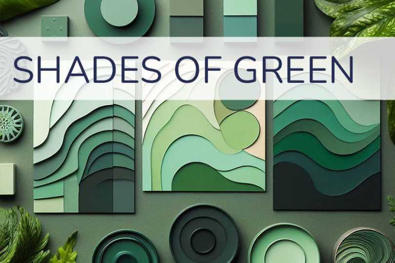
Shades of Green Color – The 100 Must-See Tones
Because chlorophyll is green and supplies plants with their pigments, green is one of the most prevalent colors in the natural world. In fact, green is the color that most suitably symbolizes the natural world in art. Green, in all its many shades, sees extensive use in artworks of all kinds. We’ve created a curated list with 100 green shades, including visualization, description, and all color codes for you.Table of ContentsToggleMost Popular Shades of GreenAcid GreenAmazonAndroid GreenApple GreenArmy GreenArtichoke GreenAvocadoBitter LemonBlue Green Color WheelBottle GreenBright GreenBritish Racing GreenBrunswick GreenBud GreenCadmium GreenCaribbean GreenCastleton GreenCeladonCharleston GreenDark GreenDark Jungle GreenDark Moss GreenDark Olive GreenDark Pastel GreenDark Sea GreenDark Spring GreenDartmouth GreenDeep Jungle GreenElectric GreenEmerald GreenEton GreenFern GreenForest GreenFrench LimeGo GreenGranny Smith AppleGreen MunsellGreen CyanGreen LizardGreen SheenHarlequinHunter GreenIndia GreenJade GreenJungle GreenKelly GreenKombu GreenLaurel GreenLawn GreenLight GreenLight Sea GreenLincoln GreenMalachiteMantisMaximum GreenMaximum Green YellowMay GreenMedium AquamarineMedium Sea GreenMedium Spring GreenMichigan State University GreenMiddle Blue GreenMiddle GreenMidnight GreenMint GreenMoss GreenMyrtle GreenNeon GreenOcean GreenOlive GreenPakistan GreenPaolo Veronese GreenParis GreenPersian GreenPhthalo GreenPine GreenPistachioRussian GreenSacramento State GreenSage GreenSap GreenScreamin GreenSea GreenSea Green CrayolaShamrock GreenSheen GreenSlimy GreenSpanish GreenSpring GreenTea GreenTropical RainforestTurquoise GreenViridian GreenVoltWintergreen DreamYellow GreenYellow Green Color WheelZompThe Shades of Green Color in Interior DecorationOur Complicated History With the Color GreenGreen in Modern TimesFrequently Asked QuestionsWhy Is Scheele Green Dangerous?What Is the Most Popular Shade of Green?Most Popular Shades of Green If you’re searching for a particular shade of green that’s on the tip of your tongue, or if you need to pair colors perfectly for your design project or website, you’ll discover a vast array of choices available – many of which might be new to you. Below is a selection of green hues, complete with their names and corresponding Hex, RGB, and CMYK color codes.Acid Green A vibrant, fluorescent green, reminiscent of acidic substances. It’s electric and eye-catching, often used in fashion for a bold statement.Hex: #B0BF1ARGB: 176, 191, 26CMYK: 8, 0, 86, 25Amazon A deep, jungle green, echoing the lushness of the Amazon rainforest. It’s rich and earthy, suitable for natural-themed designs.Hex: #3B7A57RGB: 59, 122, 87CMYK: 52, 0, 29, 52Android Green The brand color of the Android operating system, this is a medium shade of green, signifying innovation and technology.Hex: #A4C639RGB: 164, 198, 57CMYK: 17, 0, 71, 22Apple Green A light, bright green with a youthful and fresh appeal. It’s reminiscent of the skin of Granny Smith apples.Hex: #8DB600RGB: 141, 182, 0CMYK: 23, 0, 100, 29Army Green A dark olive green, commonly associated with military uniforms. It evokes strength and reliability.Hex: #4B5320RGB: 75, 83, 32CMYK: 10, 0, 61, 67Artichoke Green A muted, grayish-green, similar to the color of an artichoke. It’s sophisticated and subdued.Hex: #8F9779RGB: 143, 151, 121CMYK: 5, 0, 20, 41Avocado A creamy, pale green, resembling the inside of an avocado. It’s natural and calming.Hex: #568203RGB: 86, 130, 3CMYK: 34, 0, 98, 49Bitter Lemon A sharp, vivid yellow-green, similar to the rind of a bitter lemon. It’s zesty and energetic.Hex: #CAE00DRGB: 202, 224, 13CMYK: 10, 0, 94, 12Blue Green Color Wheel A green with a significant blue undertone. It’s a cool and serene shade, often found in color wheel representations.Hex: #064E40RGB: 6, 78, 64CMYK: 92, 0, 18, 69Bottle Green A dark shade of green, similar to traditional green glass bottles. It’s classic and elegant.Hex: #006A4ERGB: 0, 106, 78CMYK: 100, 0, 26, 58Bright Green A high-saturation, vivid green. It’s lively and attention-grabbing, often used in design to signify energy.Hex: #66FF00RGB: 102, 255, 0CMYK: 60, 0, 100, 0British Racing Green A deep, rich green traditionally used in the livery of British racing cars. It’s associated with heritage and prestige.Hex: #004225RGB: 0, 66, 37CMYK: 100, 0, 44, 74Brunswick Green A dark, muted green with a touch of gray. It’s a traditional color, often seen in historical contexts.Hex: #1B4D3ERGB: 27, 77, 62CMYK: 65, 0, 19, 70Bud Green A soft, spring-like green, reminiscent of new plant buds. It’s fresh and invigorating.Hex: #7BB661RGB: 123, 182, 97CMYK: 32, 0, 47, 29Cadmium Green A blend of blue and yellow, producing a deep, intense green. It’s often used in painting for its rich pigment.Hex: #006B3CRGB: 0, 107, 60CMYK: 100, 0, 44, 58Caribbean Green A bright, tropical green, evocative of Caribbean waters. It’s playful and vibrant.Hex: #00CC99RGB: 0, 204, 153CMYK: 100, 0, 25, 20Castleton Green Named after Castleton University, this is a deep, sophisticated green, embodying tradition and academia.Hex: #00563FRGB: 0, 86, 63CMYK: 100, 0, 27, 66Celadon A pale, grayish green, inspired by Chinese ceramics. It’s elegant and subtle.Hex: #ACE1AFRGB: 172, 225, 175CMYK: 24, 0, 22, 12Charleston Green Almost black, Charleston Green is a very dark green, originating from the American South. It’s somber and mysterious.Hex: #232B2BRGB: 35, 43, 43CMYK: 19, 0, 0, 83Dark Green A classic, deep green, evoking the depths of a forest. It’s strong and grounding.Hex: #013220RGB: 1, 50, 32CMYK: 98, 0, 36, 80Dark Jungle Green A very dark, almost black-green, resembling the dense foliage of a jungle at night. It’s mysterious and deep.Hex: #1A2421RGB: 26, 36, 33CMYK: 28, 0, 8, 86Dark Moss Green A rich, earthy green, similar to the color of damp moss. It’s natural and calming.Hex: #4A5D23RGB: 74, 93, 35CMYK: 20, 0, 62, 64Dark Olive Green A dark, muted green with a significant olive tone. It’s sophisticated and earthy.Hex: #556B2FRGB: 85, 107, 47CMYK: 21, 0, 56, 58Dark Pastel Green A muted, soft green with a pastel tone. It’s gentle and soothing.Hex: #03C03CRGB: 3, 192, 60CMYK: 98, 0, 69, 25Dark Sea Green A medium to dark green with gray undertones, reminiscent of a stormy sea. It’s moody and intense.Hex: #8FBC8FRGB: 143, 188, 143CMYK: 24, 0, 24, 26Dark Spring Green A fresh, vibrant green that symbolizes the new growth of spring. It’s rejuvenating and lively, often used in designs that emphasize renewal and vitality.Hex: #177245RGB: 23, 114, 69CMYK: 80, 0, 39, 55Dartmouth Green Official color of Dartmouth College, this is a medium-dark green, representing tradition and prestige.Hex: #00703CRGB: 0, 112, 60CMYK: 100, 0, 46, 56Deep Jungle Green A very dark, rich green, evoking the depth and mystery of the jungle. It’s immersive and intense.Hex: #004B49RGB: 0, 75, 73CMYK: 100, 0, 3, 71Electric Green A bright, neon green, highly saturated and vivid. It’s energizing and futuristic.Hex: #00FF00RGB: 0, 255, 0CMYK: 100, 0, 100, 0Emerald Green A bright, vivid green, named after the precious gemstone. It’s luxurious and radiant.Hex: #50C878RGB: 80, 200, 120CMYK: 60, 0, 40, 22Eton Green Associated with Eton College, this is a deep, sophisticated green, representing heritage and education.Hex: #96C8A2RGB: 150, 200, 162CMYK: 25, 0, 19, 22Fern Green A medium green resembling fern leaves. It’s natural and refreshing.Hex: #4F7942RGB: 79, 121, 66CMYK: 35, 0, 45, 53Forest Green A dark, dense green, reminiscent of the deep, shaded areas of a forest. It’s grounding and tranquil.Hex: #014421RGB: 1, 68, 33CMYK: 99, 0, 51, 73French Lime A bright, acidic green with a yellowish tone. It’s lively and effervescent.Hex: #9EFD38RGB: 158, 253, 56CMYK: 38, 0, 78, 1Go Green A vivid, energetic green, often associated with environmental movements. It’s motivating and positive.Hex: #00AB66RGB: 0, 171, 102CMYK: 100, 0, 40, 33Granny Smith Apple A light, vibrant green, similar to the skin of the Granny Smith apple. It’s fresh and crisp.Hex: #A8E4A0RGB: 168, 228, 160CMYK: 26, 0, 30, 11Green Munsell Based on the Munsell color system, this is a balanced, medium green. It’s standardized and consistent.Hex: #00A877RGB: 0, 168, 119CMYK: 100, 0, 29, 34Green Cyan A green with a strong blue undertone, giving it a cool, aquatic feel. It’s refreshing and modern.Hex: #009966RGB: 0, 153, 102CMYK: 100, 0, 33, 40Green Lizard A bright, vivid green with a slightly yellowish tone. It’s playful and dynamic.Hex: #A7F432RGB: 167, 244, 50CMYK: 32, 0, 80, 4Green Sheen A pale, yellow-green, with a shimmery, lustrous quality. It’s delicate and light.Hex: #6EAEA1RGB: 110, 174, 161CMYK: 37, 0, 7, 32Harlequin A bright, neon green, striking and highly visible. It’s theatrical and bold.Hex: #3FFF00RGB: 63, 255, 0CMYK: 75, 0, 100, 0Hunter Green A dark, muted green, commonly used in hunting attire. It’s traditional and natural.Hex: #355E3BRGB: 53, 94, 59CMYK: 44, 0, 37, 63India Green A deep, rich green, featured in the lower band of the Indian national flag. It symbolizes fertility and prosperity.Hex: #138808RGB: 19, 136, 8CMYK: 86, 0, 94, 47Jade Green A medium, slightly bluish green, reminiscent of jade gemstones. It’s serene and sophisticated.Hex: #00A86BRGB: 0, 168, 107CMYK: 100, 0, 36, 34Jungle Green A deep, tropical green, evoking the lushness of a rainforest. It’s vibrant and immersive.Hex: #29AB87RGB: 41, 171, 135CMYK: 76, 0, 21, 33Kelly Green A bright, pure green, named after the common Irish family name. It’s lively and festive.Hex: #4CBB17RGB: 76, 187, 23CMYK: 59, 0, 88, 27Kombu Green A dark, seaweed green, named after the Japanese kelp. It’s deep and organic.Hex: #354230RGB: 53, 66, 48CMYK: 20, 0, 27, 74Laurel Green A pale, muted green, like the leaves of the laurel plant. It’s soft and understated.Hex: #A9BA9DRGB: 169, 186, 157CMYK: 9, 0, 16, 27Lawn Green A bright, fresh green, similar to well-maintained grass. It’s lively and natural.Hex: #7CFC00RGB: 124, 252, 0CMYK: 51, 0, 100, 1Light Green A soft, pale green, easy on the eyes and calming. It’s gentle and soothing.Hex: #90EE90RGB: 144, 238, 144CMYK: 39, 0, 39, 7Light Sea Green A medium green with a significant blue component, reminiscent of shallow seas. It’s refreshing and tranquil.Hex: #20B2AARGB: 32, 178, 170CMYK: 82, 0, 4, 30Lincoln Green Historically worn by Robin Hood, this is a rich, medium green. It’s associated with folklore and adventure.Hex: #195905RGB: 25, 89, 5CMYK: 72, 0, 94, 65Malachite A vibrant, striated green, similar to the malachite gemstone. It’s luxurious and dynamic.Hex: #0BDA51RGB: 11, 218, 81CMYK: 95, 0, 63, 15Mantis A light to medium green, resembling the color of a praying mantis. It’s natural and subtle.Hex: #74C365RGB: 116, 195, 101CMYK: 41, 0, 48, 24Maximum Green A deep, saturated green, representing the maximum intensity of the color in the spectrum. It’s bold and vivid.Hex: #5E8C31RGB: 94, 140, 49CMYK: 33, 0, 65, 45Maximum Green Yellow A bright green with a strong yellow undertone, highly saturated and vibrant. It’s energetic and cheerful.Hex: #D9E650RGB: 217, 230, 80CMYK: 6, 0, 65, 10May Green A fresh, spring green, reminiscent of new leaves in May. It’s rejuvenating and bright.Hex: #4C9141RGB: 76, 145, 65CMYK: 48, 0, 55, 43Medium Aquamarine A medium green with a significant blue component, like the aquamarine gemstone. It’s serene and refreshing.Hex: #66DDAARGB: 102, 221, 170CMYK: 54, 0, 23, 13Medium Sea Green A medium-dark green with grayish tones, evoking the color of the sea. It’s tranquil and balanced.Hex: #3CB371RGB: 60, 179, 113CMYK: 66, 0, 37, 30Medium Spring Green A vibrant, medium green with a slight blue undertone. It’s refreshing and lively.Hex: #00FA9ARGB: 0, 250, 154CMYK: 100, 0, 38, 2Michigan State University Green The official green of MSU, this is a deep, rich green, embodying school spirit and tradition.Hex: #18453BRGB: 24, 69, 59CMYK: 65, 0, 14, 73Middle Blue Green A balanced green with a noticeable blue component, creating a cool and soothing effect. It’s harmonious and serene.Hex: #8DD9CCRGB: 141, 217, 204CMYK: 35, 0, 6, 15Middle Green A standard, medium green, neither too dark nor too light. It’s balanced and natural.Hex: #4D8C57RGB: 77, 140, 87CMYK: 45, 0, 38, 45Midnight Green A very dark, almost black green, reminiscent of the night sky. It’s mysterious and deep.Hex: #004953RGB: 0, 73, 83CMYK: 100, 12, 0, 67Mint Green A pale, refreshing green, like mint leaves. It’s light and invigorating.Hex: #98FB98RGB: 152, 251, 152CMYK: 39, 0, 39, 2Moss Green A medium, earthy green, similar to the color of moss. It’s natural and grounding.Hex: #8A9A5BRGB: 138, 154, 91CMYK: 51, 0, 100, 1Myrtle Green A dark, bluish-green, named after the myrtle plant. It’s rich and sophisticated.Hex: #317873RGB: 49, 120, 115CMYK: 59, 0, 4, 53Neon Green A highly saturated, bright green, similar to neon lights. It’s electric and attention-grabbing.Hex: #39FF14RGB: 57, 255, 20CMYK: 78, 0, 92, 0Ocean Green A deep, blue-green, reminiscent of the ocean’s depths. It’s mysterious and calming.Hex: #48BF91RGB: 72, 191, 145CMYK: 62, 0, 24, 25Olive Green A muted, earthy green with a brownish tone, like olives. It’s natural and subdued.Hex: #708238RGB: 112, 130, 56CMYK: 14, 0, 57, 49Pakistan Green A dark, rich green, used in the national flag of Pakistan. It symbolizes Islam and prosperity.Hex: #006600RGB: 0, 102, 0CMYK: 100, 0, 100, 60Paolo Veronese Green Named after the Renaissance painter, this is a rich, deep green. It’s artistic and historical.Hex: #009B7DRGB: 0, 155, 125CMYK: 100, 0, 19, 39Paris Green A bright, slightly bluish green, historically used in paintings. It’s vibrant and classic.Hex: #50C878RGB: 80, 200, 120CMYK: 60, 0, 40, 22Persian Green A medium, bluish green, evoking the richness of Persian art and culture. It’s elegant and exotic.Hex: #00A693RGB: 0, 166, 147CMYK: 100, 0, 11, 35Phthalo Green A dark, intense blue-green, widely used in artists’ paints. It’s vibrant and deep.Hex: #123524RGB: 18, 53, 36CMYK: 66, 0, 32, 79Pine Green A deep, rich green, reminiscent of pine forests. It evokes a sense of tranquility and natural beauty, often used in designs to convey stability and endurance.Hex: #01796FRGB: 1, 121, 111CMYK: 99, 0, 8, 53Pistachio A light, soft green akin to the pale green of a pistachio nut’s shell. It’s fresh and airy, perfect for creating a soothing and calm ambiance.Hex: #93C572RGB: 147, 197, 114CMYK: 25, 0, 42, 23Russian Green A muted, grayish-green, reflective of the lush landscapes of Russia. It’s versatile and understated, suitable for elegant and timeless designs.Hex: #679267RGB: 103, 146, 103CMYK: 29, 0, 29, 43Sacramento State Green A vibrant, medium green that is both lively and earthy. It represents vitality and growth, commonly used in branding and sports uniforms.Hex: #043927RGB: 4, 57, 39CMYK: 93, 0, 32, 78Sage Green A gray-green resembling the herb, sage. This calming, neutral color is often associated with wisdom and sophistication.Hex: #BCB88ARGB: 188, 184, 138CMYK: 0, 2, 27, 26Sap Green A yellowish-green, similar to the color of plant sap. It’s a natural and lively color, often used in artwork to depict foliage and landscapes.Hex: #507D2ARGB: 80, 125, 42CMYK: 36, 0, 66, 51Screamin Green An intense, vivid green with a neon-like quality. It’s eye-catching and energetic, perfect for designs that aim to stand out.Hex: #66FF66RGB: 102, 255, 102CMYK: 60, 0, 60, 0Sea Green A medium to light green with a hint of blue, reminiscent of shallow seawater. It’s calming and refreshing, often used in spaces intended to relax.Hex: #2E8B57RGB: 46, 139, 87CMYK: 67, 0, 37, 45Sea Green Crayola A softer, more pastel version of sea green, with a playful and youthful vibe. It’s commonly found in children’s products and whimsical designs.Hex: #00FFCDRGB: 0, 255, 205CMYK: 100, 0, 20, 0Shamrock Green A bright, vibrant green associated with the lushness of shamrocks and Irish culture. It’s lively and invigorating, often used in festive designs.Hex: #009E60RGB: 0, 158, 96CMYK: 100, 0, 39, 38Sheen Green A unique green with a shiny, almost metallic quality. It’s modern and sleek, ideal for futuristic or high-tech themes.Hex: #8FD400RGB: 143, 212, 0CMYK: 33, 0, 100, 17Slimy Green A bold, somewhat lurid green, reminiscent of cartoon slime. It’s playful and unusual, often used in fun and quirky contexts.Hex: #299617RGB: 41, 150, 23CMYK: 73, 0, 85, 41Spanish Green A deep, rich green with a hint of blue, reflective of the lush landscapes of Spain. It’s elegant and sophisticated, perfect for luxurious designs.Hex: #009150RGB: 0, 145, 80CMYK: 100, 0, 45, 43Spring Green A fresh, vibrant green that symbolizes the new growth of spring. It’s rejuvenating and lively, often used in designs that emphasize renewal and vitality.Hex: #00FF7FRGB: 0, 255, 127CMYK: 100, 0, 50, 0Tea Green A pale, muted green similar to the color of green tea. It’s subtle and soothing, ideal for creating a calm and relaxing atmosphere.Hex: #D0F0C0RGB: 208, 240, 192CMYK: 13, 0, 20, 6Tropical Rainforest A deep, lush green that captures the essence of a rainforest’s verdant beauty. It’s rich and exotic, perfect for themes related to nature and adventure.Hex: #00755ERGB: 0, 117, 94CMYK: 100, 0, 20, 54Turquoise Green A blend of green and blue, resembling the colors of tropical seas. It’s vibrant and refreshing, often used in designs that evoke a sense of escape and tranquility.Hex: #A0D6B4RGB: 160, 214, 180CMYK: 25, 0, 16, 16Viridian Green A deep, bluish-green, named after the pigment. It’s a classic and versatile shade, often used in art and interior design.Hex: #009698RGB: 0, 150, 152CMYK: 100, 1, 0, 40Volt A bright, electric green with a high-energy, modern feel. It’s striking and bold, commonly used in sports and tech industries.Hex: #CEFF00RGB: 206, 255, 0CMYK: 19, 0, 100, 0Wintergreen Dream A cool, minty green that evokes the refreshing scent of wintergreen. It’s crisp and invigorating, perfect for designs that aim to be fresh and clean.Hex: #56887DRGB: 86, 136, 125CMYK: 37, 0, 8, 47Yellow Green A green with a significant amount of yellow, bright and lively. It’s cheerful and spring-like, often used in playful and youthful designs.Hex: #9ACD32RGB: 154, 205, 50CMYK: 25, 0, 76, 20Yellow Green Color Wheel A variation of yellow-green that is specifically calibrated for color wheel use. It’s balanced and harmonious, suitable for artistic and educational applications.Hex: #30B21ARGB: 48, 178, 26CMYK: 73, 0, 85, 30Zomp A unique blend of blue and green, striking and deep. It’s reminiscent of the ocean’s depths and is often used in designs that want to capture a sense of mystery and intrigue.Hex: #39A78ERGB: 57, 167, 142CMYK: 66, 0, 15, 35The Shades of Green Color in Interior Decoration If you will recall, the most common symbolic and psychological associations that we make with green colors have to do with nature, good well-being, Zen, and peace. These sorts of themes make green a great color for homeowners to use when decorating their households. Greens are not only great at bringing the outdoors into the home space, but they can also provide a space with a relaxing atmosphere. Whether being used as accenting along the frames of walls or as a feature, shades of green are a natural fit in any home. While green works for all sorts of rooms in the average household, it is most effective as a focal element in the living room where it can create an inviting atmosphere that is both calming and energizing. If you have bare white surfaces in your household, you can soften out the starkness using green as an accenting color. Green does not only work for surfaces, however, since it looks great on furniture and décor as well. Pot plants, for example, bring a charming element of green into the indoor space.Green is widely used as a color choice when putting together tranquil living spaces.Another fantastic attribute of greens is their versatility. Greens can be relaxing and calming while also still being stimulating. This multi-atmospheric quality of green colors makes them great choices when designing a space meant to be used for both work and relaxation. Since households are typically where relaxation and work tend to intersect for most people, the color green is a natural fit for decoration. For dining rooms and kitchen spaces, green is a natural fit given its close association with fresh produce. More so, studies have shown that the color green can stimulate hunger and appetite which makes it even more suitable for these areas. If you are using green in your kitchen or dining room, adding yellows and oranges can provide the rooms with more warmth. This all being said, it is not even entirely necessary for you to paint the walls or furniture of your house to introduce green into the palette. You can instead invest in some green décor, crockery, cutlery, or devices. Green boasts enough versatility for you to experiment with your use of the color inside your home. But if you are interested in learning more about how to pair your shades of green, below are a few popular examples.Our Complicated History With the Color Green The color green has a complex history, symbolizing both the vitality of nature and the threat of toxicity. This dual symbolism has roots in early human interactions with the natural world, where the dangers of venomous creatures like the eastern green mamba were learned through perilous experiences. In human history, the quest to produce green pigments has often led to the use of harmful chemicals, causing widespread illness. Ancient civilizations, lacking modern medical knowledge, pursued the creation of green paint despite the risks. This was partly due to the rarity of natural green pigments, as most were derived from minerals. The Ancient Egyptians, for instance, used malachite with a high copper content to create green, symbolizing rebirth and renewal, though the color tarnished over time. During the Roman Empire, a safer green pigment called Verdigris was developed by soaking copper plates in red wine, but this method was expensive and labor-intensive. In the Renaissance, green began to symbolize affluence and intelligence, but the pigments, derived from plants, were not durable. The 18th century saw a worsening of the situation with the creation of Scheele Green by Carl Wilhelm Scheele. This popular pigment contained toxic chemicals like acidic copper arsenite, leading to widespread health issues. It was used in various products, including wallpapers and toys, and is believed to have caused numerous deaths, including that of Napoleon Bonaparte due to arsenite exposure.Famous painters like Renoir and Monet also suffered from the toxic effects of green paints, with Monet’s loss of sight partly attributed to them. Despite its popularity, Scheele Green was unstable and corrosive. By the 19th century, it fell out of fashion, and safer methods of producing green shades were developed. Green in Modern Times In today’s world, most shades of green color remain a potent symbol of nature. Notably, the green color palette dominates in terms of the colors that are most closely associated with environmentalism, and global warming activism.The term “go green” is used to describe the intentions and sentiments of those who advocate for the protection of the natural environment.Nevertheless, there are still many pigments of green that we still use to this day that, although they are not as lethal as Scheele, still contain chemicals with toxic qualities. There is a green color used commonly in plastic and paper materials, called Pigment Green 7, that contains chlorine and could cause health issues if ingested. And this is far from the only example.In spite of our prevailing problems with green paint, the color has not lost its potency as a symbol of well-being, rejuvenation, and vitality within cultures from all across the world. This is, of course, largely a result of the cultural values we have inherited through the ages. In Islam, the color green is a powerful symbol and color found throughout the religion’s symbolic motifs. For the Irish, green is not only their national color but also the color flown and worn on St. Patrick’s Day. Congratulations on making it this far. Hopefully, we have dispensed some information that, no matter where you are currently in your artistic journey, you have found to be useful. We hope that you found the section on our perilous relationship with green in art interesting and maybe even a bit entertaining. The last thing we want to do is dissuade you from going near green paint ever again. We encourage you to use this information simply as a basic introduction and reference guideline for working with shades of green color. More so than anything, you should experiment with the color in your own time until you figure out what works best for you and the sorts of projects you are working with – be it through trial and error or otherwise.Frequently Asked QuestionsWhy Is Scheele Green Dangerous? Scheele green was a shade of green created by Swedish Chemist Carl Wilhelm Scheele in the 18th century which saw frequent use until the mid-19th century when it was discovered to be incredibly harmful. The pigment of this paint contained toxic arsenite chemicals which we now know to cause numerous chronic diseases, including cancer. What Is the Most Popular Shade of Green? Given that it was voted the most popular shade of green in 2021, it is fair to say that sage green takes the top spot in this regard. Sage is an earthy grey-green color that takes its namesake from the similarly colored herb we use for seasoning in cooking. It is amuted colorthat works well on interior walls inside rooms intended for relaxing activities. The earthier shades of mostcolors will pair well with sage green.
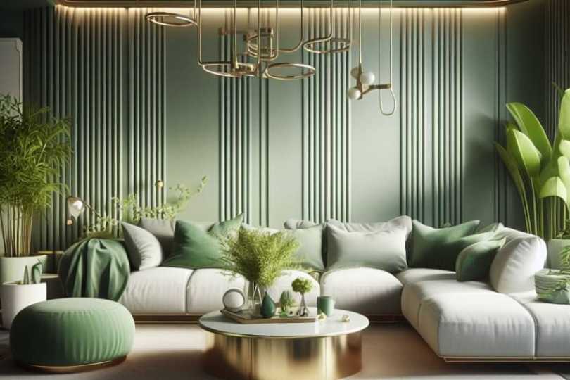
What Colors Go With Green? – 20 Perfect Pairings for Every Hue
In interior design, pairing green with complementary colors can create a harmonious and balanced aesthetic. Earthy tones such as browns and beiges can enhance the natural ambiance, while contrasting shades like coral or mustard inject a vibrant energy.Below we will be looking at our 20 color combinations which work best with different green hues when it comes to interior design. We will give you tips and tricks on how to use green color combinations in your home. Table of ContentsToggleWhat Colors Go with Green?Emerald Green and PinkOlive Green and YellowGreen and BrownGreen and WhiteGreen and NavyMint Green and CoralSage Green and LavenderForest Green and GoldPistachio Green and Soft GrayHunter Green and BurgundyTeal Green and MustardCelery Green and Sky BlueChartreuse Green and Charcoal GrayAqua Green and PeachKelly Green and CreamSeafoam Green and TerracottaTurquoise Green and BeigeFern Green and LilacMoss Green and CopperJade Green and Silver GrayFrequently Asked QuestionsWhat Goes With Green?What Colors Do Not Go With Green?Can You Combine Green With Other Shades of Green?What Colors Go with Green? Green is an excellent choice for interiors due to its associations with freshness, boldness, cleanliness, energy, and vitality. Selecting the right shade is crucial; for instance, olive green suits bedrooms, while lime green is better suited for kitchens to emphasize vitality. The color green, linked to nature, positively impacts mental health, making spaces happier and more productive. Despite its benefits, people often overlook green in interiors, possibly due to difficulty in color matching. However, exploring various sophisticated shades and incorporating green through indoor plants can transform interiors effectively.Emerald Green and Pink Because pink is a very light shade of red, it is technically a complementary color of green, especially if the green you are working with is cool-tonedemerald green. This combination works well because a dirty pink comes off as somewhat earthy, especially when compared with a naturalcolor such as pink. Emerald green and pink, while potentially too feminine for some, makes a great green color scheme for home decor. Whether you want to simply add a pop of each with throw pillows on your couch, or you want a more sophisticated look with green plants and dirty pink ornaments, the combination works fantastically. ShadeHex CodeCMYK Color Code (%)RGB Color CodeColorEmerald Green#1A8F6F82, 0, 22, 4426, 143, 111 Dirty Cool Pink#DBA9C40, 23, 11, 14219, 169, 196 Olive Green and Yellow Green and yellow is such a natural color combination. Yellow is one of the manycolors that go well with olive green, specifically. When pairing these two colors, make sure to pair them with the same tones. If you are working with a green that has more of a cool tone, make sure that the yellow you are pairing it with, doesn’t have an overly warm undertone, as the two colors will then clash. For more earthy shades of green, a mustard yellow can pair up perfectly for an understated and natural look. Pastel yellowfurniture pieces look great against olive green backdrops.ShadeHex CodeCMYK Color Code (%)RGB Color CodeColorDark Olive Green#5357245, 0, 59, 6683, 87, 36 Bright Mustard#E8B4460, 22, 70, 9232, 180, 70 Pastel Yellow#F6F09C0, 2, 37, 4246, 240, 156 Light Olive Green#9091611, 0, 33, 43144, 145, 97, 57 Green and Brown Dark green combined with chocolate brown makes for a very dramatic, natural, and earthy combination. This combination works well when wanting to achieve a cozy environment for a lounge or a bedroom area. Green and brown can give your home some lovely cool undertones and a very earthy feel. A dark green velvet cushion would go perfectly with some dark wooden furnishings. ShadeHex CodeCMYK Color Code (%)RGB Color CodeColorOlive Green#4B553112, 0, 42, 6775, 85, 49 Brown#5E2C040, 53, 96, 6394, 44, 4 Green and White If instead of a dramatic effect like green and brown, your aim is rather to create a fresh and energetic space, the combination of stark or cream whites should work well against neutral greens, which aren’t either too warm or too cold.This color combination is great if you already have white-painted walls and you want to add a splash of color throughout your interior by making use of green in the form of furniture, or naturally by incorporating plants.Neutrals like white, gray, and black work exceptionally well when combined with green and they are very on-trend. It keeps the color pallet earthy, yet modern. Green paint or furniture with black hardware against white backdrops are great examples of neutral and modern interiors.ShadeHex CodeCMYK Color Code (%)RGB Color CodeColorForest Green#10471D77, 0, 59, 7216, 71, 29 White#FFFFFF0, 0, 0, 0255, 255, 255 Gray#5959590, 0, 0, 6589, 89, 89 Black#0000000, 0, 0, 1000, 0, 0 Green and NavyBlueis a far-end analogous color to green, which makes for a very calming combination. Specifically dark blue is one of the colors that go well with green. A darker lime green paired with hints of navy in the form of floral patterns, for example, makes for a great design choice, especially in kitchens.ShadeHex CodeCMYK Color Code (%)RGB Color CodeColorLime Green#8997039, 0, 98, 41137, 151, 3 Navy#002060100, 67, 0, 620, 32, 96 Mint Green and Coral This refreshing combination brings together the calmness of mint green with the vibrant warmth of coral. Ideal for spaces where a touch of playfulness is desired, the pairing creates a balanced and invigorating atmosphere, perfect for bedrooms or living areas.ShadeHex CodeCMYK Color Code (%)RGB Color CodeColorMint Green#98FF9827, 0, 27, 0152, 255, 152 Coral#FF6F610, 73, 63, 0255, 111, 97 Sage Green and Lavender The soft, muted tones of sage green and lavender create a soothing and sophisticated ambiance. This pairing works well in spaces intended for relaxation, such as bedrooms or reading nooks, promoting a sense of tranquility and understated elegance.ShadeHex CodeCMYK Color Code (%)RGB Color CodeColorSage Green#C1D98E28, 0, 43, 15193, 217, 142 Lavender#967BB631, 39, 0, 29150, 123, 182 Forest Green and Gold The richness of forest green paired with the opulence of gold adds a touch of luxury to interiors. This combination is well-suited for formal spaces like dining rooms or home offices, where the deep green provides a sense of grounding, and gold accents bring in an element of glamour.ShadeHex CodeCMYK Color Code (%)RGB Color CodeColorForest Green#228B2285, 0, 90, 4534, 139, 34 Gold#FFD7000, 0, 100, 0255, 215, 0 Pistachio Green and Soft Gray Combining the subtlety of pistachio green with the neutrality of soft gray results in a versatile and contemporary palette. This pairing is perfect for modern living spaces, offering a serene backdrop that allows for easy integration of various textures and accent colors.ShadeHex CodeCMYK Color Code (%)RGB Color CodeColorPistachio Green#93C57226, 0, 55, 7147, 197, 114 Soft Gray#D3D3D30, 0, 0, 18211, 211, 211 Hunter Green and Burgundy The deep, bold hues of hunter green and burgundy create a sophisticated and timeless color scheme. This combination is excellent for spaces where a touch of drama is desired, such as formal dining rooms or cozy home libraries, evoking a sense of classic elegance.ShadeHex CodeCMYK Color Code (%)RGB Color CodeColorHunter Green#355E3B71, 25, 91, 1853, 94, 59 Burgundy#8000200, 100, 75, 36128, 0, 32 Teal Green and Mustard The dynamic contrast between teal green and mustard brings energy and warmth to interiors. Ideal for spaces like kitchens or home offices, this combination creates a visually stimulating environment that balances boldness with a hint of retro charm.ShadeHex CodeCMYK Color Code (%)RGB Color CodeColorTeal Green#008080100, 0, 33, 500, 128, 128 Mustard#FFDB580, 10, 70, 0255, 219, 88 Celery Green and Sky Blue This light and airy combination of celery green and sky blue lends a fresh and uplifting feel to interiors. Suited for spaces like kitchens or bathrooms, the pairing evokes a sense of cleanliness and openness, creating a serene and inviting atmosphere.ShadeHex CodeCMYK Color Code (%)RGB Color CodeColorCelery Green#BFFF0029, 0, 80, 0191, 255, 0 Sky Blue#87CEEB32, 3, 0, 11135, 206, 235 Chartreuse Green and Charcoal Gray The boldness of chartreuse green paired with the depth of charcoal gray creates a modern and visually striking palette. This combination is well-suited for contemporary spaces, adding a touch of vibrancy and sophistication, particularly in areas where a statement is desired, such as accent walls or furniture.ShadeHex CodeCMYK Color Code (%)RGB Color CodeColorChartreuse Green#7FFF0030, 0, 90, 0127, 255, 0 Charcoal Gray#36454F70, 50, 50, 5054, 69, 79 Aqua Green and Peach The calming tones of aqua green combined with the warmth of peach create a soft and inviting color scheme. Suitable for bedrooms or living rooms, this pairing exudes a sense of serenity and comfort, making the space feel welcoming and relaxed.ShadeHex CodeCMYK Color Code (%)RGB Color CodeColorAqua Green#00FFFF100, 0, 0, 00, 255, 255 Peach#FFDAB90, 16, 24, 0255, 218, 185 Kelly Green and Cream The classic combination of kelly green and cream is timeless and versatile. Ideal for both traditional and contemporary interiors, this pairing brings a sense of freshness and brightness, making it suitable for spaces like family rooms or home offices.ShadeHex CodeCMYK Color Code (%)RGB Color CodeColorKelly Green#4CBB1779, 0, 100, 076, 187, 23 Cream#FFFDD00, 0, 13, 0255, 253, 208 Seafoam Green and Terracotta The gentle contrast between seafoam green and terracotta creates a harmonious and earthy palette. This combination is well-suited for spaces with a natural or bohemian aesthetic, bringing in a sense of warmth and connection to the outdoors.ShadeHex CodeCMYK Color Code (%)RGB Color CodeColorSeafoam Green#90EE9040, 0, 40, 0144, 238, 144 Terracotta#E2725B0, 54, 36, 11226, 114, 91 Turquoise Green and Beige The vibrant energy of turquoise green paired with the calm neutrality of beige results in a balanced and soothing color scheme. This combination is suitable for various spaces, offering a timeless and adaptable palette that accommodates different design styles.ShadeHex CodeCMYK Color Code (%)RGB Color CodeColorTurquoise Green#00C78C88, 0, 62, 210, 199, 140 Beige#F5F5DC0, 0, 14, 4245, 245, 220 Fern Green and Lilac The combination of fern green and lilac creates a fresh and youthful palette. Ideal for bedrooms or playrooms, this pairing brings a sense of vibrancy and creativity, striking a balance between nature-inspired green and the delicate charm of lilac.ShadeHex CodeCMYK Color Code (%)RGB Color CodeColorFern Green#4F794258, 0, 80, 6979, 121, 66 Lilac#C8A2C825, 40, 0, 20200, 162, 200 Moss Green and Copper The earthy tones of moss green paired with the warmth of copper create a rustic and inviting atmosphere. This combination is well-suited for spaces with a natural or industrial aesthetic, bringing in a sense of coziness and character.ShadeHex CodeCMYK Color Code (%)RGB Color CodeColorMoss Green#8A9A5B38, 14, 73, 11138, 154, 91 Copper#B8733320, 45, 73, 4184, 115, 51 Jade Green and Silver Gray The cool elegance of jade green combined with the sophistication of silver gray results in a modern and refined color scheme. Suitable for contemporary living spaces or home offices, this pairing exudes a sense of calmness and style, creating a sleek and polished look.ShadeHex CodeCMYK Color Code (%)RGB Color CodeColorJade Green#00A86B86, 0, 77, 330, 168, 107 Silver Gray#C0C0C00, 0, 0, 25192, 192, 192 If you can change your mindset to start thinking of green as a neutral color, it should be easy to combine it with many different colors, and you will come to realize that depending on the shade of green, green goes with more colors than you think. Not only is green one of the most versatile colors when it comes to finding combinations, but it is also versatile in terms of the type of rooms it can be used for. The shades of green can be adjusted to fit almost any mood and function, all while being associated with nature, and thus being great for our mental state.Frequently Asked QuestionsWhat Goes With Green? What colors go with green? When looking at green color combinations it is important to consider the shade of green when asking the question of what goes with green. Bright orange pairs well with dark greens, whereas neutrals like browns or monochromatic tones that extend to blue, pair very well with light greens. What Colors Do Not Go With Green? Although there is a color for almost every shade of green, there are certainly some colors that are more difficult to pair with green. These colors tend to be bright primary colors, which include royal blue, bright yellow, and fire engine red. Can You Combine Green With Other Shades of Green? Yes, incorporating various shades of green, such as mint, emerald, or olive, can create a harmonious and nature-inspired color palette, adding depth and interest to your design.
Baby Blue Color – All About the Shades of Baby Blue
The baby blue color is said to be one of the more popular shades of blue and is a well-known color for nurseries or baby clothes. Are you considering baby blue as a paint color for your next interior design project? If so, you must read on to find out more about the color and what colors go with baby blue.Table of ContentsToggleWhat Is the Baby Blue Color?Baby Blue Color: A Brief HistoryMeaning of the Baby Blue ColorShades of Baby BlueBeau BlueSky BlueArctic BlueWhat Colors Go With Baby Blue?Complementary Baby Blue ColorsMonochromatic Baby Blue ColorsAnalogous Baby Blue ColorsTriadic Baby Blue ColorsHow to Use the Baby Blue ColorWhat Colors Make Baby Blue Paint?The Baby Blue Color in FashionBaby Blue Home InteriorsConclusionFrequently Asked QuestionsWhat Colors Make Baby Blue?Can Baby Blue Be Used in the Kitchen?What Colors Go With Baby Blue?What Is the Baby Blue Color? Baby blue can be described as a light blue color or a very soft blue. The color is also a lighter shade of azure and has a powdery look to it that can class as a pastel color. The table with baby blue shows you the hex code, which helps identify colors, and the various color codes. The RGB baby blue color code shows the breakdown of colors that are used for computer graphics, which are red, green, and blue. The CMYK baby blue color code shows you the color ink used for printing purposes and includes cyan, magenta, yellow, and black.Baby Blue ShadeBaby Blue Hex CodeCMYK Baby Blue Color Code (%)RGB Baby Blue Color CodeBaby Blue ColorBaby Blue#89cff043, 14, 0, 6137, 207, 240 Azure#0080ff100, 50, 0, 00, 128, 255 Baby Blue Color: A Brief History The baby blue color name was first used and recorded in the late 1800s. As we have mentioned, in Western culture, baby blue is a popular color for nurseries and baby clothes. Baby blue had some time in the spotlight during the 1960s in San Francisco when a well-known English writer and philosopher made a suggestion to the local police.He recommended that the police paint their cars blue and white, in place of white and black. This was put into operation in San Francisco until the late 1980s. He also recommended that the police uniform should be a baby blue color because it would help keep the officers calm in tense situations. However, this suggestion was never fulfilled, maybe with a sigh of relief from many at the time. Baby blue is also the approved color for the Argentinian flag. Meaning of the Baby Blue Color Allshades of blueof fresh, calming, and relaxing, and instill a sense of trust and loyalty. Being a softer shade, baby blue can be more playful and peaceful. This color is also associated with youth, health, reliability, and trustworthiness. Being a pastel color, baby blue has a soothing and reassuring effect. If blue is your favorite color, then some personality traits would include being compassionate, enthusiastic, communicative, imaginative, sincere, and idealistic. Shades of Baby Blue There are many shades of blue and this also means that there are many colors that are close to the baby blue color. All of these colors have slight variations in their composition, which you can see in the different color codes. Below are three examples of different shades of baby blue.Beau Blue This color can be described as a light grayish blue and is a lighter tone than baby blue. The nameBeauis French for “beautiful”. The color originally comes from the Plochere color system, which was created in the late 1940s and is mainly used by interior designers.Baby Blue ShadeBaby Blue Hex CodeCMYK Baby Blue Color Code (%)RGB Baby Blue Color CodeBaby Blue ColorBaby Blue#89cff043, 14, 0, 6137, 207, 240 Beau Blue#bcd4e618, 8, 0, 10188, 212, 230 Sky Blue A color that is extremely close to baby blue is the color sky blue. At various times of the day, the sky can have that baby blue shade, which is a very soft blue. Similar to baby blue, it is associated with relaxation and calmness.Baby Blue ShadeBaby Blue Hex CodeCMYK Baby Blue Color Code (%)RGB Baby Blue Color CodeBaby Blue ColorBaby Blue#89cff043, 14, 0, 6137, 207, 240 Sky Blue#87Ceeb43, 12, 0, 8135, 206, 235 Arctic Blue The name arctic blue inspires thoughts of ice and color and can be described as a very soft cyan as it does have a greenish undertone. A popular paint color for the home, it is used to create a space that is both calming and soothing. Baby Blue ShadeBaby Blue Hex CodeCMYK Baby Blue Color Code (%)RGB Baby Blue Color CodeBaby Blue ColorBaby Blue#89cff043, 14, 0, 6137, 207, 240 Arctic Blue#90e0f742, 9, 0, 3144, 224, 247 What Colors Go With Baby Blue? Baby blue can be used with many different colors; however, some combinations will always work if used correctly. Baby blue works well with neutrals like white, cream, and gray, but it also works wonderfully with softer pinks, lavenders, mauves, dark blues, greens, gold, and jewel tones. Let us see what colors go with baby blue when using thecolor wheel.Complementary Baby Blue Colors When looking at color theory and the color wheel, all the colors you can see have specificcolor combinationsthat are directly linked to each color’s position on the color wheel. Complementary colors are directly opposite each other. This color combination is perfect if you want to create contrast and pops of color.ShadeHex CodeCMYK Color CodeRGB Color CodeColorBaby Blue#89cff043, 14, 0, 6137, 207, 240 Soft Orange#f0aa890, 29, 43, 6240, 170, 137 Monochromatic Baby Blue Colors Instead of using a single blue color, consider different shades of baby blue. This can help create more depth and the colors are easy to look at. Colors like navy blue or azure would also go with the baby blue color.ShadeHex CodeCMYK Color CodeRGB Color CodeColorBaby Blue#89cff043, 14, 0, 6137, 207, 240 Dark Blue#0e4e6c87, 28, 0, 5814, 78, 108 Light Grayish Bluecdebf918, 6, 0, 2205, 235, 249 Analogous Baby Blue Colors Colors positioned in the same general area on the color wheel are known as analogous colors. These neighboring colors work well and are pleasing to look at as they do not create contrast like other color combinations. So, this would include shades of green and blue.ShadeHex CodeCMYK Color CodeRGB Color CodeColorBaby Blue#89cff043, 14, 0, 6137, 207, 240 Soft Cyan#89f0de43, 0, 8, 6137, 240, 222 Soft Blue#899cf043, 35, 0, 6137, 156, 240 Triadic Baby Blue Colors Three or more colors within a color scheme can get more challenging to work with. However, if you combine these colors properly, they will create some interesting combinations. The best way to use these colors is to choose the main color and then apply the other colors as accents. Triadic colors can be seen on the color wheel as an even-sided triangle shape. In the case of baby blue, the colors are soft pinks as well as greens.ShadeHex CodeCMYK Color CodeRGB Color CodeColorBaby Blue#89cff043, 14, 0, 6137, 207, 240 Soft Green#cff08914, 0, 43, 6207, 240, 137 Soft Pink#f089cf0, 43, 14, 6240, 137, 207 How to Use the Baby Blue Color Since baby blue paint is such a popular color, it can be used in a variety of design ideas and projects. The color can easily be mixed to create a baby blue paint color for art projects, or it can be mixed to paint your walls. Baby blue can also be a comforting choice for interior designs and the perfect fashion color choice. What Colors Make Baby Blue Paint? There are so many paint colors you can get ready-made in a tube these days that you do not have to mix many of the colors yourself. Although, many artists insist on mixing their own colors, to get the best color blend.Mixing baby blue paint at home is quite easy, all you need is some blue and white paint. Take some white paint and place it on your mixing surface, and then slowly add the blue paint until you reach the color you want. You can create a color chart to help record your proportions as you go, so you can replicate the colors in the future.The Baby Blue Color in Fashion Baby blue is a great color for clothing and fashion ideas and goes well with other pastels, white, and floral prints. However, black, and navy blue are classic colors that will pair suitably with baby blue. Not only does baby blue look great in clothing, but you can also bring the color in using accessories. For example, consider handbags, shoes, jewelry, scarves, and even things like nail polish or make-up. There are always blue jeans, which can come in a light baby blue color. Beautiful evening dresses and outfits can work perfectly in baby blue. Consider layer shades of blue in an outfit to create more depth and interest. For example, navy blue pants and a baby blue coat. Add pops of color to the baby blue ensemble with pinks, greens, soft oranges, or evenshades of red. Baby Blue Home Interiors Baby blue does tend to have a link to nurseries and baby clothes, however, there are other shades of baby blue you can consider. All of these colors offer a calming and relaxing atmosphere and is a popular color for bedrooms. The color has become more popular on walls and can be used alongside other neutrals like gray, white, cream, and beige.Adding different textures, patterns, and colors, you can use a baby blue color palette in any room. Blue and white is always a good combination if you are trying to create a seaside atmosphere. Besides using baby blue on the walls, it can be used to add a bit of color by painting door and window frames blue.Pairing baby blue with the right colors can help to warm up a room. You can pair the baby blue color with natural wood elements that have a warm orange undertone. Since orange and blue complement, each other, they are the perfect combination. You can also add pops of color in a blue room using accessories like cushions, rugs, curtains, art pieces, and plants for greenery. Baby blue can also be the accent color if you would just like to add a touch of blue. Below is an example of a more delicate color palette that includes light pink or peach, rose quartz, and baby blue.ShadeHex CodeCMYK Color CodeRGB Color CodeColorBaby Blue#89cff043, 14, 0, 6137, 207, 240 Peach#ffe5b40, 10, 29, 0255, 229, 180 Rose Quartz#f7cac90, 18, 19, 3247, 202, 201 Conclusion The light blue color that is baby blue does not have to be set apart for baby rooms or clothing. The color also has other uses and is a great addition to any wardrobe as well as the perfect color for a variety of interior design ideas.Frequently Asked QuestionsWhat Colors Make Baby Blue? Mixing baby blue is easy, all you need is some white and blue paint. Place some white on your palette and add in small amounts of blue until you reach the color you want. You can try out separate types of blue, to find out what shades and tones of blue you can create. Can Baby Blue Be Used in the Kitchen? Yes, baby blue can work in the kitchen. Lighter shades, when paired with white can create a clean, fresh, and invigorating look. The color can be added to cabinets, the walls, or brought in through accessories or appliances like dishcloths, kettles, or toasters. What Colors Go With Baby Blue? Baby blue can go with white, gray, black, beige, and cream. The color can also work with pinks, shades of green and orange as well as other shades of blue.
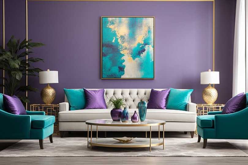
What Colors Go With Purple? – Top 15 Perfect Color Combinations
Renovating your house and wondering what colors go with purple? Purple is one of those colors that we don’t see often enough used in interior design color schemes. However, as with all colors, finding appropriate color combinations for purple makes it a much less daunting color to incorporate in an interior setting. This article will demonstrate 10 optimal color pairings that complement purple and provide guidance on incorporating them into your home decor.Table of ContentsTogglePurple Color CombinationsWhat Colors Go With Purple?Purple and Gray Purple and GoldPurple and CreamPurple and TealPurple and CoralPurple and Olive GreenPurple and Silver Purple and Turquoise Purple and Mustard YellowPurple and Navy Blue The Different Shades of Purple Lavender Combined With SilverLilac Combined With Sage Green Plum Combined With ChampagneDark Purple Combined With Gold Violet Combined With Creamy Yellow Frequently Asked QuestionsWhat Colors Complement Purple?What Are the Best Accent Colors for Purple?What Is the Best Color Combination With Purple?Purple Color Combinations To discover effective purple color combinations, one can apply color theory alongside thecolor wheel. It should be noted that each shade and hue has its own color code; therefore, different values of the below color theories will apply depending on theshade of purpleyou are using. The color theories that we will be looking at include complementary colors,split complementary colors, monochromatic colors, triadic colors, and analogous colors.Monochromatic Colors Colors along the line drawn from purple to the center of the color wheel, sharing the same hues but differing in shades. Ideal for interior design, creating rhythm and calm while adhering to a specific color scheme. Complementary Color Yellow is the complementary color of purple, located directly opposite on the color wheel. While highly complementary, these colors also contrast strongly, requiring careful use, especially in saturated hues.Triadic Colors Triadic colors include orange and green. Triadic combinations tend to be richer in hues. Suitable for highlighting one color in an interior while introducing the other two minimally to enhance purple. Analogous Colors Ideal for using a variety of colors while maintaining a cohesive and visually aesthetic interior. Analogous colors, sharing similar undertones, work well for a cool or warm color palette. Split Complementary Positioned on either side of purple’s complementary color, yellow, orange, and green serve as split complementary colors. When combined, this palette creates an unexpected yet potentially effective color combination, especially when selecting the right hues. Suitable for interior settings, offering a unique and dynamic color scheme. What Colors Go With Purple? Taking the above color theories and color psychology into consideration, let’s have a look at a few color combinations with specific shades and hues. Be sure to play around with these pairings, and you will most certainly find a purple color combination that works well for almost any setting in an interior.Purple and Gray The neutral and versatile nature of gray provides a sophisticated backdrop for purple, allowing it to take center stage while maintaining a timeless and balanced aesthetic, making it suitable for various design styles.ShadeHex CodeCMYK Color Code (%)RGB Color CodeColorPurple#916D9F9, 31, 0, 38145, 109, 159 Gray#8080800, 0, 0, 50128, 128, 128 Purple and Gold The pairing of gold with purple brings a sense of opulence and warmth to interior spaces, creating a luxurious atmosphere. This combination adds depth and richness, making it particularly well-suited for elegant and regal design themes.ShadeHex CodeCMYK Color Code (%)RGB Color CodeColorPurple#916D9F9, 31, 0, 38145, 109, 159 Gold #D4AF370, 14, 71, 17212, 175, 55 Purple and Cream The soft contrast of cream with purple evokes a serene and classic ambiance, offering a fresh and timeless palette. This combination works well in creating a calm and inviting atmosphere, especially in bedrooms and living areas.ShadeHex CodeCMYK Color Code (%)RGB Color CodeColorPurple#916D9F9, 31, 0, 38145, 109, 159 Cream#FFFDD00, 0, 25, 0255, 253, 208 Purple and Teal Teal’s bold and vibrant presence complements purple, injecting energy and visual interest into the design. The combination of these two colors creates a dynamic and contemporary look, ideal for modern and eclectic interiors.ShadeHex CodeCMYK Color Code (%)RGB Color CodeColorPurple#916D9F9, 31, 0, 38145, 109, 159 Teal#008080100, 0, 33, 500, 128, 128 Purple and Coral Adding a pop of coral to purple infuses spaces with energy and playfulness, making it an excellent choice for lively and eclectic design schemes. The warm undertones of coral enhance the overall vibrancy of the space.ShadeHex CodeCMYK Color Code (%)RGB Color CodeColorPurple#916D9F9, 31, 0, 38145, 109, 159 Coral#FF6F610, 62, 46, 0255, 111, 97 Purple and Olive Green The earthy and muted tones of olive green harmonize with purple, creating a calming and nature-inspired design. This combination is well-suited for spaces where a relaxed and tranquil atmosphere is desired, such as bedrooms or reading nooks.ShadeHex CodeCMYK Color Code (%)RGB Color CodeColorPurple#916D9F9, 31, 0, 38145, 109, 159 Olive Green#556B2F47, 0, 64, 4385, 107, 47 Purple and Silver Silver’s cool tones complement purple, offering a sleek and modern touch to interior design. This combination is perfect for contemporary settings, adding a touch of sophistication and creating a visually appealing contrast.ShadeHex CodeCMYK Color Code (%)RGB Color CodeColorPurple#916D9F9, 31, 0, 38145, 109, 159 Silver#C0C0C00, 0, 0, 25192, 192, 192 Purple and Turquoise The refreshing and invigorating qualities of turquoise pair well with purple, creating a lively and balanced color scheme. This combination works wonders in spaces where a vibrant and cheerful ambiance is desired, such as kitchens or playrooms.ShadeHex CodeCMYK Color Code (%)RGB Color CodeColorPurple#916D9F9, 31, 0, 38145, 109, 159 Turquoise#40E0D073, 0, 18, 064, 224, 208 Purple and Mustard Yellow Mustard yellow adds a trendy and bold element to purple, creating a dynamic and visually stimulating design. This combination is ideal for those seeking a contemporary and fashion-forward look in their interior spaces.ShadeHex CodeCMYK Color Code (%)RGB Color CodeColorPurple#916D9F9, 31, 0, 38145, 109, 159 Mustard Yellow#FFD7000, 10, 100, 0255, 215, 0 Purple and Navy Blue The classic and timeless pairing of navy blue with purple exudes elegance and sophistication. This combination is well-suited for formal spaces, bringing a sense of tradition and refinement to the overall interior design.ShadeHex CodeCMYK Color Code (%)RGB Color CodeColorPurple#916D9F9, 31, 0, 38145, 109, 159 Navy Blue#001F3F100, 50, 0, 00, 31, 63 The Different Shades of Purple From the deep and regal hues reminiscent of majestic velvet to the light and delicate lavender tones reminiscent of a serene field in bloom, the spectrum of purple is a testament to its versatility. Dark purples evoke a sense of mystery and sophistication, while lighter shades convey a soft and dreamy ambiance. The richness of royal purple exudes opulence and grandeur, while mauve whispers of vintage charm. ShadeHex CodeCMYK Color CodeRGB Color CodeBackground ColorLavender#E6E6FA19, 20, 0, 0230, 230, 250 Lilac#C8A2C824, 39, 0, 20200, 162, 200 Plum#8E458539, 76, 0, 47142, 69, 133 Dark Purple#4B008286, 100, 0, 4975, 0, 130 Violet#EE82EE71, 100, 0, 11138, 43, 226 Lavender Combined With Silver Lavender’s soft and calming nature pairs harmoniously with the sophistication of silver. This combination brings an air of elegance to interior spaces, creating a serene ambiance that is both timeless and refined. The cool tones of lavender complement the metallic sheen of silver, making it an ideal choice for bedrooms or living areas seeking a balance of tranquility and modernity. ShadeHex CodeCMYK Color CodeRGB Color CodeBackground ColorLavender#E6E6FA19, 20, 0, 0230, 230, 250 Silver#C0C0C00, 0, 0, 25192, 192, 192 Lilac Combined With Sage Green Lilac’s gentle and romantic essence finds a complementary partner in the earthy tones of sage green. Together, they create a soothing and nature-inspired palette, making this combination perfect for spaces that aim to evoke a sense of relaxation and connection with the outdoors. The softness of lilac enhances the freshness of sage green, making it an appealing choice for bedrooms or living rooms seeking a harmonious and calming atmosphere. ShadeHex CodeCMYK Color CodeRGB Color CodeBackground ColorLilac#C8A2C824, 39, 0, 20200, 162, 200 Sage Green#8F977938, 21, 60, 0143, 151, 121 Plum Combined With Champagne The richness of plum combined with the warmth of champagne creates a luxurious and inviting atmosphere. This color combination adds depth and opulence to interior spaces, making it well-suited for areas where a touch of glamour is desired, such as dining rooms or entertainment spaces. The deep, regal undertones of plum harmonize with the shimmering sophistication of champagne, resulting in a palette that exudes sophistication and style. ShadeHex CodeCMYK Color CodeRGB Color CodeBackground ColorPlum#8E458539, 76, 0, 47142, 69, 133 Champagne#F7E7CE2, 5, 16, 0247, 231, 206 Dark Purple Combined With Gold The pairing of dark purple and gold brings a sense of drama and opulence to interior design. Dark purple’s mysterious allure complements the richness of gold, creating a color scheme that radiates luxury and regality. This combination is particularly well-suited for accent details or statement pieces, adding a touch of grandeur to spaces like entryways or home offices. ShadeHex CodeCMYK Color CodeRGB Color CodeBackground ColorDark Purple#4B008286, 100, 0, 4975, 0, 130 Gold#FFD7000, 0, 100, 0255, 215, 0 Violet Combined With Creamy Yellow Violet’s playful energy combined with the warmth of creamy yellow creates a lively and cheerful interior palette. This combination is ideal for spaces where a vibrant and uplifting atmosphere is desired, such as kitchens or children’s rooms. The contrast between the boldness of violet and the softness of creamy yellow adds visual interest, injecting a sense of joy and positivity into the overall design. ShadeHex CodeCMYK Color CodeRGB Color CodeBackground ColorViolet#8A2BE271, 100, 0, 11138, 43, 226 Creamy Yellow#FFFDD02, 0, 24, 0255, 253, 208 Hopefully, you now have enough knowledge of the color purple to realize that there are endless color combinations that work exceptionally well with purple, depending on its shade and hue. Whether you want to incorporate a sense of royalty that purple so easily evokes, or you relate to the spiritual background of purple, it is worth considering to incorporate into your home for a unique color palette that is a great conversation starter.Frequently Asked QuestionsWhat Colors Complement Purple? When it comes to color theory, the complementary color of purple is yellow. However, aside from yellow, there are many other colors that complement purple, depending on the shade and hue of the purple in question. Among these complimenting colors are orange, blue, yellow, brown, turquoise, and cream or off-white. What Are the Best Accent Colors for Purple? What are the best accent colors for purple? The best accent colors for purple depend heavily on the shade of purple you are trying to match. If you are working with a cool-undertone purple, pair it with brown, cream, blue, or turquoise. Whereas warm purple looks great when combined with orange or yellow. What Is the Best Color Combination With Purple? What is the best color combination with purple? There are many colors that pair well with purple, depending on the specific shade of purple. According to color theory, yellow complements purple the best, as it sits directly opposite purple on the color wheel. If you are using a bright shade of purple, complement it with a lighter, toned-down shade of yellow, and vice versa.

Orchid Color – Using Orchid Color Palette in Design and Fashion
Orchids are lovely and sought-after flowers, and they come in a variety of colors. However, we will be dealing with the web orchid color, which is bold and beautiful. The orchid color can be challenging to work with, so we will be providing a few tips and discovering what colors go with orchid.Table of ContentsToggleWhat Color Is Orchid?Orchid Color: A Brief HistoryOrchid Color MeaningShades of the Color OrchidOrchid PinkDark OrchidWild OrchidWhat Colors Go With Orchid?Complementary Color CombinationsAnalogous Color CombinationsMonochromatic Color CombinationsTriadic Color CombinationsHow to Use the Orchid ColorHow to Mix Orchid Paint ColorsOrchid Colors in the HomeWearing Orchid ColorsConclusionFrequently Asked QuestionsWhat Color Is Orchid?What Colors Go With Orchid?What Does the Orchid Color Represent?What Color Is Orchid? The orchid color can be described as a soft magenta or a shade of purple that has pink, blue as well as grayish undertones. The orchid color has its own hex code, which helps designers identify the multitude of colors available. Also, in the chart below, you can see the different color codes and how much of each color is used to make up the orchid color. The RGB color code has red, green, and blue, and is used for graphics like web designing. The CMYK color code refers to how much ink is used during printing and includes cyan, magenta, yellow and black.Orchid ShadeOrchid Hex CodeCMYK Orchid Color Code (%)RGB Orchid Color CodeOrchid ColorOrchid#da70d60, 49, 2, 15218, 112, 214 Orchid Color: A Brief History The orchid color was first used and recorded as an English color name in 1915. When web colors were developed, the orchid color formed part of the X11 color system. The flower was named after a Greek botanist, who thought the plants underground tubers looked like testicles, which in Greek is “orchis”. The ancient Greeks believed that the orchid was closely linked to fertility, and if a woman ate a flower, they would be guaranteed to have a male child. In general, orchids were believed to have many healing properties. The Chinese have been using the orchid as a remedy for lung conditions and helping to cure coughs. The Victorians found the orchid flowers mesmerizing, so they collected them and placed them on display. However, the plants were rare and expensive, so it was only those who could afford to do this. The orchids were also popular in Japan and were also considered symbols of wealth.Coming back to the orchid color in more recent years, Radiant Orchid was the color chosen by Pantone for the color of the year in 2014. The color is described as a balance of purple, fuchsia, and pink.Orchid Color Meaning The orchid plant has always been a little mysterious, beautiful, and rare. So, the color also reflects luxury, mystery, wealth, and elegance. Orchids are also associated with love, joy, creativity, and confidence. The color can also represent fertility, power, dignity, abundance, and health. There are many different types and colors of orchids, and each of these has its own meaning. Shades of the Color Orchid As with all colors, you can get many different shades of the color orchid from purple orchid colors to light orchid colors. So, when considering a design, you do not have to stick to a single hue, there are many other choices available that can fit in with your ideas.Orchid Pink What color is orchid pink? This color is more of a light orchid color, or it can also be described as being a very soft pink. This color was first used on the Pantone Textile Paper (TPX) color list, which are colors used for printing. You will notice that it leans more towards pink and is softer than the original orchid color.Orchid ShadeOrchid Hex CodeCMYK Orchid Color Code (%)RGB Orchid Color CodeOrchid ColorOrchid Color#da70d60, 49, 2, 15218, 112, 214 Orchid Pink#f2bdcd0, 22, 15, 5242, 189, 205 Dark Orchid When compared to the original orchid color, this is a darker color that is more of a purple orchid color, or strong violet color. The dark orchid has more blue and less red than when compared to the orchid color.Orchid ShadeOrchid Hex CodeCMYK Orchid Color Code (%)RGB Orchid Color CodeOrchid ColorOrchid Color#da70d60, 49, 2, 15218, 112, 214 Dark Orchid#9932cc25, 75, 0, 20153, 50, 204 Wild Orchid Wild orchid is more of amuted colorthat can be described as a desaturated pink. The wild orchid color is another hue that can be found in the Pantone Textile Paper (TPX) Color list. Wild orchid and dusty pink can also be confused with each other, as they are very close in color but are slightly different and each has its own hex code.Orchid ShadeOrchid Hex CodeCMYK Orchid Color Code (%)RGB Orchid Color CodeOrchid ColorOrchid#da70d60, 49, 2, 15218, 112, 214 Wild Orchid#d470a20, 47, 24, 17212, 112, 162 Dusty Pink#c291a40, 25, 15, 24194, 145, 164 What Colors Go With Orchid? The web orchid color is quite bold, however, as we have seen, you also get a variety of different shades. So, what colors go with orchid? Orchid colors can work well with neutral colors like gray, white, black, or beige and taupe but let us go into the variouscolor combinationsand how you can determine them.ShadeHex CodeCMYK Color Code (%)RGB Color CodeColorOrchid#da70d60, 49, 2, 15218, 112, 214 Gray#8080800, 0, 0, 50128, 128, 128 Beige#f5f5dc0, 0, 10, 4245, 245, 220 Taupe#483c320, 17, 31, 7272, 60, 50 Complementary Color Combinations To determine color combinations, you have to look at thecolor wheel. On the color wheel, you will find all your primary, secondary as well as tertiary, or intermediate colors. How the colors are positioned, will help you find the various color combinations. For example, complementary colors are found on opposite sides and form a contrast in colors. In other words, the colors stand out. So, shades of green and yellow would work well with orchid.ShadeHex CodeCMYK Color Code (%)RGB Color CodeColorOrchid Color#da70d60, 49, 2, 15218, 112, 214 SoftLime Green#70da7449, 0, 47, 15112, 218, 116 Analogous Color Combinations If you want a more harmonious combination that is easier on the eyes, you can go for an analogous color scheme. These colors all have something in common, as they can be found alongside one another on the color wheel. In this case, it is your reds, pinks, andshades of purple.ShadeHex CodeCMYK Color Code (%)RGB Color CodeColorOrchid Color#da70d60, 49, 2, 15218, 112, 214 Soft Violet#a970da22, 49, 0, 15169, 112, 218 Soft Pink#da70a10, 49, 26, 15218, 112, 161 Monochromatic Color Combinations Shades and tints of orchid form a monochromatic color scheme. These involve lighter as well as darker hues of the same color. As with analogous colors, these colors are harmonious and pleasant to look at and provide depth to a design.ShadeHex CodeCMYK Color Code (%)RGB Color CodeColorOrchid Color#da70d60, 49, 2, 15218, 112, 214 Magenta#c934c40, 74, 2, 21201, 52, 196 Soft Magenta#eaade70, 26, 1, 8234, 173, 231 Triadic Color Combinations Forming an equal-sided triangle, these colors also create a contrasting color scheme. Blues, greens, and yellow work within this color scheme. You can also get four colors, known as square or tetradic colors. The more colors within a scheme, the more challenging it is to balance everything out. So, choose your main color and supporting color, and the others can be used as accent colors.ShadeHex CodeCMYK Color Code (%)RGB Color CodeColorOrchid Color#da70d60, 49, 2, 15218, 112, 214 Soft Cyan#70d6da49, 2, 0, 15112, 214, 218 Soft Yellow#d6da702, 0, 49, 15214, 218, 112 How to Use the Orchid Color The orchid color can be used in all types of designs from art to fashion and interior design. The color can also successfully be used in marketing, advertising, and web design for businesses, where you can use the color to express your message. The orchid color should provide a sense of luxury as well as sophistication to a design. How to Mix Orchid Paint Colors Whenmixing colors, remember that the colors in a tube can vary in tone and temperature. For example, a blue can have a warm or cold undertone. So, to get a nice purple color try mixing ultramarine blue and quinacridone red, then you can add in white to lighten it or black, or a little more blue paint to darken it. You can experiment with proportions and remember to make a color chart to document all your efforts.Orchid Colors in the Home The orchid color can be challenging to use, as it is quite a vibrant color. You have to be careful with how much you use and what colors you pair it with. Orchid is a shade of purple or magenta, and if used too much, can overwhelm the senses. Shades of purple can work in all rooms, but it is used best in living areas and the bedroom. So, what are a few tips you can use when working with this fun and amazing color?If you are afraid to work with the orchid color,start small by incorporating it using accessories. For example, cushions, rugs, or throws.Be a little more daring and consider the color for chairs, sofas, or an accent wallwithneutral colors.Create a less feminine look with the orchid color, by painting it with natural elementslike wood, green plants, stone, or jute.Think about what you want to achieve, for example, orchid and turquoise are vibrant, while orchid and gray are more subtle and subdued.To create a luxurious and layered look, consider a monochromatic color scheme. For example, in the bedroom different shades with a headboard, rug, bedding, and furniture, with more neutral colors.Wearing Orchid Colors The orchid color is a vibrant, feminine, fresh, and luxurious color that can be worn in a variety of ways. You have various dark to light orchid colors to choose from. Consider beautiful dresses, both formal and informal, jackets, skirts, tops, pants, and even shoes and other accessories. Here are a few tips if you want to choose this color for your next outfit.Consider print patterns with the orchid color. If you do not want a solid color, a pattern that brings in the color can also work.Wear the orchid color with white or other neutral colors, which helps to tone down the intense look of the purple color. Pair with black, white, or navy.If you do want to go all out with the color,consider amonochromatic color combination for more depth and interest.Another way to bring in the color more subtly is through accessories. An orchid color bag, pair of shoes, or earrings can bring a colorful and fun element into an outfit.An orchid color jacketcan add a bit of fun and color into the cold winter months.Conclusion The orchid color is a vibrant, trendy, fresh, and fashionable choice when it comes to using it in various designs. Maybe consider it the color for your next bedroom makeover, your new hair color or go for a colorful orchid handbag to spice up your next outfit. Frequently Asked QuestionsWhat Color Is Orchid? The orchid color can be seen as a shade of magenta or purple that contains undertones of pink, gray, and blue. You can also get shades of orchid that range from a purple orchid color to other colors with more pink or reddish undertones. What Colors Go With Orchid? The best colors to pair with orchid are neutral colors like white, black, brown, taupe, beige, and gray. However, colors that also work well with orchid include contrasting colors like turquoise, teal, green, and yellow. What Does the Orchid Color Represent? Since the orchid flowers are rare and quite pricey, the color is also associated with luxury and wealth. The orchid color meaning can also be linked to joy, fertility, health, creativity, confidence, and sophistication.
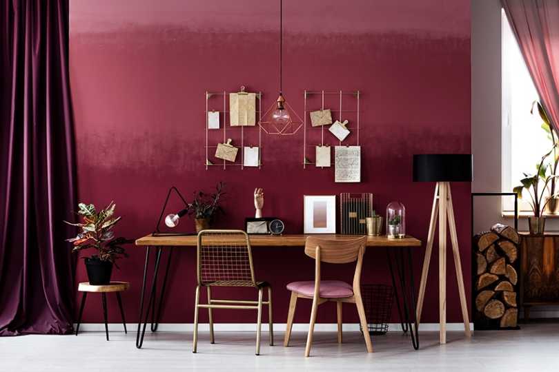
Bordeaux Color – What Color is Bordeaux?
The world of color can become very confusing at times, as there are so many different shades and hues, so we need to understand these colors to be able to apply them in our art. Take the color, Bordeaux, for example, it can be many different shades from a light Bordeaux color to a dark red. So, to get a better understanding, let us take a closer look.Table of ContentsToggleWhat Color is Bordeaux? Bordeaux Color: A Brief HistoryMeaning of the Bordeaux Color Shades of Bordeaux BurgundyCarmineClaret Maroon What Colors Go With Bordeaux?Bordeaux Complementary Colors Bordeaux Monochromatic Colors Bordeaux Analogous Colors Bordeaux Triadic Colors How to Make Bordeaux Color Paint for ArtworksBordeaux Color Palettes in Design and FashionBordeaux Color in Fashion ConclusionFrequently Asked QuestionsWhat Color Is Bordeaux?Is Bordeaux a Warm or Cool Color?What Does the Bordeaux Color Represent? What Color is Bordeaux? The color Bordeaux is a somber and deepshade of redand is also often referred to as maroon, burgundy, or even claret. It is a dark and shaded Merlot red color that has oaky undertones and is an ideal color for painting your dining room, entrance hall, and front door, as it makes a bold statement when entering your home.Bordeaux ShadeHex CodeCMYK Color Code (%)RGB Color CodeBordeaux ColorBordeaux#4c1c240, 63, 53, 7076, 28, 36 Bordeaux Color: A Brief History The color Bordeaux officially obtained its name in 1891 in honor of a French wine called Bordeaux, which has a very dark red color, similar to other wines produced such as cabernet and merlot. Before this, the Russians used the wordchermny, which describes this shade of red. Ancient rulers or emperors often wore aburgundy coloras their official shade or hue to display their status or office. It is a bit difficult to pinpoint the Bordeaux color in paintings, although somefamous paintingsusing this shade include theFrench Riverscape(1829) by Peraire Paul Emmanuel andRolla(1876) by Henri Gervex. Meaning of the Bordeaux Color The color Bordeaux signifies an opaque dark-red color, with a touch of purple. The color is named after the Bordeaux wine, which originated in France and has a very long history associated with the world of wines. From one perspective, Bordeaux’s color shows the majesty and power of red, and on the other hand, it shows the joyfulness of yellow and the calm of dark blue. Bordeaux absorbs the quality of all theprimary colorsrevealing a bright character, and expressing respectability, dignity as well as power. The color also adds a touch of Christmas to the holidays, and as such, most of the traditional decorations depicting the new year are very often a shade of Bordeaux. Appreciation for the color of Bordeaux expresses, stability, confidence, and excellent organizational skills. However, when applied excessively, it begins to reveal depression and heaviness. It is a very elegant and sober color signifying love, passion, sensuality, and vigor, and is a popular autumn color where home décor and clothing are concerned. Shades of Bordeaux There are many different shades of Bordeaux from light to dark Bordeaux. Bordeaux has also been referred to as Burgundy, claret, or maroon. Here are some colors that are closely related to Bordeaux: Burgundy Burgundy is a shade of Bordeaux that has a reddish-brown hue, inspired by a French wine of the same name, and can be made by mixing red and a dash of blue and green, resulting in purple and brown overtones. Burgundy is more refined than true red and symbolizes power, ambition, and wealth.Bordeaux ShadeHex CodeCMYK Color Code (%)RGB Color CodeBordeaux ColorBurgundy#8000200, 100, 75, 50128, 0, 32 Carmine The color carmine is a deep vivid red with a slightly purplish tone. However, is closer to red than it is to crimson, and some rubies have the color of a rich deep carmine. Carmine dye is a natural extract that comes from the crushed shells of the female cochineal insect and is often used to color strawberry yogurt, designer drinks, candy, and different shades of lipstick. Bordeaux ShadeHex CodeCMYK Color Code (%)RGB Color CodeBordeaux ColorCarmine#d700400, 100, 70, 16215, 0, 64 Claret Claret is a rich, deep, and dark shade of red, and is often referred to as Bordeaux. It can be acquired by mixing red and black, and due to its many shades, is often used in winter and autumn color schemes. Claret represents nobility and is often found in women’s clothing and cosmeics, and can also be applied in your home using dark or lighter tones.Bordeaux ShadeHex CodeCMYK Color Code (%)RGB Color CodeBordeaux ColorClaret#8113310, 85, 62, 49129, 19, 49 Maroon Maroon has a deep red hue, and it can show up as brown in different designs. Maroon can be combined with various deep colors like dark purple and navy blue, giving it a very mysterious and intense effect. Maroon can also be mixed with peach or amber, giving you a much boldercolor combination. Maroon is also coupled with passion, depth, and force due to its very dark quality, and also arouses sentiments of wisdom and spirituality due to the color’s intimate relationship with Buddhism. Bordeaux ShadeHex CodeCMYK Color Code (%)RGB Color CodeBordeaux ColorMaroon#8000000, 100, 100, 50128, 0, 0 What Colors Go With Bordeaux? When combining colors with Bordeaux, you will find red expresses tranquility and power, dark blue gives a burst of enthusiasm, and yellow brings out a cheerful atmosphere. In fashion, the Bordeaux hue pairs well with olive, black, tomato, gray, and most shades of red, and it provides a great balance to most berry tones, such as blueberries, blackberries, and elderberries. Other colors that give a well-balanced combination with Bordeaux are pink, brown, ultramarine, blue-green, turquoise, orange, Umber, and coral. The numerous color combinations that go with Bordeaux are as follows. Bordeaux Complementary Colors Many people seem to be confused with the term “complementary” as it means appreciative, approving, harmonizing, and supportive in the English language. However, when it is about colors, it can also mean opposite or contrasting. This means that complementary colors face one another on the color wheel. When talking about pigments and paint andmixing these colors, they tend to cancel each other out. If you mix paints with them, you will produce a more muted color, which can be gray or muddy brown. This type of combination gives you a high impact and contrasting colors that appear to be more prominent and brighter. So, what is the complementary color of Bordeaux? Let us consider the below chart for the answer to this question.ShadeHex CodeCMYK Color Code (%)RGB Color CodeColorBordeaux#4c1c240, 63, 53, 7076, 28, 36 Midnight Green#1c4c4463, 0, 0, 7028, 76, 76 Bordeaux Monochromatic Colors A monochromatic color palette is a variation of different tones, tints, or shades of one single color, which gives you a conservative and subtle color combination. This versatile color combination will give designs a harmonious look. So, what are the monochromatic colors for Bordeaux? let us take just two of the monochromatic colors and show them in the chart below. ShadeHex CodeCMYK Color Code (%)RGB Color CodeColorBordeaux#4c1c240, 63, 53, 7076, 28, 36 Dark Red#8b000027, 100, 100, 34139, 0, 0 Moderate Red#bc495c0, 61, 51, 26188, 73, 92 Bordeaux Analogous Colors An analogous color scheme is easy to understand, as it groups three or more hues that appear right next to one another on thecolor wheel, which comprises the main dormant color and two supporting colors on either side of it. Let us now consider some of the analogous colors for Bordeaux in the chart below.ShadeHex CodeCMYK Color Code (%)RGB Color CodeColorBordeaux#4c1c240, 63, 53, 7076, 28, 36 Dark Pink#4c1c3c37, 97, 39, 52105, 22, 57 Dark Orange#bc442419, 82, 92, 9188, 68, 36 Bordeaux Triadic Colors Triadic colorcombinations consist of three colors equally spaced, in the form of a triangle, on the traditional color wheel. The best way to use these colors includes a dominant color and other equally spaced colors that can serve as accent colors. The triadic color scheme allows the colors to be eye-catching, vibrant, and lively whenever they are used together. Let us now consider the three triadic colors for Bordeaux in the chart below.ShadeHex CodeCMYK Color Code (%)RGB Color CodeColorBordeaux#4C1C240, 63, 53, 7076, 28, 36 Dark Blue#1c244c100, 32, 38, 3928, 36, 76 Dark Lime Green#41A31775, 6, 100, 165, 163, 23 How to Make Bordeaux Color Paint for Artworks When mixing paint, to create a Bordeaux color for your painting, you need to have the following colors. The exact proportions of paint you will need for the mix are dependent on the medium you are going to use, such as watercolor acrylic or oil paint. ShadeHex CodeCMYK Color Code (%)RGB Color CodeColorPhthalo Blue#000f89100, 89, 0, 460, 15, 137 Cadmium Red#d22b2b0, 80, 80, 18210, 43, 43 Cadmium Yellow#fdda0d0, 14, 95, 1253, 218, 13 Burnt Umber#6e260e0, 65, 87, 57110, 38, 14 White#ffffff0, 0, 0, 0255, 255, 255 Let us now follow the process you need to follow to create the perfect color mix of Bordeaux paint color. On your palette squeeze out some blue, red, and brown paint. Drag a small amount of the red paint into the center of your palette forming a circle. Take a very small amount of blue paint and mix it with the red paint. Take twice as much brown as blue paint and mix it with the red paint. Continue to mix until you reach the color you are looking for.Bordeaux Color Palettes in Design and Fashion The use of Bordeaux paint in your home can create a lively and welcoming atmosphere, and used in private spaces, like the master bedroom, can create a feeling of energy. However, you must make use of neutral tones, such as white or light gray, to keep the intensity of the color down, so as not to overshadow the space. Subtly bring in the color using patterned rugs, cushions, luxurious couches, or drapes within a neutral-based room. You can also use shades of light Bordeaux color, for less of a dramatic effect. Bordeaux Color in Fashion When discussing fashion, and it comes to the autumn season, it is virtually impossible not to consider the color Bordeaux, as it is regarded as an extremely versatile color in most fashion brands throughout the world. Its versatility makes it an ideal color to combine with colors such as gray and burgundy, and it also blends perfectly with green, mustard, and persimmon. For garments worn on the upper body like shirts or blouses, it can work well when combined with black or gray trousers and for the lower body like trousers, Bordeaux blends well with shirts withwarm colorslike mustard or pink. The color Bordeaux will always go well with colors like black and white. Conclusion The Bordeaux color is very bold, and you will be able to create amazing effects when it comes to home décor. When the Bordeaux color is paired withhunter greenor gold, it produces an extremely sophisticated appearance. We sincerely hope you have enjoyed this article about the vibrant Bordeaux color with all its color combinations.Frequently Asked QuestionsWhat Color Is Bordeaux? Bordeaux is a very rich color and is a very somber and deep red color like burgundy, claret, and maroon. The color got its name from the dark red wine with a similar name. Is Bordeaux a Warm or Cool Color? With its rich red harmonious color, Bordeaux is considered a warm color. In ancient history, emperors used to wear a shade of Bordeaux, which has the majesty and power of warm red but also has the calming effect of dark blue and the joyful effect of yellow. What Does the Bordeaux Color Represent? Bordeaux represents stability, confidence, power, love, passion, and enterprise, but if used in excessive amounts, it can tend to become depressing and heavy. Good pairings for the Bordeaux color are light gray, ivory, white, beige, milk, and cream.

Azure Blue Color – Learn All About the Various Shades of Azure
When someone mentions the word azure, it conjures up images of crystal clear water and wide open blue skies. As a shade of blue, the azure blue color is a particular favorite among many. There are also shades of azure you can choose from. Below we will be discussing a few more interesting facts about the azure blue color.Table of ContentsToggleDescription of Azure BlueA Brief History: Azure Blue ColorMeaning of the Azure Blue ColorShades of AzureLapis LazuliRoyal Azure BlueAlice BlueAzure Blue Color CombinationsComplementary Azure ColorsAnalogous ColorsMonochromatic ColorsTriadic ColorsMixing Azure Blue PaintsDesigning With Azure BlueConclusionFrequently Asked QuestionsWhat Color Is Azure?Where Does the Azure Color Name Come From?How to Mix Azure Blue Acrylic Paint?Description of Azure Blue What color is azure? Azure blue belongs to the blue family of colors and when looking at the visible light spectrum, can be found between blue and cyan. The color is often used as a description of the sky on a sunny and clear day. The azure-blue color can be described as being a little lighter than blue and more vibrant than dark blue. The color is said to be derived from the lapis lazuli stone. Besides the stone, the azure color can also be found in many different types of insects and birds.When mixing paint colors, azure blue remains between blue and cyan, however, many experts say there is also a hint of purple. When looking at colors on websites and for printing, there are different color codes used to display the varying amounts of colors used. The hex code also helps to identify colors, in this case, the azure blue color code is #007fff. Most consider azure to be a color on its own and distinct from blue. However, there is a range of azure colors, so you might find different hex codes also indicating this color.Azure ShadeAzure Hex CodeCMYK Azure Color Code (%)RGB Azure Color CodeAzure ColorAzure Blue#007fff100, 50, 0, 00, 127, 255 Blue#0000ff100, 100, 0, 00, 0, 255 Dark Blue#00008b100, 100, 0, 450, 0, 139 A Brief History: Azure Blue Color The azure blue color gets its name from a blue mineral known as lapis lazuli.Lazuliis a medieval Latin word that comes fromlazawardin Arabic, which is the name of the Persian stone. Azure comes from the French, who mistranslated the Arabic word. The name azure was first documented as a color in 1374 by Geoffery Chaucer, in his poemTroilus and Criseyde(completed around the 1380s). Some get confused with azurite and lapis lazuli.Lapisis Latin for the word “stone”, and you havelapis linguis, which is known as azurite. However, you also havelapis lazuli, also referred to as lazurite. Both of these are blue stones, which have a distinctive azure color. However, azurite does tend to have more of a deeper azure blue color.During the Renaissance period in Europe, lapis lazuli was very expensive due to the process of obtaining the blue pigment, and the final yield was extremely small. Many also refer to this deep blue pigment from the lapis lazuli as ultramarine blue.In many of the old paintings, azurite and lapis lazuli have been incorrectly labeled, as some of the azurite blue pigments have been mistakenly identified as lapis lazuli. Sometimes, both pigments have been used in paintings, the cheaper azurite was used as an underpainting, while the more expensive lapis lazuli was used in the glazes. Azurite was often used since antiquity and was very popular during the 15th and 17th centuries in European paintings. Crushed azurite was a popular pigment used byAncient Egyptian artisans, and the pigment has also appeared on the walls in China cave paintings. However, since the beginning of the 18th century, when Prussian blue came into the picture, pigments from azurite have disappeared. When creating the pigment, the azurite was ground coarsely, to help preserve the beautiful deep blue color. The fine-ground azurite produced a lighter blue color. You can see the azurite blue inA View of Het Steen in the Early Morning(1636) by SirPeter Paul Rubens. The azurite blue color is evident in the beautiful sky. Today, the United Nations uses the color and have called it “United Nations Azure”. Not only in the flag, but the color is also part of the uniform in the blue beret. Meaning of the Azure Blue Color Since azure is part of the blue family, it has similar associations and meanings as the color blue. The color is calming and reminds us of open spaces, blue skies, and oceans. The azure color is also soothing and refreshing and is associated with cleanliness. Blue colors, including azure, are also linked to intelligence, confidence, trust, responsibility, logic, and loyalty. The color can help to encourage more thoughtful and deep thinking.The azure blue color can also be reminiscent of paradise, and tranquility and helps to promote relaxation. Overuse is mainly associated with being cold, unstable, and weak. Blue, in general, can also be linked to depression and unfaithfulness. However, overall, the azure blue color is that of contentment and is simply pleasant to look at. Shades of Azure There are a few different shades of azure from dark azure blue to pale and royal azure blue. So, if you do not like a particular azure blue color, you can easily try something darker or lighter to fit the mood. Each of these shades has its own azure blue color code for both printing purposes as well as webpages. These will be the CMYK (cyan, magenta, yellow, and black) and RGB (red, green, and blue) color codes respectively, and represents the percentage of each color that creates azure. This information is important for anyone in the graphic design business.Lapis Lazuli This particular shade is more of a dark azure blue and is a representation of the actual lapis lazuli gemstone. When compared to the azure blue color, it does seem to have more of a purple undertone. This color can sometimes be confused with indigo; however, these are completely separate colors.Azure ShadeAzure Hex CodeCMYK Azure Color Code (%)RGB Azure Color CodeAzure ColorLapis Lazuli#26619c76, 38, 0, 3938, 97, 156 Royal Azure Blue This is a rich tone of azure blue and can also be described as being a dark blue color. If you are working on graphics or the RGB azure blue color code, the color contains zero red, 22 percent green, and 65.9 percent blue.Azure ShadeAzure Hex CodeCMYK Azure Color Code (%)RGB Azure Color CodeAzure ColorRoyal Azure Blue#0038a8100, 67, 0, 340, 56, 168 Alice Blue Going to the light side of the spectrum, this color can be described as being a pale shade of azure. The hue was the preferred color of Alice Roosevelt Longworth, Theodore Roosevelt’s daughter. She was also a painter and because of her position and exposure to the public, began a fashion trend. This particular shade of azure is also a part of the original X11 web colors and is often referred to as white blue.Azure ShadeAzure Hex CodeCMYK Azure Color Code (%)RGB Azure Color CodeAzure ColorAlice Blue#f0f8ff6, 3, 0, 0240, 248, 255 Azure Blue Color Combinations Azure is a vibrantshade of bluethat also comes in a variety of shades and tones. Blue is quite a versatile color and, generally, goes with many different colors. To get the bestcolor combinations, you can bring out the color wheel. Each color combination can be found in different positions and forms on the color wheel. Complementary Azure Colors To make the azure blue color stand out, it is always a good idea to pair it with colors that sit on the opposite side of the color wheel. In this case, the color chosen below is a vibrant orange. If you are using contrasting colors like these in a design, you should consider using a single vibrant color, and use any other colors in moderation or as an accent color. There are color combinations that include four or more colors, for example, tetradic colors, but we will be only going up to three color combinations below.ShadeHex CodeCMYK Color Code (%)RGB Color CodeColorAzure Blue#007fff100, 50, 0, 00, 127, 255 Orange#ff80000, 50, 100, 0255, 128, 0 Analogous Colors These are colors on the same side of the color wheel and are found close to each other. Since Azure is found in between cyan and blue, it is safe to say that these colors are analogous to the azure blue color.ShadeHex CodeCMYK Color Code (%)RGB Color CodeColorAzure Blue#007fff100, 50, 0, 00, 127, 255 Cyan#00ffff100, 0, 0, 00, 255, 255 Blue#0000ff100, 100, 0, 00, 0, 255 Monochromatic Colors When you take a single color, like azure blue, and you use different shades and tones of this particular color, you are creating a monochromatic color scheme. So, you will see below in the table, a lighter and darker version of azure blue.ShadeHex CodeCMYK Color Code (%)RGB Color CodeColorAzure Blue#007fff100, 50, 0, 00, 127, 255 Light Blue#4da5ff70, 35, 0, 077, 165, 255 Strong blue#0059b3100, 50, 0, 300, 89, 179 Triadic Colors This is another color combination that offers contrast and allows each color to stand out. On the color wheel, the colors form an equal-sided triangle shape, making it easier to find. Again, it is best to use a single main color, while the others work as accent colors.ShadeHex CodeCMYK Color Code (%)RGB Color CodeColorAzure Blue#007fff100, 50, 0, 00, 127, 255 Chartreuse#7fff0050, 0, 100, 0127, 255, 0 Rose#ff007f0, 100, 50, 0255, 0, 127 Mixing Azure Blue Paints You could achieve the azure blue color by blending green and blue to create a cyan color and then add in a small amount of purple like indigo, which is more of a deep blue and violet color. Green is not aprimary color, so to avoid any issues, it might be best to create your own green. Green is a blend of yellow and blue, so you will have more control over the amount of yellow that goes into the azure blend. You can regulate the color temperature by making it warmer or cooler. Adding more yellow will create awarmer color, just remember to keep it subtle by adding small amounts, otherwise, you will lean more toward green. Add more blue to keep things cooler.Many paints you purchase in a tube are also warmer or cooler. For example, ultramarine blue is considered a warmer blue, while cerulean blue is more of a greenish, cool blue color. Again, azure has a slight purple undertone, so you could also create your own purple color, which is a blend of red and blue. This then provides more control over the amount of red color added.Many professionals claim that azure is more of a bright blue, without the purple undertone, so you can leave out the purple if you want. You can try various proportions, just remember to create a color palette when experimenting, so you can refer back to the color chart when you need to. Designing With Azure Blue Azure blue is a popular color that can grab your attention, so it is the perfect color when used for advertising. Azure blue can also make beautiful outfits and fashion accessories. When considering interior design, all shades of blue have universal appeal. Blue can go with virtually any color, and you can use any shade of azure blue you want. Try the most vibrant and bold azure blue color as an accent color or use a pale azure as your base or neutral color. You can use azure blue in any room, but since it is relaxing, it does have a certain appeal in the bedroom. Azure blue goes especially well with white, gray, and other moreneutral colors. However, it can stand out when placed next toshades of orangeand yellow. When using a color scheme, you should consider the 60-30-10 rule, where your main color takes up most of the space, while the other colors come in as accents.Even though blue is a versatile color, to create a more balanced look, it should not be overused. Try to use accent walls and furniture to bring in the color. Remember, you can also use different patterns and textures on fabrics. Accessories are always great when bringing in some color to a neutral background. For example, cushions, rugs, vases, drapes, and even appliances in the kitchen.Conclusion Whether it is a bright azure blue color or dark azure blue, this color does stand out amongst other shades of blue. A relaxing and refreshing color that can easily be used in graphic and interior designs. Not only is the color ideal for a corporate image, but it is also perfect for that holiday house on the beach.Frequently Asked QuestionsWhat Color Is Azure? The azure blue color can be described as being a blend of blue and green or cyan since it is located between these colors on the color wheel. Azure blue is also acool colorand is often used to describe the sky on a clear and sunny day. Where Does the Azure Color Name Come From? Azure is French in origin and means sky blue. However, this was derived from an Arabic word, which was used to describe the color of the stone lapis lazuli. From French, the name eventually made it through to the English language. How to Mix Azure Blue Acrylic Paint? The quickest way to create an azure-blue color is to mix blue-violet paint with some white paint since many experts say that azure has a slight purple tint to it. You could also purchase an azure blue color already in a tube or bottle.
Why Hydration Sprays Are A Must-Have In Your Daily Beauty Routine
I like to call the Hydration Sprays the true multitaskers. As an esthetician, I know the benefits they give to the skin thanks to their clean, skin-loving ingredients. And, I’m a makeup artist, so I see how well they work with our makeup when I’m working on events and photoshoots. From delivering a boost of hydration, setting your foundation, helping to calm irritated skin or balance oily skin, these hydrating mists are truly a gamechanger in your daily routine. With buzzwords like “dewy” and “glass skin” being used nowadays, Hydration Spray is the perfect item to be used throughout the day to keep your glow on! Let’s take a deeper dive into each Hydration Spray and its benefits:Pommisst Hydration SprayIt’s our bestseller and not just because it smells divine! Botanicals like Pomegranate, Rosemary and White Tea Extracts make it a powerhouse of antioxidants. Ideal for all skin types. While all our sprays set makeup, Pommisst is a facial mist that works hand in hand with your SPF to help your skin repair itself and recover more quickly from sun damage. Talk about a gamechanger! Remember, the Pomegranate Extract is what protects skin from free radicals that cause hyperpigmentation. If you are investing in treatments that address hyperpigmentation, Pommisst should be the last step in your makeup routine to help prevent further hyperpigmentation. Pro Tip: Pommisst can be used as more than just a hydrating mist, use it on color treated hair to help combat brassiness!Balance Hydration SprayMy oily-skinned or acne-prone women, fear not, this spray is ideal for you! I know many of you stay away from any products that say moisturizing or hydrating. True you don’t need extra oil on your skin, but hydration (water-based) is what your skin is thirsting for. Extracts of Grapefruit and Orange Peel in this hydrating mist help to balance sebum production. When your skin’s natural oils mix with sweat and humidity it can create a breeding ground for bacteria and blemishes usually follow. Balancing sebum, keeping the bacteria at bay and delivering hydration is what this spray does best. If you travel a lot this spray doubles as a toner for oily/combination skin, just saturate your cotton pad and swipe all over your face. One less item to pack!.ubf6a4b34580443b898f33916559945a1 { padding:0px; margin: 0; padding-top:1em!important; padding-bottom:1em!important; width:100%; display: block; font-weight:bold; background-color:#eaeaea; border:0!important; border-left:4px solid #34495E!important; text-decoration:none; } .ubf6a4b34580443b898f33916559945a1:active, .ubf6a4b34580443b898f33916559945a1:hover { opacity: 1; transition: opacity 250ms; webkit-transition: opacity 250ms; text-decoration:none; } .ubf6a4b34580443b898f33916559945a1 { transition: background-color 250ms; webkit-transition: background-color 250ms; opacity: 1; transition: opacity 250ms; webkit-transition: opacity 250ms; } .ubf6a4b34580443b898f33916559945a1 .ctaText { font-weight:bold; color:#464646; text-decoration:none; font-size: 16px; } .ubf6a4b34580443b898f33916559945a1 .postTitle { color:#9B59B6; text-decoration: underline!important; font-size: 16px; } .ubf6a4b34580443b898f33916559945a1:hover .postTitle { text-decoration: underline!important; } See alsoSummer Clean Beauty Must-Haves - A Beautiful MessD2O Hydration SprayThis moisture-packed facial mist is perfect for those with dry skin. Algae Extract is a powerful humectant that “draws” moisture to the skin. D2O also contains Ylang Ylang which helps to soothe the skin. I love to keep my Hydration Spray in the fridge on hot, humid summer days for an invigorating pick-me-up. D2O also works wonderfully on post-laser skin to help calm redness and irritation. Pro Tips: Spray liberally on your brush to create liners out of any powder eye shadows.Calming Lavender Hydration SprayI feel like this Hydration Spray doubles as aromatherapy. Lavender delivers that feeling of calm to the mind. Chamomile helps to calm sensitive, red or irritated skin. The real star ingredient? Myramaze Extract, this provides deep hydration and helps to minimize the appearance of fine lines. While it is ideal for dry, sensitive skin, anyone needing to create a moment of soothing calm can use Calming Lavender. Pro tips: Use Calming Lavender at night! My personal nighttime ritual includes this hydrating mist; I keep it on my nightstand. After my nighttime skin care ritual, I spray this on my face, then on my pillowcases. It signals to my mind and body it’s the end of a day. Time for regeneration of the skin, body and mind!I hope this inspired you to make sure to incorporate a Hydration Spray into your routine. Summer is upon us now, that means travel plans! I invite you to get our full size (3.4 oz) or our Mini Hydration Sprays (.4 oz) for your carry on. Both are TSA approved, and all our sprays are refillable..u4f85fba4e21767757133b9b59e2735f1 { padding:0px; margin: 0; padding-top:1em!important; padding-bottom:1em!important; width:100%; display: block; font-weight:bold; background-color:#eaeaea; border:0!important; border-left:4px solid #34495E!important; text-decoration:none; } .u4f85fba4e21767757133b9b59e2735f1:active, .u4f85fba4e21767757133b9b59e2735f1:hover { opacity: 1; transition: opacity 250ms; webkit-transition: opacity 250ms; text-decoration:none; } .u4f85fba4e21767757133b9b59e2735f1 { transition: background-color 250ms; webkit-transition: background-color 250ms; opacity: 1; transition: opacity 250ms; webkit-transition: opacity 250ms; } .u4f85fba4e21767757133b9b59e2735f1 .ctaText { font-weight:bold; color:#464646; text-decoration:none; font-size: 16px; } .u4f85fba4e21767757133b9b59e2735f1 .postTitle { color:#9B59B6; text-decoration: underline!important; font-size: 16px; } .u4f85fba4e21767757133b9b59e2735f1:hover .postTitle { text-decoration: underline!important; } See alsoHailey Bieber’s Calling 2024’s Biggest Beauty Trend
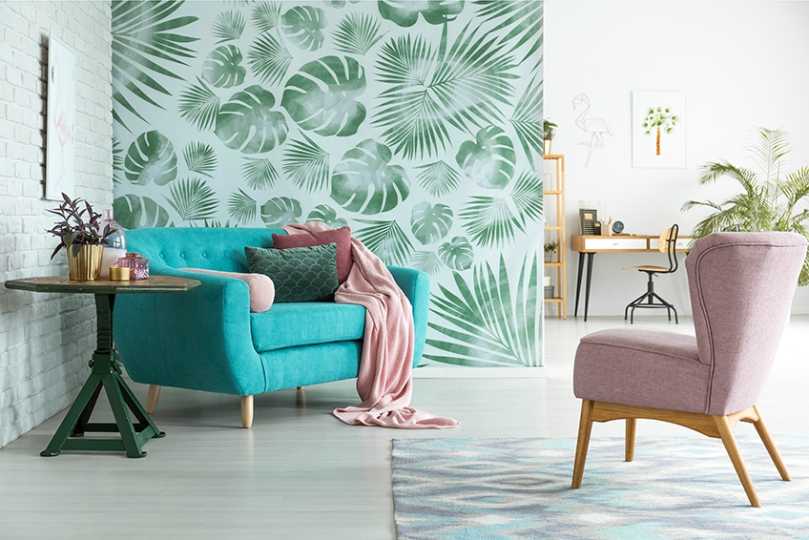
Tiffany Blue Color – Colors That Go Well With Tiffany Blue
What color is Tiffany and why is it associated with luxury and elegance? To answer these questions and more, we will be going on a journey to discover everything there is to know about this beautiful and popular color.Table of ContentsToggleWhat Color Is Tiffany?Tiffany Blue: A Brief HistoryMeaning of the Color Tiffany BlueShades of Tiffany BlueTurquoiseAquaMint BlueColors That Go Well With Tiffany BlueComplementary Tiffany Blue ColorsAnalogous Tiffany Blue ColorsMonochromatic Tiffany Blue ColorsTriadic Tiffany Blue ColorsHow to Work With Tiffany Blue?How to Mix Tiffany Blue PaintTiffany Blue Color Palettes for the HomeTiffany Blue on the WallsDecorative Tiffany Blue AccentsConclusionFrequently Asked QuestionsWhat Color Is Tiffany?What Are Colors That Go Well With Tiffany Blue?Why Is the Tiffany Color Popular?What Color Is Tiffany? The Tiffany blue color can be described as a light blue shade or strong cyan that is extremely similar to the color also known as robin egg blue. There is only a slight variation, so you can say that Tiffany blue is simply a shade of the robin egg blue. According to computer graphics, they each have separate hex codes that identify them. Tiffany blue can also be seen as a turquoise blue, but is it the same as turquoise? Turquoise has more of a green undertone and is a brighter shade of cyan, while Tiffany blue is a little closer to a blue undertone and is a darker shade of cyan.Tiffany Blue ShadeHex CodeCMYKColor CodeRGB Color CodeTiffany Blue ColorTiffany Blue#0abab595, 0, 3, 2710, 186, 181 Robin Egg Blue#1fcecb85, 0, 1, 1931, 206, 203 Tiffany Blue: A Brief History The name comes from a well-known New York jewelry company known as Tiffany & Co. The company was established by two people, Charles Tiffany, and John Young, in the early 19th century. Charles Lewis Tiffany was a jeweler, who came up with a specific color for the jewelry he made as well as the packaging. Nobody knows why he chose the specificshade of bluebut it has become synonymous with the jewelry brand. Some believe the color was chosen because of the turquoise Victorian jewelry that was quite popular at the time. The Tiffany blue color was first used in 1845 and was the color chosen for what is known as the company’sBlue Book. This book was printed annually and contained hand-drawn illustrations of the jewelry collection, which was distributed to customers as the first direct mail catalog for fine jewelry. This tradition still occurs with the annual blue book collection, which is now filled with photos and can be viewed online or in print.Over the years, the color became part of more than just the book, it moved on to become the color that represents the brand and can be seen in the packaging, advertising, jewelry creations as well as other accessories.The color Tiffany Blue has been registered and become a color trademark since 1998. Pantone also standardized and custom-made a color identified as “1837 Blue”, which is exclusive to the Tiffany brand in 2001, and not available to the public. So, the color cannot be used in advertising, packaging, or for any other use that is in direct competition with the Tiffany company brand. Even though the color is heavily associated with the jewelry company, it remains a popular shade of blue in fashion and interior design.Meaning of the Color Tiffany Blue Since Tiffany blue has such a strong connection to the jewelry brand, it is also associated with luxury, glamor, sophistication, elegance, confidence, and excitement. However, the color can also be fun, fresh, cool, confident, peaceful, relaxing, and vibrant, and can be used in many design applications.Shades of Tiffany Blue Tiffany blue can be confused with some other colors that are quite similar. These colors can be described as shades of Tiffany blue, and each can be identified as a separate color with its own hex code. You will also notice that each color code, will show you slight variations in color composition.Turquoise Turquoise is a bright cyan color that is a mix of green and blue. This is a friendly, calming, and tranquil color that is often associated with the beach and ocean. However, it is named after the mineral known as turquoise.Tiffany Blue ShadeHex CodeCMYK Color CodeRGB Color CodeTiffany Blue ColorTiffany Blue#0abab595, 0, 3, 2710, 186, 181 Turquoise#40e0d071, 0, 7, 1264, 224, 208 Aqua This is an even brighter, pure form of cyan, and is also known as electric cyan or waterspout. The names aqua and cyan are used interchangeably in computer graphics. You can mix this paint color, by combining light blue with light green paint.Tiffany Blue ShadeHex CodeCMYK Color CodeRGB Color CodeTiffany Blue ColorTiffany Blue#0abab595, 0, 3, 2710, 186, 181 Aqua#00ffff100, 0, 0, 00, 255, 255 Mint Blue Mint blue is leaning towards a more moderate and darker cyan color. The color name was first recorded in 1920 and was taken from the color of breath mints. To create mint blue paint, mix yellow and blue to get green, and then add in some white.Tiffany Blue ShadeHex CodeCMYKColor CodeRGB Color CodeTiffany Blue ColorTiffany Blue#0abab595, 0, 3, 2710, 186, 181 Mint Blue#429e9d58, 0, 1, 3866, 158, 157 Colors That Go Well With Tiffany Blue Tiffany blue, like most colors, will always go well with white and otherneutral colorslike beige or cream, to create a sophisticated look. Other colors that go well with Tiffany blue include black, as well as sterling silver, dark blues, corals, and yellow. Let us first look at some color combinations that work with color theory and thecolor wheel.Complementary Tiffany Blue Colors Thiscolor combinationproduces contrast, where colors stand out when placed next to each other. This means, if you choose a color on the color wheel, the hue directly opposite will be the complementary color. Othershades of orangeand yellow should also produce a similar effect. ShadeHex CodeCMYK Color Code (%)RGB Color CodeColorTiffany Blue#0abab595, 0, 3, 2710, 186, 181 Strong Red#ba0a0f0, 95, 92, 27186, 10, 15 Analogous Tiffany Blue Colors This color combination is different from the complementary colors, as they are more harmonious and easier to look at. You will find these colors in the same general area on the color wheel, so they will all have something in common with the other. These will be your shades of blue and green when it comes to Tiffany blue.ShadeHex CodeCMYK Color Code (%)RGB Color CodeColorTiffany Blue#0abab595, 0, 3, 2710, 186, 181 Strong Green#0aba5d95, 0, 50, 2710, 186, 93 Strong Blue#0a67ba95, 45, 0, 2710, 103, 186 Monochromatic Tiffany Blue Colors When you take one color like Tiffany blue and you create variations, some lighter and some darker in color, this will form a monochromatic color scheme. These are similar to analogous colors in that they are easy on the eyes and there is not much of a big difference in the colors.ShadeHex CodeCMYK Color Code (%)RGB Color CodeColorTiffany Blue#0abab595, 0, 3, 2710, 186, 181 Dark Cyan#06716e95, 0, 3, 566, 113, 110 Light Vivid Cyan#1ef3ed88, 0, 2, 530, 243, 237 Triadic Tiffany Blue Colors This color combination forms a contrast again, and the colors tend to stand out when paired. The colors appear in an equal-sided triangle shape that can be seen on the color wheel. There are other color combinations with more colors, for example, square, rectangular, or tetradic color combinations.ShadeHex CodeCMYK Color Code (%)RGB Color CodeColorTiffany Blue#0abab595, 0, 3, 2710, 186, 181 Strong Yellow#bab50a0, 3, 95, 27186, 181, 10 Strong Magenta#b50aba3, 95, 0, 27181, 10, 186 How to Work With Tiffany Blue? Tiffany blue is a wonderful color that can be used for many purposes. You will be bringing a cool, fresh, and vibrant color to any design. Every color has meaning and a certain resonance, and if you can capture this design element, then you can subtly influence those around you. How to Mix Tiffany Blue Paint The basic composition of Tiffany blue would be blue, green, and white. You can begin by placing some white paint on your mixing surface. To this add a little bit of dark blue and mix well. Follow this by mixing in small amounts of dark green and yellow. You can then add more white, and, if necessary, more blue. You can also mix your own green by using blue and yellow.You can experiment with the proportions until you achieve a Tiffany blue color. Create for yourself a Tiffany blue color palette or chart as a reference, as you mix your paints. You can also try taking some turquoise paint and adjusting this by adding a little more blue, yellow, and white paint. You will again need to experiment with proportions and types of paint colors until you are happy with the results. Tiffany Blue Color Palettes for the Home There is a variety of Tiffany paint colors for the home, which can help to produce an elegant, cool, fresh, and inviting space. You can easily combine Tiffany blue with natural wood elements for a more sophisticated look, or go for a more retro style, for example, polka dots and patterns on rugs or throw pillows. Remember, overusing blue can be overwhelming and create a cold feeling. It is recommended that you combine Tiffany blue with other shades and colors. Tiffany Blue on the Walls Tiffany blue can be your main color on the walls, however, pairing it with another color like white can balance the look. For example, Tiffany blue walls with a white ceiling and wall trimmings, and doors. Tiffany blue can also make a wonderful focal point and accent wall, which is also less overwhelming. You can also consider Tiffany wallpaper patterns. As mentioned, there are numerous Tiffany blue paint colors, below are a few examples.Tiffany Blue ShadeTiffany Blue Hex CodeCMYK Tiffany Blue Color Code (%)RGB Tiffany Blue Color CodeTiffany Blue ColorPoolside Blue#1fb9b483, 0, 3, 2731, 185, 180 Mariner#6bc0c345, 2, 0, 24107, 192, 195 Alexandra Valley#00bcb5100, 0, 4, 260, 188, 181 Decorative Tiffany Blue Accents If you are not looking to create an entire Tiffany blue color palette for a room, you can bring the color in more subtly. You can simply add in a few Tiffany color accents or accessories. This can be cushions, throws, rugs, art, or anything you can easily take away or replace. You can also paint moldings or arrange couches or chairs around the house.For the bedroom, it could be bedding, a side table, or a lamp. In the kitchen, you could paint the cabinets Tiffany blue, or simply have the color as plates and bowls in a display cabinet. You can consider Tiffany blue towels, rugs, and tiles in the bathroom.Conclusion The Tiffany blue color already has a reputation as being a luxurious, exciting, and elegant color. There are quite a few colors similar to Tiffany blue, but not have that status you might be looking for. Tiffany blue is a good choice to add freshness and confidence to any design idea.Frequently Asked QuestionsWhat Color Is Tiffany? Tiffany blue is a shade of blue that can be described as a strong cyan hue that has a greenish undertone. This color is extremely close to turquoise, which is a brighter version of cyan and is considered a separate color. What Are Colors That Go Well With Tiffany Blue? The Tiffany blue color can go well with many colors but always looks amazing when paired with white. Other neutral colors like cream and beige also work well. Shades of red, pink, orange, and even yellow can add pops of color. Other shades of blue as well as green can work well together. Why Is the Tiffany Color Popular? The color is closely associated with the Tiffany brand of jewelry, which helped link the color with certain ideas such as sophistication and elegance. The color signifies a time when the Tiffany blue jewelry boxes brought joy to many.
Cognac Color – What Colors Go With Cognac?
In most cases, if you mention cognac, burgundy, or Bordeaux, you will likely conjure up images of wine and brandy. However, this is exactly where each color comes from, with cognac specifically being a popular color in fashion and décor. To appreciate this color even further, we will be going over a few interesting facts about the cognac color.Table of ContentsToggleWhat Color Is Cognac?Cognac Color: A Brief HistoryMeaning of the Cognac ColorShades of Cognac BrownBurnt SiennaSaddle BrownTanWhat Colors Go With Cognac?Complementary Cognac ColorsAnalogous Cognac ColorsMonochromatic Cognac ColorsTriadic Cognac ColorsMixing Cognac Color Acrylic PaintCognac Color in Fashion and Interior DesignsFrequently Asked QuestionsWhat Color Is Cognac?What Colors Go With Cognac?What Color Is Cognac Leather?What Color Is Cognac? To understand what the real cognac color looks like, you will have to check out the French brandy. You will notice that the liquid has an earthy, glowing appearance, with shades of brown as well as red. You can also say that cognac is several shades lighter than that of the color burgundy. So, ultimately, you can describe the cognac color as a warm reddish brown. When it comes to cognac color vs. brown, both colors are extremely similar, and you can say that cognac is a shade of brown that has more of a moderate red undertone.ShadeHex CodeCMYK Color Code (%)RGB Color CodeColorCognac#9a463d0, 55, 60, 40154, 70, 61 Brown#a52a2a0, 75, 75, 35165, 42, 42 Cognac Color: A Brief History As we have mentioned, the cognac color comes from the French variety of brandy, which also originates from Cognac, a region found in France. So, the name comes from the actual place where the brandy is made. The alcoholic beverage is made from grapes, unlike some other drinks that are barley-based.The remodeling show, which is known as “This Old House”, selected cognac as their color of the month in 2014. They advised that cognac provides an elegant and luxurious feel when used to paint rooms. This is why other regal interiors use the color, for example, Buckingham Palace and other Victorian-type manors.It is also said that when Obama was President, the interior designer, Michael S. Smith, used furniture in the cognac color as accent pieces in the White House.Meaning of the Cognac Color Since cognac is a little bit red and brown, it does impart similar qualities. Cognac can symbolize power, warmth, wealth, and refinement. As with the cognac brandy, the color is also associated with luxury, sophistication, maturity, and stateliness. The brown brings in a sense of reliability and practicality. If the color is overused, it can become a bit pretentious and prideful, and irritating to some.Shades of Cognac Brown There are other shades of cognac brown that you can choose. All of these colors have similar traits and simply vary slightly in their composition. There might even be different cognac colors, with different hex codes when you search online. The hex code is a way you can identify a specific web color. Designers also rely on other information to help them decide on certain colors, for example, color codes. Color codes, like the RGB and CMYK, are used to determine how much of each color is present when it comes to online designs or printing. Each uses different additive and subtractive color methods to create the color you see. The ref, green, and blue (RGB) colors are derived from a light source, while the cyan, magenta, yellow, and black (CMYK) colors are used for printing. This means ink and pigments are used to create colors. Below are a few shades of cognac from burnt sienna to a natural tan.Burnt Sienna This is a deep reddish-brown color that originates from a substance known as sienna, which is an earth clay that gets it color from the minerals like iron oxide and manganese oxide. As you can see, the web color below can be described as a soft red.ShadeHex CodeCMYK Color Code (%)RGB Color CodeColorCognac#9a463d0, 55, 60, 40154, 70, 61 Burnt Sienna#e974510, 50, 65, 9233, 116, 81 Saddle Brown This particular shade is a rich and saturated saddle brown that has more of a brownish undertone that gets its name from the leather a saddle. The web color displayed below is described as beina a dark moderate red.ShadeHex CodeCMYK Color Code (%)RGB Color CodeColorCognac#9a463d0, 55, 60, 40154, 70, 61 Saddle Brown#8b45130, 50, 86, 45139, 69, 19 Tan This is a much lighter hue, but it also produces the same neutral look as cognac. The web color below is described as a slightly desaturated orange. Like all shades of brown, the tan color provides a sense of warmth, earthiness, and stability, and can easily work as a neutral color in designs.ShadeHex CodeCMYK Color Code (%)RGB Color CodeColorCognac#9a463d0, 55, 60, 40154, 70, 61 Tan#d2b48c0, 14, 33, 18210, 180, 140 What Colors Go With Cognac? Colors and how they work with each other can be a little confusing, so learning a bit more about color theory can help you gain a better understanding. When deciding on what colors go with cognac, the color wheel can help provide several great color combinations. Cognac goes well with many colors including shades of red and neutral colors like white, beige, tan, brown, copper, and black.Complementary Cognac Colors This color combination is perfect if you wish to create a color contrast. Any colors that are placed on opposing sides are deemed complementary colors. This can be anything from a dark cyan hue to navy blue. You can also consider lighter grayish-blue colors paired with cognac.ShadeHex CodeCMYK Color Code (%)RGB Color CodeColorCognac#9a463d0, 55, 60, 40154, 70, 61 Dark Cyan#3d919a60, 6, 0, 4061, 145, 154 Navy Blue#000080100, 100, 0, 500, 0, 128 Analogous Cognac Colors You will notice that all the warmer reds, yellows, and oranges are in one area of the color wheel, while the cooler greens and blue colors are located in the other. The colors that are positioned close to or next to each other are your analogous colors. So, shades of pink, red, and orange will work well with cognac.ShadeHex CodeCMYK Color Code (%)RGB Color CodeColorCognac#9a463d0, 55, 60, 40154, 70, 61 Dark Pink#9a3d620, 60, 36, 40154, 61, 98 Dark Orange#9a753d0, 24, 60, 40154, 117, 61 Monochromatic Cognac Colors Various shades and tints that are derived from cognac, which provide darker as well as lighter versions, are monochromatic colors. This color combination will always provide a harmonious look that is appealing and that can create more of a layered look in designs.ShadeHex CodeCMYK Color Code (%)RGB Color CodeColorCognac#9a463d0, 55, 60, 40154, 70, 61 Dark Cognac#632d270, 55, 61, 6199, 45, 39 Light Cognac#e9cac60, 13, 15, 9233, 202, 198 Triadic Cognac Colors Another contrasting color scheme is triadic colors, which can be seen on the color wheel as a triangle form if you draw a line and connect them all. Using cognac as your main color, this could be deep indigo and dark green hues. ShadeHex CodeCMYK Color Code (%)RGB Color CodeColorCognac#9a463d0, 55, 60, 40154, 70, 61 Dark Blue#463d9a55, 60, 0, 4070, 61, 154 Dark Lime Green#3d9a4660, 0, 55, 4061, 154, 70 Mixing Cognac Color Acrylic Paint Shades of brown are great for painting landscapes and can also help to produce effects like creating slight graduations from lighter to darker on a canvas. This can help to create depth and realism in a painting.When mixing colors, always make a color chart where you can add all the colors you mix. This makes it easier to come back and see what colors you blended and the proportions you used. You can simply purchase a brown color paint and adjust this by adding more white or red to achieve cognac, or you can start from scratch.To make brown, you can use all the primary colors and mix them to create a brownish color. This means mixing red, blue, and yellow. You can also consider adding in small amounts of white and using different proportions until you achieve a cognac color. You can also consider mixing complementary colors like red and green. This also means blending a primary and secondary color. You could also try mixing colors like violet, orange, and white. Start with a small amount of white, then a tiny amount of violet, and then a little orange. Whatever approach you use, you are looking to create a dark reddish-brown color. Of course, if you wish to mix lighter shades, you then simply add more white paint.Cognac Color in Fashion and Interior Designs The cognac color is well-liked as a fashion color and makes the perfect color for handbags or shoes. Cognac brings warmth into an outfit, which is great for those fall and winter outfits. You can pair cognac with other warmer tones, however, including white and black or deeper purples into the mix will create a more interesting look. Consider a beautiful leather or suede jacket in the cognac color. Cognac skirts or long trousers are also a popular option. When it comes to interior design, painting walls in shades of cognac can provide a warmer, comforting, and relaxing feel to a room. What color is cognac leather? This is similar to the cognac color and is ideal for leather couches or chairs, or even leather boots and bags. You can include cognac color as an accent color by using cognac leather or colored fabrics in furnishings.White will always work perfectly with cognac and do not forget to try other color combinations like navy blue, deep purples, bringing in other shades of brown, or incorporating natural elements like wood. Preferably, stick to the 60:30:10 rule, which uses a base color, a secondary hue, and then the accent color. Cognac is one of the easier neutral colors to work with, and you should be able to use it as your base color, or as an accent color. If you are looking for a sophisticated, luxurious, refined, and warm color, then cognac should be one of your first choices. A variety of earthy cognac tones make the color easy to work with and brings some glamor into various designs.Frequently Asked QuestionsWhat Color Is Cognac? Cognac is a warm color that is reddish-brown and may even have a slight grayish undertone to it. The web color can be described as a dark moderate red, however, there are also various shades of cognac as well. What Colors Go With Cognac? Cognac works well with many colors, especially other shades of brown as well as white. However, it also goes with darker shades of red and other neutral colors like beige and black. To create contrast, consider pairing cognac with darker greens and deep purples. What Color Is Cognac Leather? When looking a the cognac color vs. brown, you can say that cognac is a shade of brown. Cognac leather, which is naturally aged leather, depicts this shade of brown very well with its subtle reddish undertones.
Best Skincare Products – With Clean Ingredients!
I LOVE skincare.I could go on and on and ON about it. I love it so much! In today’s post, I am sharing the best (and my favorite) skincare products with clean ingredients.ContentsMorning Routine:TonerFace MistMoisturizerNight Routine:Cleanser ExfoliantNight CreamThese are items I use daily and religiously. I am dividing them up by morning and night routine. The night routine is, of course, much more important! I hope you enjoy a peek into my medicine cabinet.Related:Emma’s Skincare RoutineWhen recently asked to describe my skin type, my reply was “old.” Haha. I was joking, of course! I know that I’m still young(ISH). But being 40 years old means taking great care of my skin morning, noon, and night.If you’re reading this and you’re 22, trust me when I say—the earlier you start, the better. Just simply removing ALL your makeup every night and keeping your skin toned and hydrated can make a huge difference.And you don’t need a bunch of expensive products. Toner and coconut oil could get you pretty far if you’re on a small budget and don’t know where to begin.In my opinion, the most important element of a skincare routine isconsistency.Morning Routine:TonerEach morning I wake up, splash some water on my face (and towel dry), brush my teeth, and then immediately reach for my Thayer’s Toner. It’s one item in my routine that I never leave without. I prefer the unscented version.You can swipe toner on your face using a cotton pad or your hands to press it into your face. During the winter, I tend to have more dry skin—I use toner often to keep my dry skin at bay..uc36de8322ee87716167c375bfe689c38 { padding:0px; margin: 0; padding-top:1em!important; padding-bottom:1em!important; width:100%; display: block; font-weight:bold; background-color:#eaeaea; border:0!important; border-left:4px solid #34495E!important; text-decoration:none; } .uc36de8322ee87716167c375bfe689c38:active, .uc36de8322ee87716167c375bfe689c38:hover { opacity: 1; transition: opacity 250ms; webkit-transition: opacity 250ms; text-decoration:none; } .uc36de8322ee87716167c375bfe689c38 { transition: background-color 250ms; webkit-transition: background-color 250ms; opacity: 1; transition: opacity 250ms; webkit-transition: opacity 250ms; } .uc36de8322ee87716167c375bfe689c38 .ctaText { font-weight:bold; color:#464646; text-decoration:none; font-size: 16px; } .uc36de8322ee87716167c375bfe689c38 .postTitle { color:#9B59B6; text-decoration: underline!important; font-size: 16px; } .uc36de8322ee87716167c375bfe689c38:hover .postTitle { text-decoration: underline!important; } See also6 Summer Pregnancy Skincare Tips to Keep You GlowingFace MistNext, I spritz my face with a mist. I am currently using and loving the Sea Vitamin Boost by Osea. Mists make my skin feel fresh and it’s a part of my morning routine that actually helps me wake up. I wake up very early currently with two kids, so it’s not always pretty.MoisturizerWhen I’m not wearing makeup, I will put on some Summer Fridays Cloud Dew. It’s a great texture and a nice, natural scent. When I’m not wearing makeup (which is often), I still try to keep my skin highly moisturized.Love a good toner? Check out 3 Easy Hydrating Toners You Can Make At Home!Night Routine:CleanserI use Leahlani Bless Balm as my oil cleanserprettyoften. Oil cleansing is my favorite. All you have to do is rub the product into your skin (you can use pretty much any kind of face oil for this).Then, run hot water onto a fresh washcloth and press it into your skin for 5-10 seconds. Repeat this a few times if you’re wearing a lot of makeup. It melts right off.When I’m not oil cleansing, I use Honest Gentle Gel Cleanser. It’s great for all skin types.ExfoliantI am LOVING Moon Juice Acid Potion as my exfoliant. A few months back, I was experiencing a lot of breakouts around my mouth area. It was getting worse and worse.After not having any facials or skin treatments for a year, my skin was generally just not at its best. I read a review for Acid Potion on another blog and ordered it right away. It has done wonders for me..u1e9321e3e2bc1c1a41a105ffee6b9f8f { padding:0px; margin: 0; padding-top:1em!important; padding-bottom:1em!important; width:100%; display: block; font-weight:bold; background-color:#eaeaea; border:0!important; border-left:4px solid #34495E!important; text-decoration:none; } .u1e9321e3e2bc1c1a41a105ffee6b9f8f:active, .u1e9321e3e2bc1c1a41a105ffee6b9f8f:hover { opacity: 1; transition: opacity 250ms; webkit-transition: opacity 250ms; text-decoration:none; } .u1e9321e3e2bc1c1a41a105ffee6b9f8f { transition: background-color 250ms; webkit-transition: background-color 250ms; opacity: 1; transition: opacity 250ms; webkit-transition: opacity 250ms; } .u1e9321e3e2bc1c1a41a105ffee6b9f8f .ctaText { font-weight:bold; color:#464646; text-decoration:none; font-size: 16px; } .u1e9321e3e2bc1c1a41a105ffee6b9f8f .postTitle { color:#9B59B6; text-decoration: underline!important; font-size: 16px; } .u1e9321e3e2bc1c1a41a105ffee6b9f8f:hover .postTitle { text-decoration: underline!important; } See also5-Day Clean Beauty Challenge: Reduce Your Chemical Exposure!At first, I used it every day. Then when my skin cleared up, I started using it every other night or a few times a week. I will definitely keep it in my routine as it’s one of the first times a product has created an immediate result for my skin.Night CreamI absolutely love Osea’s Atmosphere Protection Cream. I was looking for a night cream with great ingredients, and this one smells and feels amazing.I’m also obsessed with their Vagus Nerve Pillow Mist. It has so many incredible five-star reviews. I have found that sticking to a night routine has greatly improved my sleep quality!One last thing that I forgot to include in a photo (but use every single night) is a lip sleeping mask. It’s super thick and the ultimate remedy for dry lips, which I often have. I love it and use it every single night right as I hop into bed.Links: Thayer’s Toner / Sea Vitamin Boost / Acid Potion / Bless Balm / Cloud Dew / Atmosphere Protection Cream / Vagus Nerve Pillow Mist / Lip Sleeping Mask / Honest Gel CleanserI’d love to hear if there are any skincare products that you use and love, especially in the clean skincare category! xx- Elsie
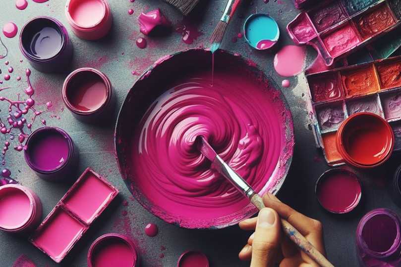
What Colors Make Magenta? – 5 Easy Ways to Your Mix
As one of the most visually striking colors to grace our eyes, Magenta presents itself as a deep purple or dark pink shade. Come with us as we explore how to make magenta paint for yourself at home, including color mixing recipes for 25 popular shades of magenta.Table of ContentsToggle5 Methods on How to Mix Magenta Color25 Mixing Recipes on How to Mix Popular Magenta Color ShadesHow to Make Magenta with the Primary Colors MethodFrequently Asked QuestionsHow Did Magenta Get Its Name?When Did Magenta Become Popular?5 Methods on How to Mix Magenta Color Magenta is a vibrant color that can be mixed using various methods, depending on the medium and the desired shade. Here are some known methods to create magenta:Primary Colors Method (Subtractive Color Mixing):In traditional color theory for painters, magenta is considered a primary color, so it is not typically mixed from other colors in painting. However, in practice, you might create a magenta-like hue by mixing red and blue paint, although this often results in a violet shade rather than true magenta. The exact colors used can vary, but a bright red and a bright blue would be the starting point.Mixing Quinacridone Rose or Pink with a Touch of Blue:Some artists create a magenta-like color by mixing quinacridone rose or a similar pink with a small amount of blue.Using Pre-mixed Pigments:For artists and designers, purchasing pre-mixed magenta pigments is often the most reliable way to achieve a true magenta color, as it can be challenging to mix the perfect magenta shade by hand.RGB Color Model (Additive Color Mixing)In digital media and lighting, magenta can be created by combining red and blue light at equal intensity, which is representative of the additive color mixing process. CMYK Color Model (Subtractive Color Mixing):In printing, magenta is one of the primary colors and is typically not mixed but used as a base color. However, to adjust the shade of magenta, it may be combined with varying amounts of yellow or cyan. Remember, the method you choose will depend on the medium you’re working with and the specific hue you’re trying to achieve. It’s also important to note that the perception of color can be subjective, and the exact formula for magenta may vary between different materials and color systems.25 Mixing Recipes on How to Mix Popular Magenta Color ShadesShade NameMixing RecipeFuchsia2 parts Quinacridone Magenta, 1 part WhiteDeep Fuchsia2 parts Quinacridone Magenta, <1 part Ultramarine BlueDeep Pink1 part Quinacridone Magenta, <1 part Ultramarine Blue, <1 part WhiteBright Magenta2 parts Quinacridone Magenta, 1 part White, <1 part Primary CyanNeon Magenta1 part Quinacridone Magenta, 2 parts WhiteElectric Magenta1 part Quinacridone Magenta, 1 part White, <1 part Primary CyanFluorescent Magenta1 part Quinacridone Magenta, <1 part WhiteHot Magenta2 parts Quinacridone Magenta, <1 part Ultramarine BlueRose Red1 part Quinacridone Magenta, <1 part Alizarin CrimsonDeep Magenta1 part Quinacridone Magenta, <1 part Ultramarine BlueBright Rose1 part Quinacridone Magenta, <1 part Alizarin CrimsonDeep Fuchsia Pink1 part Quinacridone Magenta, <1 part Primary Cyan, <1 part WhiteHot Pink1 part Quinacridone Magenta, 1 part WhiteRazzle Dazzle Rose1 part Quinacridone Magenta, <1 part Dioxazine PurpleRuby Magenta1 part Quinacridone Magenta, <1 part Alizarin CrimsonShocking Pink2 parts Quinacridone Magenta, <1 part WhiteUltra Magenta1 part Quinacridone Magenta, 1 part White, <1 part Dioxazine PurplePink Flamingo1 part Quinacridone Magenta, 2 parts White, <1 part Lemon YellowPink Lavender1 part Quinacridone Magenta, 1 part White, <1 part Ultramarine BluePurplish Magenta1 part Quinacridone Magenta, <1 part Dioxazine PurpleViolet Magenta1 part Quinacridone Magenta, <1 part Ultramarine Blue, <1 part WhiteCrimson Magenta1 part Quinacridone Magenta, <1 part Cadmium RedCerise1 part Quinacridone Magenta, <1 part Alizarin CrimsonMagenta Rose1 part Quinacridone Magenta, <1 part Primary Cyan, <1 part WhiteMagenta Pink2 parts Quinacridone Magenta, 1 part White, <1 part Lemon YellowHow to Make Magenta with the Primary Colors Method To make magenta paint, you will mix red and blue, the two primary colors that combine to create this vibrant hue. Red, with its hex code #ff0000, is a powerful color associated with passion, desire, and also with warning and urgency due to its ability to attract attention. Blue, with its hex code #0000ff, brings calmness, peace, and is often linked to intelligence and wisdom, as it is reminiscent of the sky and ocean. When these colors blend, they produce magenta, a color that can evoke a range of emotions and is versatile for artists to convey different feelings in their work. To achieve magenta, you start with a base of red paint on your palette, which you can get from primary red paint or by mixing yellow and blue. Then, add blue paint, available as a primary color or mixed from green and red. As you mix red and blue, you’ll see a variety of shades emerge until you reach your desired magenta. For a lighter magenta, incorporate a small amount of white paint. To darken it, add more red or blue paint to the mixture. This process allows for customization and exploration of the depth of magenta shades.Frequently Asked QuestionsHow Did Magenta Get Its Name? While the color magenta was first referred to as fuchsine, derived from the fuchsia flower, magenta would later be named after the town of Magenta in Milan, Italy. The name was given to the color after a battle between France and Austria left the surrounding fields covered in a deep red, a shade similar to that of what is now known as magenta. When Did Magenta Become Popular? The color magenta grew in popularity during the mid-19th century when the French chemist, François-Emmanuel Verguin, first synthesized the pigment in an attempt to combat the textile industry’s growing demand for bright and vibrant colors. At the time, this color was merely named fuchsine, after the fuchsine flower that displayed similar shades.
What Color Does Red and Blue Make? – Color Mixing Guide
When it comes to colors and mixing them, the course of action might not be as easy as you think. There are certain things you need to think through if you are looking to mix the perfect color. For example, what color does red and blue make? Is it the same color when mixing paints as it is when creating a webpage? Let us see if we can make a bit more sense of these questions as we find out more about the combination of red and blue.Table of ContentsToggleWhat Color Does Red and Blue Make?What Color Does Red and Blue Make With Light?How Does Blue and Red Work With Paint Pigments?Why Blending Blue and Red Does Not Always Make PurpleRed and Blue in Interior DesignRed and Blue in FashionPurple: The Combination of Red and BlueDifferent Shades of PurplePurple vs. VioletPurple vs. IndigoMore Shades of PurpleMixing Different Shades of Purple PaintShades of ColorTints of colorConclusionFrequently Asked QuestionsWhat Color Does Red and Blue Make?Why Is Purple Connected With Wealth?What Is an Additive Color System?What Is a Subtractive Color System?What Color Does Red and Blue Make?In general, mixing red and blue makes purplec color.It depends on the blue and red shades you are using, which we will have a look a bit later.What Color Does Red and Blue Make With Light? It is amazing how many colors we can see, which is possible when the light reflects off surfaces and reaches our eyes. Every color has differing wavelengths, which is then seen as a particular color. What are known as cones and rods in our eyes are what help us see these colors. The combination of red and blue light results in the color magenta. Light is energy and falls into the category of electromagnetic radiation. Now there are various forms of electromagnetic radiation from ultraviolet rays, infrared, and radio waves to X-rays and microwaves. Each of these has a different wavelength and somewhere in the middle of all of this, you will find visible light. The visible light spectrum is but a small section, however, there are still many different wavelengths involved. On the one end of the light spectrum, you have the color red, which has the longest wavelength, while violet or blue has the shortest and sits on the opposite end. Colors in the middle, are generally seen as green.Therefore, theprimary colorsfor light are red, blue, and then green. Maybe you have seen the RGB color codes used when designing computer graphics, also known as an additive color model. All other colors are mixtures of these colors. So, yoursecondary colorswill be yellow, cyan, and magenta. This is how red, and blue makes magenta, which you can say is more of ashade of purple. By combining all the colors within the light spectrum, you will produce white light. Objects and surfaces appear as certain colors because of how the colors are reflected and absorbed. For example, a red stop sign reflects the red light and absorbs the green and blue light. How Does Blue and Red Work With Paint Pigments? As we have learned, light is a combination of colors and objects reflect and absorb these colors. So, when you are looking at a certain paint color, the color comes from certain wavelengths that are reflected, while other wavelengths are absorbed. This whole process is known as subtractive coloring and is how dyes and pigments are made.At school, most of us were taught the basics of mixing paint colors. We learned that there are primary and secondary hues. For example, blue, red, and yellow, which cannot be created are primary colors, while mixing these create purple, orange, and green, and are the secondary colors. From there you can create the many shades and tints of all the colors in between. This is also called an RYB (red, yellow, blue) color system. So, what colors do red and blue make? As we have mentioned, red and blue form part of the primary colors, so a combination of red and blue will give you the secondary color of purple. This is a simple explanation; however, things do not always work out as intended.Why Blending Blue and Red Does Not Always Make Purple Different paints are made by different manufacturers, and they each have their own formulas. This means there are many variations of blue and red out there. When used, some mightcreate the best purple color, while others produce a dull or unexpectedly ugly color. This is why checking out the paint ingredients is always important, to make sure the colors are pure. Some blue and red paints may contain a tiny amount of yellow. Since, according to color theory, yellow and purple arecomplementary colors, the resultant color will be a brownish, muddy color. Even if it is only a small amount of yellow, it can affect the outcome, which can sometimes be unexpected. Although, you can experiment with different blue and red paints, to observe the different purple colors you can get. Another reason for not always making purple can also depend on the medium you are using. Purple can vary when using watercolors, acrylic paints, and oil paints.What color paints can you use? Not only are there slight variations in similar colors from different manufacturers, but you also get different types of blue or red. For example, ultramarine blue or cerulean blue, and alizarin crimson or permanent rose.Ultramarine blue and alizarin crimson can work, as theshade of redalready has a blue undertone and is a cool dark shade of red. Mixing these two paints will produce a deep purple color. You can try a brighter violet color like permanent rose and mix it with cerulean blue to produce more of a violet color. You should take some time to experiment with a few different paints to see all the possibilities available. Red and Blue in Interior Design In a living room, incorporating red can infuse the space with a sense of warmth and vibrancy, making it feel lively and inviting. Meanwhile, blue tones can create a soothing and calm atmosphere, offering a tranquil retreat from the hustle and bustle of daily life.Red and Blue in Fashion In fashion, red often symbolizes confidence and boldness, making a striking statement in any outfit through its vibrant and energizing hue. Blue, on the other hand, is versatile and universally flattering, exuding a sense of calmness and stability, and is often used to create looks that are both sophisticated and approachable.Purple: The Combination of Red and Blue Whether you are an artist or designer, it is advantageous to discover and learn more about the colors you are dealing with. All colors have meaning, and this can play a pivotal role in your art and designs. When it comes to the combination of red and blue, we have learned it can make purple. The color combines the qualities of both red and blue, red being more stimulating, while blue is more relaxing. Purple is closely linked to spirituality and imagination, and is often associated with royalty, luxury, creativity, and mystery.When looking at purple, the color is supposed to encourage and inspire, as well as enlighten us about who we are. Lighter shades of purple can also be associated with romance and nostalgia. However, overuse of the color or darker shades can bring on sadness or frustration and is associated with immaturity and being overly emotional. Purple is a wonderful and exquisite color, which you can use to your advantage. Different Shades of Purple As with most colors, you can have many different shades and tints, and colors that are similar. For example, take violet and indigo. However, these are not the same color as purple. When dealing with thecolor wheel, purple is often referred to as violet.Purple vs. Violet Purple and violet are often referred to as being the same color in different texts and countries, which can create some confusion. Violet is the color that is at the lowest end of the light spectrum, which means it has the shortest wavelength. In the table below, you will notice that violet appears to contain more blue with the RGB color model, while purple has equal amounts of red and blue.The CMYK color system comes into play when printing and involves an amount of ink, which is used to create a color. The colors you usually get for this are cyan, magenta, yellow, and black. This is also recognized as a subtractive color system. As you can see in the table for violet, you have a blend of cyan and magenta, with a lot more magenta than cyan.When violet is mixed with paint, it is a mixture of blue and red pigments, and the color can be found somewhere between purple and blue on the color wheel. An example of paint pigment to make violet includes a 2:1 ratio of quinacridone magenta and ultramarine blue. You can then add a little titanium white to change the color value.Purple ShadeHex CodeCMYK Color CodeRGB Color CodePurple ColorPurple#8000800, 100, 0, 50128, 0, 128 Violet#8000ff50, 100, 0, 0128, 0, 255 Purple vs. Indigo Indigo can be described as being another shade of purple that contains a little more blue than red. As you can see, it is a deeper color than violet, or it can also be described as a dark violet. Violet and indigo are part of the visible light spectrum, unlike purple. They are also a part of theseven colors of the rainbow, indigo being situated between blue and violet. However, some sources differ in the position of indigo within the light spectrum. When mixing indigo paint, you can try using a light blue or something like ultramarine blue. You can then add some red to achieve anindigo color. You might have to experiment with proportions and types of paint to find the best combination. Indigo is often used in painting to help with creating landscapes or night skies.Purple ShadeHex CodeCMYK Color CodeRGB Color CodePurple ColorPurple#8000800, 100, 0, 50128, 0, 128 Indigo#4b008242, 100, 0, 4975, 0, 130 More Shades of Purple The color purple has a long history from ancient times through to the present time. Today there are many variations of the color purple, especially when it comes to graphic designs. If you are not a graphic designer, many online tools can help you find specific colors, and they will also adjust these colors to suit your needs. Below are just a few shades of purple, with their names and color codes, showing how much red and blue or cyan and magenta are used.Purple ShadeHex CodeCMYK Color CodeRGB Color CodePurple ColorPurple#8000800, 100, 0, 50128, 0, 128 Byzantium#7029630, 63, 12, 56112, 41, 99 Mauve#e0b0ff12, 31, 0, 0224, 176, 255 Mulberry#c54b8c0, 62, 29, 23197, 75, 140 Orchid#da70d60, 49, 2, 15218, 112, 214 Mixing Different Shades of Purple Paint Just like you get shades of purple on the computer, you can also create a variety of purple shades with paint. Remember that you can get many different types of the same color, so again, always read the ingredients on the tubes of paint, and experiment with some to see what happens. When blending colors and you want to go lighter or darker, it is also known as shades and tints.Shades of Color To make a color darker, many add small amounts of black paint. However, this does always work as black tends to easily overpower the color. When it comes to making purple darker, rather try adding more blue paint. Depending on what blue you used, instead of black, you could also try a darker blue, such as navy blue to darken the purple. To find out what works better, you can experiment and create your own color chart. To deepen a purple color and make it warmer, try adding more red paint. Tints of color Tints are opposite to shades, meaning that paint colors become lighter and not darker. To do this, you can simply add small amounts of white to the purple. You can also tone down or create a less vibrant purple by adding yellow, its complementary color. Just make sure it small amounts as you will land up with a muddy color if you use too much.Complementary colors can be determined by looking at a color wheel. You will notice that purple and yellow are positioned directly opposite each other. When placed alongside one another, the colors stand out. However, if you mix these two paint colors, they cancel each other out and create a brownish color. Conclusion As you can see, a combination of red and blue is a little different when considering light and pigments. Be it purple, magenta, or violet, all shades of purple are ideal for helping to promote creativity and imagination.Frequently Asked QuestionsWhat Color Does Red and Blue Make? To put it simply, there are different systems used to create colors, one is through light, which is an additive system so red and blue make magenta. When it comes to paints, dyes, and inks, red and blue make purple, which uses a subtractive system. Why Is Purple Connected With Wealth? Purple has a strong connection to wealth as well as royalty since, in ancient times, the dye that was used to color fabrics was extremely expensive as well as rare, and could only be afforded by those who were wealthy and those from royalty. What Is an Additive Color System? This is the process of adding ormixing colorsof light, for example, if you combine red and blue light in equal proportions, you will create magenta. So, when combining all the colors, you will get white light. What Is a Subtractive Color System? This color system deals with things like pigments and dyes, where certain colors are absorbed, and others reflected. For example, the CMYK color model for printing, which involves cyan, magenta, yellow, and black ink, is a subtractive color model.